lauantai 19. elokuuta 2023

PictureCorrect.com: Contrast is King in Photography

I feel that contrast is probably the most important element in the entire world of visual arts. Let’s take a closer look.

Contrast is king

If Contrast was, in fact, the king of visual communication, then possibly he is only trumped by the beautiful Queen of Symmetry. We will take a look at symmetry at a later date.

If symmetry is the one element above all else that the human eye finds most attractive, then contrast would be the single element that the human eye finds the most interesting.

Contrast (Google definition)

noun

noun: contrast; plural noun: contrasts

ˈkɒntrɑːst/

1. The state of being strikingly different from something else in juxtaposition or close association.

Even the dictionary definition hints at the interesting quality of Contrast.

When we think about contrast within photography, we generally think about tonal contrast. Tonal contrast is what we photographers are referring to when we’re talking about adding or reducing the contrast within an image.

However, contrast by no means stops there. In fact, tonal contrast only just scratches the surface of the types of contrasts we can use to make our photography much more interesting.

This is not something I have pulled from thin air; the power of difference, variance or “contrast” has been around for as long as art itself.

How often have you seen a photo of the odd one out?

Google “Odd one out.” click on the image tab, and you will see the types of photos I am referring to. The interest that these images create is contrast at play.

Let’s break these forms of contrast into subgroups:

Compositional or in camera – types of contrast we can capture in camera.

Post-processing – types of contrast we can apply within post-processing.

Conceptual – Conflicting stories we can imply within our photography.

Compositional Contrast (contrasting elements)

Rough vs smooth

Sharp vs blurry

Still vs movement

Big vs small

Shiny vs dull

Old vs new

Square vs circle

Straight vs curve

Symmetry vs Asymmetry

Processing Contrast (contrasting effects)

Tonal contrast – high contrast vs low contrast

Light contrast – Dark vs light

Saturation contrast – High saturation vs low saturation

Colour contrast – Complementary, cold vs warm, others

Detail contrast – sharper vs softer

Conceptual Contrast (contrasting stories)

Happy vs sad

Many vs none

Have vs have not

There would be many, many more. I’m sure you have thought of a couple already; however, the point is, whatever we call it – contrast, variation, difference – is the foundation for interesting photography. In fact, there could be a case made that contrast is the foundation for almost everything interesting, full stop!

Compositional Contrast

Looking for contrast within your compositions can be an excellent way to improve the interest level within your photos.
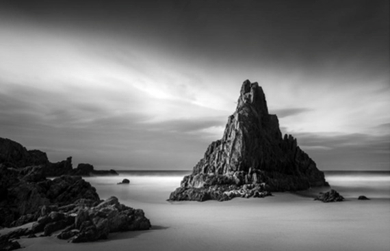
compositional contrast

Above is a great example of compositional contrast. The first and probably the most obvious is the rough texture of the rocks vs the smooth texture of the sand and water.

– Very strong light contrast on the main triangular rock: light side v dark side.

– There is symmetry contrast with the strong symmetry of the triangular rock against the asymmetric position of that rock within the frame.

– Line contrast with the flat, straight horizon being broken by the rough outline of the rocks.

– Shape contrast: the strong triangle v the lack of any other shape.

– Shape contrast: the contrast of the triangle v the rectangular frame of the photo.

– The dark rock against the bright surroundings.

– The white soft line of the long-exposure water v the dark sharp line
of the horizon.

I would be lying if I told you that I consciously saw all of these elements when composing this photo. I can clearly remember that this position was the composition that jumped off the rear LCD much more than any other shot that I composed that day. This definitely has to do with the shape and symmetry of the pinnacle rock from this exact spot. The choice of shutter speed is also interesting because I will usually do several different speeds; however, more often, it’s the longer speeds with the smooth water that look the most interesting – the contrast of smooth vs rough.

Processing Contrast

When processing my images, the 3 main types of contrast I find particularly useful in leading the viewers are light, tonal contrast, and saturation.

Light (More or less light): As a type of contrast, light contrast would be the difference between a light area and an area of dark within an image. By adding light, we can attract attention to an area, or conversely by removing light or darkening an area, we will tend to divert attention from that area.

Tonal contrast (more or less contrast): Tonal contrast is the more commonly referred to contrast within photography. When photographers talk about contrast, we are talking about tonal contrast. Generally speaking, to add more tonal contrast is to create a larger distance between the light pixels and the dark pixels within a photo. Lighten the lights and darken the darks. To lower tonal contrast within a photo would be to create less distance between the lights and the darks. Darkening the lights and lightening the darks would reduce the overall tonal contrast of a photo.

Saturation (more or less colour saturation): Saturation as a contrast element would be the difference between highly saturated areas and the low saturated areas of a photo.
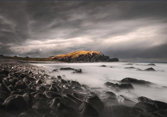
processing contrast

Attracting the attention of your viewer’s eye using these three forms of contrast is actually quite simple. By adding more of any of them to a specific area of our photograph (more light, more tonal contrast or more saturation) will have the effect of drawing attention to that specific area. Reducing the light, tonal contrast or saturation will have the opposite effect of allowing these areas to fade into the background, as these areas will appear less interesting to your viewers.

I must highlight the fact that removing contrast interest from the surroundings is at least as equally important as adding contrast interest to your main subject. In fact, in the case of saturation contrast, I will very rarely add extra saturation; however, I will almost always remove at least a little saturation from the areas surrounding my interest point (main subject).

Let’s take a look at another example where the above techniques are clearly visible.
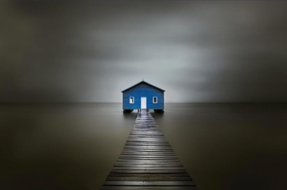
tonal contrast

Hopefully, once again your eye is drawn to the boatshed in this particular photo.

Again note:

The centre of the image here contains the brightest areas, the highest colour saturation and also the highest area of tonal contrast (the point at which light and dark are at the closest proximity to each other).

Whereas the edges of the image contain;

– Very little, if any bright areas

– Next to no colour saturation

– Very little tonal contrast (Apart from the walkway leading into the photo)

Using these 3 forms of contrast, we can create very powerful photos that grab the viewer’s eye and lead it directly into the central subject matter.

Conceptual contrast

Conceptual contrast deals with conflicting stories or themes within a single photo.

To name just a few:

  • Happy vs sad
  • Despair vs hope
  • Love vs broken heart

This is a relatively new concept to me and as I develop my conceptual contrast skills, I will revisit with more in-depth thoughts. In the meantime, let’s look at an image of mine where I have attempted to use conceptual contrast.
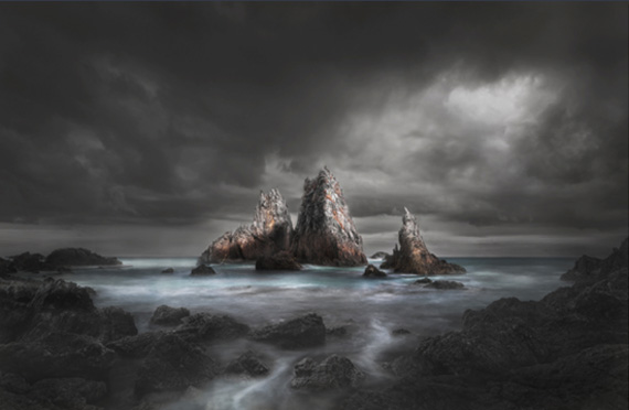
conceptual contrast

In this photo, the main conceptual contrast that I wanted to portray was quite a heavy, depressing scene with the ray of light representing hope.

There is also another possible storyline containing conceptual contrast, that being one of isolation v companionship. The three rocks themselves are quite isolated within the image, but within that, we also have the smaller rock of the three, separated from the embrace of the other two. Once again, I didn’t consciously see this at the time of making the photo. It all may seem a bit far-fetched, but at the end of the day, the more stories that we consciously place within our photos, the greater chance that our viewers will make their own interpretation and connect with our work.

- - - - - - - - - - - - - - - - - - - - - - - - - - - - - - - - - - - - - - - - - - - - - - - - - - - - - - - - - - - - - - - - - - - - - - - - - -

Did you appreciate this newsletter? Please help us keep it going by Joining Our Patreon Supporters

What are your thoughts on this article? Join the discussion on our Facebook Page

PictureCorrect subscribers can also learn more today with our #1 bestseller: The Photography Tutorial eBook

- - - - - - - - - - - - - - - - - - - - - - - - - - - - - - - - - - - - - - - - - - - - - - - - - - - - - - - - - - - - - - - - - - - - - - - - - -

The post Contrast is King in Photography appeared first on PictureCorrect.


from PictureCorrect https://ift.tt/uwb6VBS
via IFTTT
perjantai 18. elokuuta 2023

PictureCorrect.com: Choosing the Best Camera Bag for Your Needs

Photography isn’t just about nailing that perfect shot; it’s also about the seamless transition from one location to another with your precious gear in tow.

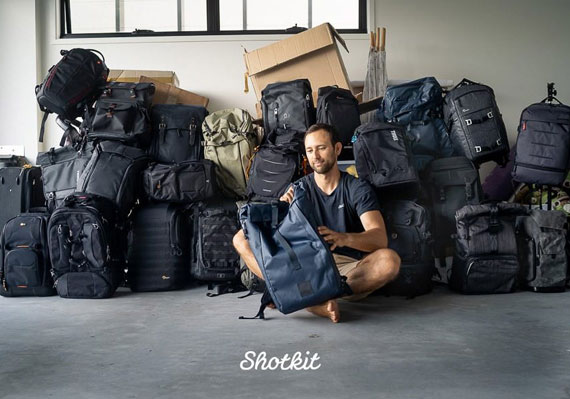
Throughout my work with Shotkit, we’ve tested a selection of camera bags—over 150 to be precise. Some bags stood out brilliantly, while others barely made it through a single day’s shoot.

The ideal camera bag acts as your dependable partner, ensuring your equipment’s safety while you immerse yourself in capturing the magic around you. And yes, making sure your lunch doesn’t end up crushed is part of the deal.

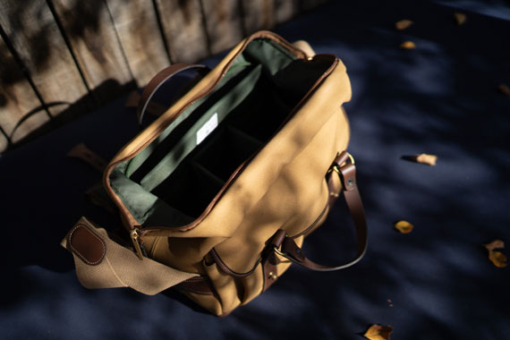
camera bags

It’s not merely about stashing your gear; it’s about smart organization, reliable protection, and showcasing your style as a photographer.

If you’re navigating the vast sea of camera bags, or just wondering what defines a bag worth its price tag, you’ve landed on the right guide. Let’s journey through the labyrinth of camera bags.

Tailoring Your Camera Bag Search to Your Needs

Your choice of a camera bag transcends its visual appeal or features—it mirrors your unique photography vibe. Reflect on your common shooting locales. Mountainous terrains versus bustling urban streets will call for different bag functionalities. Similarly, a nature enthusiast’s gear will differ from that of a candid wedding snapper.

Consider your equipment arsenal. Sometimes, I venture out with just my reliable camera and a lens, while other times I’m armed with an array of lenses. Recognizing your go-to equipment will guide you toward the right bag choice.

Your duration outdoors also plays a role. Extended photo sessions demand comfort and ample space for essentials, while a brief outing might only require a compact bag for swift access.

Having experimented with countless bags, the golden rule I’ve discerned is: the best bag seamlessly integrates into your photography rhythm, enhancing your workflow.

camera bag comparisons

6 Main Camera Bag Types

The camera bag realm is akin to a treasure trove—each gem with its unique charm.

  1. Camera Backpacks: Ideal for adventurers or those with substantial gear. The ideal photographer backpack can balance weight effectively, safeguarding your back during prolonged journeys. My current fave is the Everyday Backpack from Peak Design, and for hiking, Shimoda’s Explore II is excellent as well.
  2. Camera Shoulder/Messenger Bags: Suited for urban wanderers and candid moments. Their style quotient is high, and they offer rapid gear access.
  3. Camera Sling Bags: If you’re seeking a balance between backpacks and messenger bags, sling bags are your answer. They prioritize agility, allowing swift gear retrieval.
  4. Rolling Cases: The gold standard for photographers with hefty gear loads. Especially practical for urban landscapes or traveling with photography equipment. My personal recommendation? Any rolling bag by ThinkTank.
  5. Camera Hard Cases: Tailored for challenging environments. They promise unparalleled protection against external shocks. Brands like Pelican are renowned for their watertight variants—perfect for aquatic settings.
  6. Camera Holsters and Pouches: A minimalist’s dream. Designed for moments when you need your camera and perhaps one extra lens.

From my decades in photography, it’s evident that each bag type shines in its situation. It’s less about crowning a ‘best’ bag and more about discerning the right one for your current pursuit.

bags for cameras

Key Considerations When Bag Hunting

Selecting a camera bag? Mull over these vital considerations:

  • Durability & Craftsmanship: Ensure the bag’s fabric can endure occasional rough handling and weather changes. Prioritize water-resistant materials, robust zippers, and durable stitching. If you’re after a waterproof camera bag, a hard case is your best option.
  • Dimensions & Volume: Gauge your gear size and frequency. Aim for a bag that comfortably houses your essentials without adding redundant weight.
  • Comfort Quotient: Extended gear lugging shouldn’t strain your physique. Opt for cushioned straps, ergonomic designs, and breathable materials.
  • Accessibility & Structure: Quick and organized gear access is pivotal. Favor bags with intuitive compartments and adaptable dividers.
  • Design & Appeal: Your camera bag doubles as a fashion statement. Find one that echoes your personal style.
  • Safety Attributes: In populated or travel scenarios, gear security is vital. Look out for unique safety features.
  • Budget & Worth: High-end price tags don’t guarantee top-notch quality. Set a budget, research, and identify the features that align with your requirements.

Wrapping Up

Finding the quintessential camera bag merges your photographic prerequisites with your distinct style, creating a bond that safeguards your gear and enriches your photography journey. With numerous options available, the guidelines we’ve explored will steer you toward a judicious choice. Remember, the superior camera bag isn’t necessarily the priciest or the most en vogue—it’s the one that aligns flawlessly with your photographic spirit. Cheers to discovering that impeccable match and to myriad unforgettable captures ahead!

About the Author:
Jeff Collier is a Shotkit writer, social media manager and photographer.

- - - - - - - - - - - - - - - - - - - - - - - - - - - - - - - - - - - - - - - - - - - - - - - - - - - - - - - - - - - - - - - - - - - - - - - - - -

Did you appreciate this newsletter? Please help us keep it going by Joining Our Patreon Supporters

What are your thoughts on this article? Join the discussion on our Facebook Page

PictureCorrect subscribers can also learn more today with our #1 bestseller: The Photography Tutorial eBook

- - - - - - - - - - - - - - - - - - - - - - - - - - - - - - - - - - - - - - - - - - - - - - - - - - - - - - - - - - - - - - - - - - - - - - - - - -

The post Choosing the Best Camera Bag for Your Needs appeared first on PictureCorrect.


from PictureCorrect https://ift.tt/XkKVM6F
via IFTTT

torstai 17. elokuuta 2023

PictureCorrect.com: When to do Noise Reduction in a Photo Editing Workflow

In the age of digital photography, noise can often sneak its way into our photos. Whether it’s the grainy specks in low-light shots or the colored pixels in certain textures, noise can be distracting and degrade the quality of an image. Thankfully, we have the tools and software to address this issue. But when should you incorporate noise reduction into your photo editing workflow? Let’s dive in.

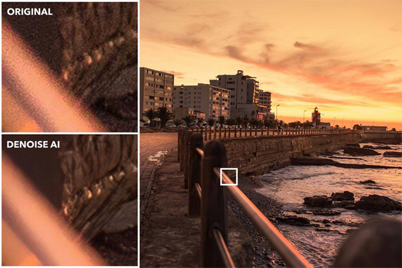
noise reduction

Photo captured by Darwin Vegher

1. Understanding Noise

Before we address when to tackle noise, it’s crucial to understand its types:

  • Luminance Noise: These are the grainy, black and white specks that appear in photos, especially in shadows or under low-light conditions.
  • Chroma (Color) Noise: These are the colored specks that can appear anywhere in the photo, often in uniform areas like the sky or skin tones.

2. The Ideal Time for Noise Reduction

Typically, noise reduction should be one of the earlier steps in your editing process, especially if it’s a significant concern in the image. Here’s why:

  • Before Detailed Edits: Reducing noise before making detailed edits ensures that you don’t accidentally enhance the noise when adjusting sharpness, clarity, or contrast.
  • After Raw Conversion: If you’re shooting in RAW (which is recommended for the most editing flexibility), apply noise reduction after converting the file. Some RAW converters even have built-in noise reduction tools.
  • Before Color Adjustments: Chroma noise can impact how colors appear, so it’s wise to reduce this noise before making color corrections.

3. Things to Remember

  • Don’t Overdo It: While it’s tempting to completely eliminate noise, over-processing can result in a plasticky look, void of details. Balance is the key.
  • High ISO Isn’t Always Bad: Yes, higher ISO settings can introduce noise. But don’t be afraid of it. Sometimes, a bit of grain adds character to a photograph.
  • Noise Reduction Tools Matter: Not all noise reduction tools are made equal. Some software focuses on luminance noise while ignoring chroma noise, and vice versa. Research and invest in one that suits your needs.

Incorporating noise reduction at the right time in your photo editing workflow ensures that you maintain image quality without sacrificing essential details. Remember, while the aim is to reduce distractions, retaining the natural feel and texture of the photograph is just as important. Happy editing!

For Help Sharpening Blurry Photos:

In photo editing news, Topaz Photo AI was recently updated to version 1.5. The company has marked it down $40 off for a short time to celebrate the update if you want to try it out.

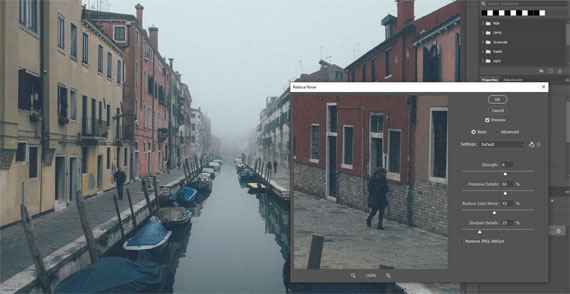
denoise cityscape

Updated: Reducing Noise in a Cityscape Results (see how it works)

Sharpen, remove noise, and increase the resolution of your photos with tomorrow’s technology. Topaz Photo AI supercharges your image quality so you can focus on the creative part of photography.

Deal ending soon: Topaz Photo AI at $40 Off

- - - - - - - - - - - - - - - - - - - - - - - - - - - - - - - - - - - - - - - - - - - - - - - - - - - - - - - - - - - - - - - - - - - - - - - - - -

Did you appreciate this newsletter? Please help us keep it going by Joining Our Patreon Supporters

What are your thoughts on this article? Join the discussion on our Facebook Page

PictureCorrect subscribers can also learn more today with our #1 bestseller: The Photography Tutorial eBook

- - - - - - - - - - - - - - - - - - - - - - - - - - - - - - - - - - - - - - - - - - - - - - - - - - - - - - - - - - - - - - - - - - - - - - - - - -

The post When to do Noise Reduction in a Photo Editing Workflow appeared first on PictureCorrect.


from PictureCorrect https://ift.tt/psOP4xo
via IFTTT

keskiviikko 16. elokuuta 2023

PictureCorrect.com: Next Generation Tools Coming to the Luminar Neo Photo Editor

In photo editing news, Skylum, a leading innovator in photo editing software and the company behind the award-winning program Luminar Neo, announces a significant milestone in the evolution of its core product that will release in the coming months, below is their press release. The cornerstone of this update is the introduction of generative AI technologies being integrated into Luminar Neo.

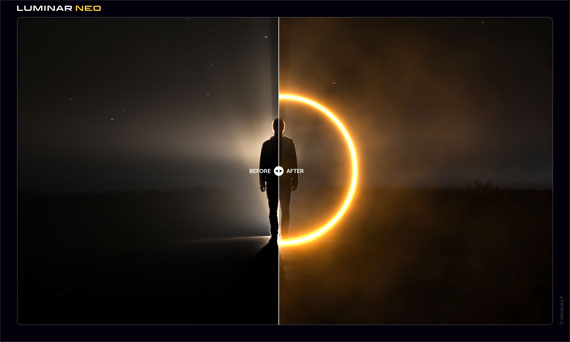
image from new luminar tools

New Tools in Luminar Neo

As one of the first movers in this domain, Skylum is determined to lead the way toward a future where AI-assistive photo editing becomes second nature, saving photographers precious time previously spent on mundane tasks that can now be dedicated to exploring the world and their creativity. The profound impact that AI has already had on all creatives is undeniable, and Skylum is proud to be at the forefront of this transformative shift, with a firm belief that AI should always serve photographers, not replace them.

To illustrate that, Skylum’s announcing an array of new AI-assistive tools designed to streamline photographers’ challenges with scene manipulation, removing unwanted objects, and expanding the canvas of a photo. Here is what Luminar Neo users can expect this fall.

  • GenErase: A next-generation Erase tool that not only removes unwanted distractions from your images but also replaces those areas using content-aware tools, providing a focused and distraction-free composition. This feature preserves the integrity of your photos by intelligently filling in the gaps with textures and other elements to match the surrounding area. GenErase can seamlessly remove objects like trash, street signs, vehicles, graffiti, and more to preserve the beauty of the composition.
  • SceneExpand: This tool enables users to extend the boundaries of their photos, adding a new dimension to original compositions. Whether creating panoramic landscapes or adding breathing room to favorite images, SceneExpand offers the ability to break free from traditional aspect ratios and unlock new creative possibilities.
  • SceneSwap: Let users replace specific elements (such as the sky or foreground) with high-quality AI-generated visuals that blend seamlessly with the rest of the photo. Imagine a stunning sunset replacing the dull, overcast sky or crystal-clear azure waters instead of a murky pond in your photos.
  • Water Enhancer: Designed to enhance water features in aquatic scenes, giving landscape photos greater visual impact.
  • Studio Light: A creative tool for portrait photographers that faithfully replicate lightning effects usually achieved with expensive technical equipment in the studio and breathes new life into older photos. With Studio Light, creators can easily add a whole new dimension to portrait photos.
  • Neon & Glow: Elevate your creations with impressive lighting effects. This tool will allow photographers to overcome challenges such as inadequate lighting conditions and seamlessly blend visually-striking neon elements into the composition, making them even more intriguing.

before after ai

“As photography keeps evolving, AI should be seen as an opportunity and not a threat. Think about what makes a photo special – the creative ideas behind it, the personal touch, the experience of taking that image. AI cannot replace any of those things, but it can serve as a powerful assistive tool to expand the realm of photography, making it easier for everyone.” – said Ivan Kutanin, CEO of Skylum.

As part of the commitment to keep Luminar Neo intuitive and easy to use, Skylum will also debut a Refreshed UI Design and Navigation. This update addresses user interface fatigue and usability issues, as well as improves the overall user experience. The improvements will address some of the most common challenges with photo management and interaction with the app, making your experience using Luminar Neo even more intuitive and enjoyable.

With this update, Skylum’s bringing next-generation AI-powered photo editing technologies, new post-processing tools, and a host of UI/UX improvements, making Luminar Neo better than it has ever been.

Availability:

Platform upgrades and generative technologies will be available to monthly and annual Pro, Explore, and Ultimate plan subscribers. Studio Light will be added first to the software in the next release within a month, and the rest will be gradually incorporated over the following months this fall.

Existing Luminar Neo lifetime (perpetual) license owners can opt to switch to the Pro subscription at an early bird rate ($49 for the first year), or they can make a one-time purchase of the 2023/24 Creative Journey Pass for $39 (early bird price). This pass will grant access to generative technologies until August 16th, 2024, as well as all new features announced and released before that date, except Extensions.

Learn more: Luminar Neo Generative AI Tools

- - - - - - - - - - - - - - - - - - - - - - - - - - - - - - - - - - - - - - - - - - - - - - - - - - - - - - - - - - - - - - - - - - - - - - - - - -

Did you appreciate this newsletter? Please help us keep it going by Joining Our Patreon Supporters

What are your thoughts on this article? Join the discussion on our Facebook Page

PictureCorrect subscribers can also learn more today with our #1 bestseller: The Photography Tutorial eBook

- - - - - - - - - - - - - - - - - - - - - - - - - - - - - - - - - - - - - - - - - - - - - - - - - - - - - - - - - - - - - - - - - - - - - - - - - -

The post Next Generation Tools Coming to the Luminar Neo Photo Editor appeared first on PictureCorrect.


from PictureCorrect https://ift.tt/8uRDlGx
via IFTTT

tiistai 15. elokuuta 2023

PictureCorrect.com: When to Apply Sharpening in the Photo Editing Process

Photography, in its essence, is an art of capturing light. Once that light is captured, the journey isn’t quite over – the art of post-processing begins. Photo editing allows us to accentuate the best parts of our images, fix imperfections, and achieve a final look that’s both appealing and striking. One such technique, often left for the end, is sharpening. Let’s dive into why it’s best to apply sharpening at the end of the photo editing process.

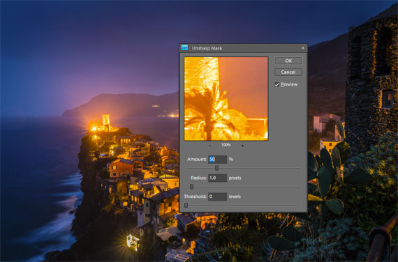
sharpen edit

1. Understanding Sharpening

Sharpening is a post-production technique that increases the contrast along the edges within an image. This accentuates details, making the image look clearer and more refined. However, like any tool, if used excessively or inappropriately, it can lead to undesirable artifacts like halos or increased noise.

2. Maintaining Image Quality

During the editing process, numerous adjustments – be it exposure, contrast, color correction, or retouching – are made to the image. Every adjustment, especially when done in raster format (like JPEG), can potentially degrade the image quality slightly. If you sharpen early and make subsequent edits, you risk exacerbating the unwanted artifacts introduced by sharpening. By sharpening at the end, you ensure that you’re applying this effect to the final version of the image, preserving maximum detail.

3. Tailored to Output

The required amount of sharpening can vary depending on where the image will be displayed. For instance, a photo meant for Instagram might need different sharpening than one intended for a large print. By leaving sharpening to the end, you can adjust according to the specific output in mind, ensuring optimal clarity.

4. Flexibility with Layers

For those using advanced photo editing software like Adobe Photoshop, sharpening at the end allows for the use of layers. This means you can adjust the sharpening intensity on a separate layer without affecting the underlying edits. This non-destructive approach offers great flexibility, as you can easily tweak or revert the sharpening without redoing the entire editing process.

5. Avoiding Cumulative Noise

Noise is the grainy or speckled appearance often seen in photos, especially those taken in low light. Editing can amplify noise, and sharpening can make it even more pronounced. If sharpening is applied early in the process, subsequent edits can amplify this noise even further. By sharpening at the end, you can better control and minimize the enhancement of noise.

6. Better Visual Judgment

After all the edits and enhancements, the image’s overall look and feel will be different from the starting point. What might have seemed like an appropriate amount of sharpening at the beginning could be overkill by the end. By waiting, you allow yourself to judge the appropriate sharpness based on the final product.

In Conclusion

While sharpening is undeniably a powerful tool in the photographer’s post-production arsenal, its timing in the editing process is crucial. By saving sharpening for the end, photographers can ensure they’re delivering the highest quality image, tailored to its intended output, with minimized artifacts and noise. Remember, photo editing is as much about the sequence of steps as it is about the steps themselves. Happy editing!

- - - - - - - - - - - - - - - - - - - - - - - - - - - - - - - - - - - - - - - - - - - - - - - - - - - - - - - - - - - - - - - - - - - - - - - - - -

Did you appreciate this newsletter? Please help us keep it going by Joining Our Patreon Supporters

What are your thoughts on this article? Join the discussion on our Facebook Page

PictureCorrect subscribers can also learn more today with our #1 bestseller: The Photography Tutorial eBook

- - - - - - - - - - - - - - - - - - - - - - - - - - - - - - - - - - - - - - - - - - - - - - - - - - - - - - - - - - - - - - - - - - - - - - - - - -

The post When to Apply Sharpening in the Photo Editing Process appeared first on PictureCorrect.


from PictureCorrect https://ift.tt/7k1MgV8
via IFTTT

maanantai 14. elokuuta 2023

PictureCorrect.com: Summer Storm Photography Tips

Summer storms can be nature’s way of putting on a show, offering photographers an excellent opportunity to capture powerful, dramatic, and beautiful images. With clouds, lightning, rainbows, and dramatic lighting, there’s plenty to photograph. However, photographing storms also presents some unique challenges. Here’s a guide to help you capture the beauty of summer storms safely and effectively.

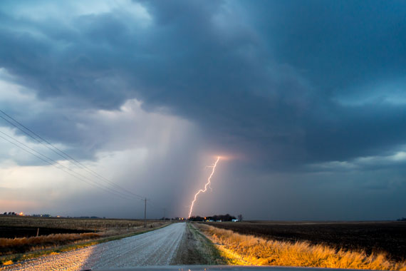
summer storm

Photo captured by NOAA; 18mm, f/8, 10 seconds, ISO 400

Safety First

  • Distance: Never prioritize a photo over your safety. Ensure you’re at a safe distance from the storm, especially lightning.
  • High Ground: Avoid being the tallest object in an open area, and don’t stand near tall trees or metal structures.
  • Weather Updates: Keep an eye on weather updates and storm movement. Apps like RadarScope or AccuWeather can be invaluable.

Optimal Settings

  • Shutter Speed: For lightning, longer exposures (several seconds) can be effective. However, if you want to capture the individual raindrops, a fast shutter speed (1/500 or faster) is required.
  • ISO: Start with a lower ISO (100 or 200) to reduce noise. You can increase it if the scene is too dark.
  • Aperture: Depending on your desired depth of field, an aperture of f/4.0 to f/11 is a good starting point.

Gear Protection

  • Rain Covers: Use rain covers to protect your camera and lens. Plastic bags with rubber bands can also work in a pinch.
  • Lens Cloth: Keep one handy to wipe off raindrops.
  • Backup Equipment: If possible, have backup gear in case something gets wet or damaged.
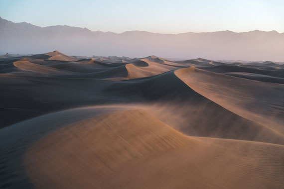
summer sand wind

Photo captured by Jeremy Bishop; f/4, 1/1000s, ISO 160

Composition Tips

  • Foreground Interest: Including objects in the foreground can give the viewer a sense of scale.
  • Leading Lines: Use roads, paths, or natural lines to lead the viewer’s eye into the storm.
  • Rule of Thirds: Position the horizon on the top or bottom third of the frame, depending on whether the sky or ground is more interesting.

Use a Tripod

Especially in lower light conditions or when capturing lightning with longer exposures, a tripod is essential to reduce camera shake and ensure sharp images.

Focus on Details

While vast stormy skies are captivating, don’t forget to focus on smaller details like raindrops on leaves, puddles reflecting the stormy sky, or the patterns of streaming water.

Chase the Light

The period just before or after a storm can have incredibly dramatic lighting. Golden hues, intense contrasts, and rainbows can emerge, offering unique photographic opportunities.

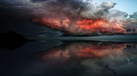
storm light

Photo captured by Johannes Plenio; 16mm, f/4.0, 1/30s, ISO 200

Post-Processing

Enhance the drama using editing tools. Increase contrast, sharpen details, and bring out the colors to give your storm photos an edge. However, avoid over-editing to the point of making the image unrealistic.

Practice and Patience

Nature is unpredictable. You may not get the perfect shot on your first outing. Keep practicing, understanding the nuances of your equipment and the weather patterns of your location.

Learn and Share

Join storm photography communities online or in person. Sharing experiences, tips, and photos can be beneficial and inspiring.

In conclusion, photographing summer storms is as much about understanding and respecting nature as it is about technical prowess. With safety at the forefront, embrace the challenge, and you’ll find yourself capturing some of nature’s most awe-inspiring moments.

For Further Training:

This #1 bestseller is the most in-depth eBook on how to capture amazing photography anywhere. Over 250 pages of photography tips & tricks from industry insiders. Currently 83% off which ends soon for a Summer Sale if you want to check it out.

It is the product of over a DECADE of research as an insider in the photography industry, assembled to help you learn quickly and avoid the mistakes that I made along the way.

Deal ending soon: The Photography Tutorial eBook Summer Sale

- - - - - - - - - - - - - - - - - - - - - - - - - - - - - - - - - - - - - - - - - - - - - - - - - - - - - - - - - - - - - - - - - - - - - - - - - -

Did you appreciate this newsletter? Please help us keep it going by Joining Our Patreon Supporters

What are your thoughts on this article? Join the discussion on our Facebook Page

PictureCorrect subscribers can also learn more today with our #1 bestseller: The Photography Tutorial eBook

- - - - - - - - - - - - - - - - - - - - - - - - - - - - - - - - - - - - - - - - - - - - - - - - - - - - - - - - - - - - - - - - - - - - - - - - - -

The post Summer Storm Photography Tips appeared first on PictureCorrect.


from PictureCorrect https://ift.tt/r1tXbh6
via IFTTT

sunnuntai 13. elokuuta 2023

PictureCorrect.com: How to Use Topaz Photo AI Within Photoshop

Editing photographs can be a game-changer for both professional photographers and hobbyists alike. With the myriad of tools available, knowing the right one to use can be a daunting task. In this recent video tutorial, we got a detailed walkthrough on how to edit photos using Topaz Photo AI through Adobe Photoshop. Here’s a breakdown of the key points:

The tutorial begins with a Canon raw file. If you’re unfamiliar with raw files, they are digital negatives that preserve the most amount of information from your camera, providing more flexibility in post-processing.

You have two options to begin the process:

  1. Launch Photoshop and open the file.
  2. Drag the file from its location directly onto the Photoshop icon.

Adobe Camera Raw will open by default when working with a raw file, giving you an initial opportunity to make adjustments. But for the tutorial’s purpose, the file was directly opened without any changes.

Noise Reduction First

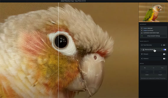
Zooming into the image, it was evident that it suffered from significant noise. Before any edits, the first task was to get rid of this noise. Here’s how it was approached:

  1. Create a dedicated layer for Topaz Photo AI by right-clicking on the original layer and selecting ‘Duplicate Layer’.
  2. Rename this new layer to ‘Topaz Photo AI’.

remove noise

Accessing Topaz Photo AI

  1. From the main menu, go to ‘Filter’.
  2. Navigate to ‘Topaz Labs’ and select ‘Topaz PhotoAI’.

Autopilot: The Core Feature

Once in PhotoAI, you are introduced to the ‘Autopilot’ feature. It’s a hallmark of PhotoAI, showcasing everything the software has detected with your image. This includes:

  • Existing issues in the image.
  • Detection of a subject.
  • In portraits, the number of faces detected and their quality.

Hovering over the word ‘subject’ in Autopilot, a mask is automatically applied, revealing any other identified issues.

The beauty of Autopilot is that once it identifies issues, it also applies the best model and strength to rectify them. The split view in the software showcases this effectively. By swiping right, you can see the noisy image, while swiping left demonstrates the noise reduction in action, preserving all essential image details.

Customizing Autopilot Settings

While Autopilot does an impressive job, you can still make manual changes to the settings. This includes:

  • Enabling and adjusting sharpening.
  • Specifying if the sharpening should apply to the detected subject or the entire image.

Should you wish to revert to the original Autopilot settings, there’s a handy ‘Reset to Autopilot Settings’ button.

It’s worth noting that when using PhotoAI with Photoshop, resizing is unsupported within PhotoAI. Resizing would have to be conducted in Photoshop or through an external platform.

Once satisfied with the edits, you can save and return to Photoshop.

Benefits of a Layer-Based Workflow

A significant advantage of this process is the layer-based workflow in Photoshop. You can effectively compare the edited image with the original. If desired, you can also add layer masks or make further adjustments using Photoshop’s suite of tools.

How to Get Topaz Photo AI for a Discount Today:

Topaz Labs has currently marked it on sale at $40 off to celebrate the most recent update.

Deal found here: Topaz Photo AI at $40 Off

- - - - - - - - - - - - - - - - - - - - - - - - - - - - - - - - - - - - - - - - - - - - - - - - - - - - - - - - - - - - - - - - - - - - - - - - - -

Did you appreciate this newsletter? Please help us keep it going by Joining Our Patreon Supporters

What are your thoughts on this article? Join the discussion on our Facebook Page

PictureCorrect subscribers can also learn more today with our #1 bestseller: The Photography Tutorial eBook

- - - - - - - - - - - - - - - - - - - - - - - - - - - - - - - - - - - - - - - - - - - - - - - - - - - - - - - - - - - - - - - - - - - - - - - - - -

The post How to Use Topaz Photo AI Within Photoshop appeared first on PictureCorrect.


from PictureCorrect https://ift.tt/ms56dwC
via IFTTT