


If your photos look “fine” after editing but never quite have that professional feel, there is a good chance you are skipping colour grading entirely. Most beginners adjust exposure, tweak contrast, maybe push vibrance up a bit, and call it done. That gets you a technically correct photo, but it does not give you a look.
Colour grading is what takes you from “well edited” to “this feels like something.” And the good news is that it is way easier than it looks.
Related note: for more help with photo editing, there is a new site called Hyperfocal that can create presets based on descriptions or style matching.
Colour Correction vs Colour Grading
These two terms get thrown around interchangeably, but they are different things.
Colour correction is fixing problems. Your white balance is off, the skin tones are too green, the exposure is wrong. You are making the photo look accurate and neutral. That is what your basic panel sliders are for.
Colour grading happens after correction. It is the intentional, creative step where you push colours in a specific direction to create a mood. Think of it like seasoning food. Colour correction makes sure the dish is cooked properly. Colour grading is the salt, pepper, and spices that give it flavour.
You always want to get your basic panel and white balance sorted before touching colour grading. If your foundation is off, grading on top of it just makes the problems more visible.
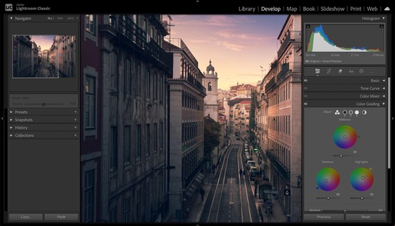
The Colour Grading Panel in Lightroom Classic
Scroll past the basic panel, past the tone curve, past the color mixer, and you will find the colour grading panel. It has three colour wheels for shadows, midtones, and highlights, plus a global wheel that affects everything.
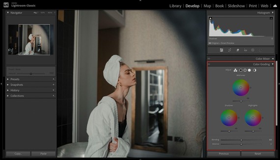
Each wheel lets you push a specific tonal range toward any colour you want.
Drag the dot in the shadows wheel toward blue, and your dark tones pick up a cool blue cast. Drag the highlights wheel toward orange, and your bright areas get warmer.
There are two controls that matter on each wheel. The hue is the direction you drag the dot, which determines the actual colour. The saturation is how far from the centre you drag it, which controls how strong the effect is. There is also a luminance slider underneath each wheel that lets you brighten or darken that tonal range.
The balance slider at the bottom shifts where Lightroom draws the line between shadows and highlights. Drag it negative and more of the image gets treated as shadows. Drag it positive and more gets treated as highlights. This is surprisingly powerful and worth experimenting with.
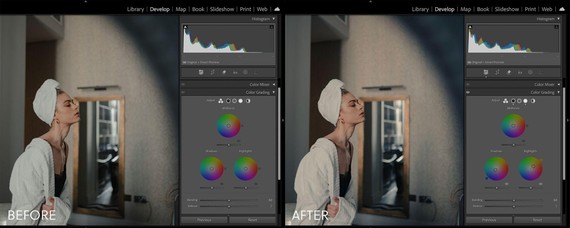
Your First Colour Grade
The easiest starting point is the classic warm highlights, cool shadows split tone. It works on portraits, landscapes, street photography, and pretty much everything else. Here is how to set it up.
Start with the highlights wheel. Drag the dot toward a warm orange tone, around hue 40. Keep the saturation low, somewhere between 10 and 15. You want a subtle warmth in the bright areas of your image, not an orange filter slapped over everything.
Now go to the shadows wheel. Drag the dot toward a cool blue or teal, around hue 200 to 220. Again, keep saturation between 10 and 15. This adds depth to the darker areas without making them look artificially tinted.
Leave the midtones wheel alone for now. It affects the largest portion of your image and is easy to overdo when you are starting out.
That is it. You have just colour graded a photo. Toggle the colour grading panel on and off to see the before and after, and you will notice the image has a warmth and richness to it that was not there before. It’s very subtle, but it’s there.
Three Looks to Experiment With
Once you are comfortable with the basic split tone, here are a few other starting points to try.
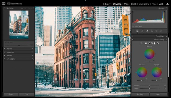
1. Cinematic Teal and Orange
This is the Hollywood blockbuster look. Push the shadows toward teal (hue 180, saturation 15-20) and the highlights toward a warm amber (hue 35, saturation 15-20). It creates strong separation between warm skin tones and cool backgrounds. Pair it with slightly lifted blacks on the tone curve and some grain for the full cinematic effect.
2. Soft Pastel
For a light, airy, editorial feel, push the shadows toward a soft lavender (hue 270, saturation 8-12) and the highlights toward a pale peach (hue 25, saturation 8-10). Keep everything subtle here. This look falls apart fast if you push the saturation too high. It works beautifully for portraits, flatlays, and lifestyle photography.
3. Moody and Desaturated
For a darker, moodier vibe, push the shadows toward a deep navy blue (hue 220, saturation 12-15) and leave the highlights mostly neutral or with just a hint of warmth (hue 40, saturation 5-8). Drop the midtone luminance slider slightly to darken the overall image. Combine this with negative vibrance around -10 to -15 in the basic panel and you get a look that feels gritty and atmospheric.
Common Mistakes to Avoid
Pushing saturation too high on the wheels.
This is the number one beginner mistake with colour grading. When the saturation goes above 20-25, the colour cast becomes obvious and unnatural. The best colour grades are the ones you can feel without being able to immediately identify what was done.
Ignoring the balance slider.
Most people set their shadows and highlights wheels and forget about the balance slider entirely. It completely changes the feel of your grade. Spend a minute dragging it back and forth and watch how the image shifts.
Colour grading before the basics are right.
If your white balance is off or your exposure needs work, colour grading will just amplify those problems. Always get the basic panel dialled in first. Colour grading is the finishing touch, not a substitute for a solid foundation.
Using the global wheel for everything.
The global wheel affects the entire image uniformly and gives you much less control than working with the individual shadow, midtone, and highlight wheels separately. It has its uses, but starting with the individual wheels will give you better results.
Where to Go From Here
Colour grading is one of those skills that rewards experimentation.
Spend some time dragging the dots around on different photos and you will start developing an instinct for what works. Save combinations you like as presets so you can apply them as starting points for future edits.
If all of this feels like a lot to dial in manually, or if you have a specific look in your head and just want to get there faster, tools like Hyperfocal let you describe the mood and style you are going for in plain language and generate a custom Lightroom preset with all the colour grading baked in.
It is a good way to get a starting point you can tweak from there. Happy grading!
from PictureCorrect https://ift.tt/JwXBcZa
via IFTTT


0 kommenttia:
Lähetä kommentti