


You have seen the look before. Skin glowing like a traffic cone, skies so blue they belong in a cartoon, and grain cranked up so high the photo looks like it was taken through a screen door. Over-processed photos are everywhere, and the worst part is that most people doing it think their edits look great.
I get it. I’ve been there too. You discover a slider, you get excited, and suddenly everything gets the same heavy-handed treatment.
Here are five of the most common editing mistakes I see, why they happen, and how to fix them. All in Lightroom Classic.
Related note: for more help with Lightroom Classic styles, there is a new site called Hyperfocal that can create photo editing presets based on descriptions or style matching.
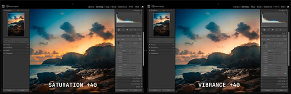
1. Cranking Saturation Instead of Using Vibrance
This is the big one. The saturation slider is a sledgehammer. It boosts every colour equally, which means skin tones go orange, greens go neon, and the whole image starts looking like a poster for a theme park.
Vibrance is the smarter tool.
It boosts muted colours more aggressively while barely touching tones that are already saturated, and it is specifically biased to protect skin tones from going orange. The difference is subtle when you compare the sliders side by side, but it is massive in the final image.
The fix is to keep saturation between -10 and +10 for most photos and let vibrance do the heavy lifting for global adjustments. If you need more control beyond that, colour grading and the HSL panel are where you should be working. They let you target specific hues without blowing out everything else.
If you find yourself pushing saturation past +20, take a step back and ask yourself if the image actually needs it.
2. Over-Sharpening Everything
Sharpening is one of those settings that looks amazing at 100% zoom and terrible everywhere else. Crank the amount slider too high and you will start seeing halos around edges, crunchy textures in skin, and noise that was invisible before.
The problem is that most people sharpen while zoomed into their photo at 100% or even 200%. At that zoom level, you are pixel-peeping and chasing detail that nobody will ever notice in the final image. Then you export, post it online, and wonder why it looks harsh.
A good starting point is an amount of 40, a radius of 1.0, and detail around 25 (which are the defaults once you enable sharpening). For portraits, use the masking slider to protect smooth areas like skin.
Hold Alt (or Option on Mac) while dragging the masking slider and you will see exactly which areas are being sharpened. White areas get sharpened, black areas are left alone.
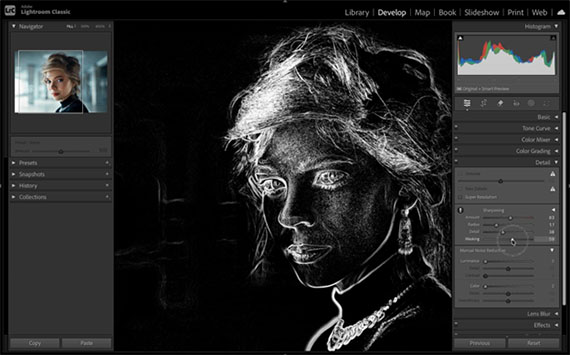
If you are using the latest version of Lightroom Classic, the AI masking tools take this even further.
You can create a mask that excludes the subject or skin entirely, so sharpening only hits the background, clothing, and hair while leaving the face completely untouched.
3. Going Too Hard on Clarity and Texture
Clarity and texture are addictive sliders. They add punch and make details pop, which feels great when you are editing. The problem is that a little goes a long way, and most people use way too much.
High clarity on a portrait makes every pore, wrinkle, and blemish more visible. It is the opposite of flattering. On landscapes, too much clarity creates that overcooked HDR look where everything has an aggressive, gritty halo around it.
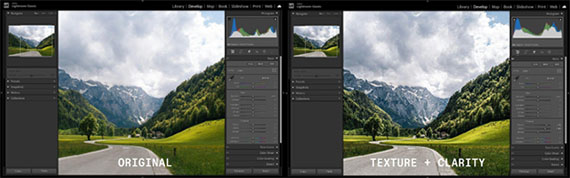
For portraits, try keeping clarity between -5 and +10. Negative clarity can actually be really flattering for skin. For landscapes and architecture, you can push it higher, but anything above +30 starts to look unnatural pretty quickly.
Texture follows the same logic. Use it to enhance specific areas like hair or foliage, but do not treat it like a global improvement slider.
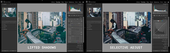
4. Lifting Shadows & Blacks So Much That You Kill the Mood
Every beginner tutorial tells you to pull up the shadows slider to “recover detail.” And that is true, to a point. The problem is when you lift shadows so aggressively that the photo becomes completely flat.
Shadows exist for a reason. They add depth, dimension, and mood to a photo. A moody street scene at dusk needs those dark areas. A portrait with dramatic side lighting needs contrast between the lit face and the shadowed side.
When you fill in every shadow, you remove the thing that made the photo interesting in the first place.
The next time you are editing, try being intentional about which shadows you want to keep and how much you want to lift the blacks. Instead of globally lifting the shadows slider to +70 or higher, try a more moderate value around +20 to +30.
Then use the tone curve to selectively brighten just the midtones if you need more visibility in specific areas. The goal is to retain detail in the shadows without eliminating them entirely.
5. Ignoring Colour Grading Completely
This is less of a “mistake” and more of a missed opportunity. A lot of photographers adjust the basic panel, maybe tweak HSL a little, and call it done. They never touch colour grading, and it shows.
Colour grading is what separates a technically correct edit from one that actually has a look. It is the difference between a photo that is “well exposed” and a photo that feels like something.
Adding a slight teal to the shadows and a warm orange to the highlights creates that cinematic feel you see everywhere. A subtle warm shift in the midtones makes golden hour shots feel even more golden.
You do not need to go crazy with it. Start by adding a small amount of warmth (around hue 40, saturation 10-15) to the highlights and a cool tone (around hue 200, saturation 10-15) to the shadows. That is the classic warm highlights, cool shadows tone and it works on so many types of images.
From there, experiment with the balance slider to shift the emphasis between shadows and highlights.
The Bigger Picture
All five of these mistakes have something in common. They come from a good instinct taken too far. You want vibrant colours, sharp details, punchy contrast, visible shadows, and a cohesive look. Those are all good goals. The trick is restraint.
The best edits are the ones where nobody can tell the photo was edited at all. The colours feel natural, the details are there without being aggressive, and the mood is intact. That is the sweet spot.
If dialing in all of these settings feels overwhelming, or if you just want a solid starting point that you can fine-tune, tools like Hyperfocal let you describe the look you are going for in plain language and generate a custom Lightroom preset in seconds. It is a good way to skip the trial and error and land on a balanced edit right away.
Happy editing.
from PictureCorrect https://ift.tt/6WFwmKT
via IFTTT

Great tips — really helpful breakdown of essential photo editing techniques. I especially liked how clearly everything was explained for both beginners and professionals. At PhePhotos, we also focus on delivering clean, natural, and high-quality real estate photo editing, so it’s always great to see valuable insights like this shared with the community. Thanks for the useful content! https://phephotos.com/
VastaaPoista