lauantai 28. helmikuuta 2026

PictureCorrect.com: Start This Month by Turning Auto Mode Off (Just Once)

This isn’t a lecture about how Auto mode is “bad.”
It’s not a commitment, and it’s definitely not an all-or-nothing mindset shift.

It’s a small, intentional challenge to kick off the month:

Turn Auto mode off — just once.

If you’ve been wanting to make real progress this spring, this is a great moment to do it intentionally. For a limited time, PictureCorrect Premium is now open for March enrollment, and new subscribers can get the first 3 months for just $1 ⌛

auto to manual

That’s it. One photo. One moment of control.

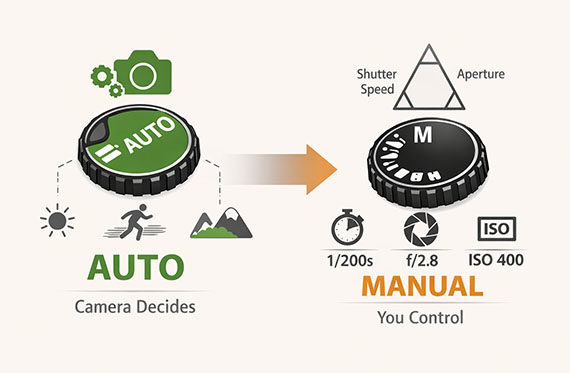
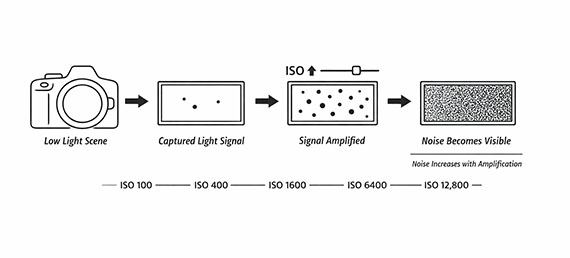
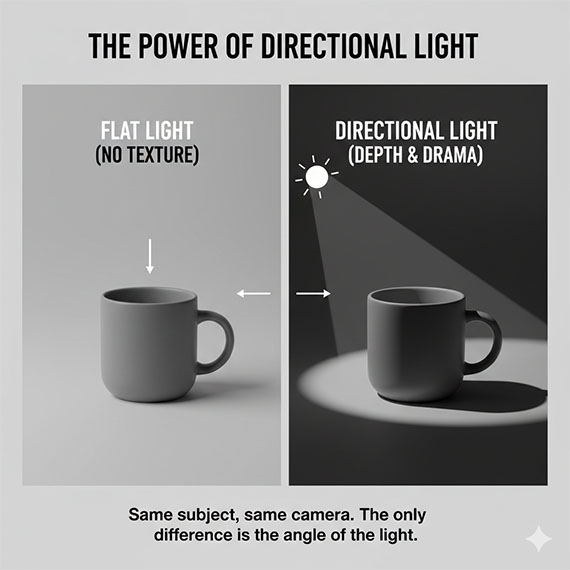
Auto mode is great at delivering a usable image. What it doesn’t do is explain why the image looks the way it does. Your camera quietly decides how bright the photo should be, how much motion blur is acceptable, how much of the scene stays in focus, and how much noise is allowed — all without telling you.

You get a result, but not the reasoning behind it.

When you step out of Auto mode, even briefly, those decisions become visible. You start to feel the tradeoffs instead of guessing at them later.

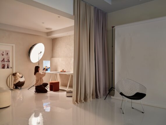
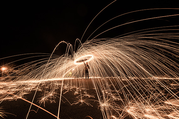
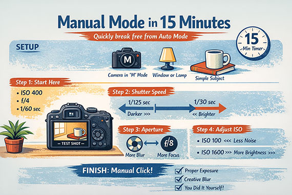
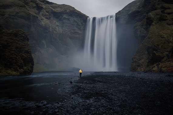
This doesn’t need to be complicated or dramatic. Pick a simple subject — something familiar, something that isn’t going anywhere. Switch your camera to Manual or Aperture Priority and take a single frame while adjusting the exposure yourself.

The challenge (10 minutes, no pressure)

You don’t need a dramatic scene or perfect light. Do this at home or anywhere familiar.

  1. Switch your camera to Manual (M) or Aperture Priority (Av)
  2. Choose a simple subject: a window, a chair, a plant, a street corner
  3. Take one photo, adjusting: Aperture, Shutter speed, and ISO

That’s it. No rules beyond that single frame.

If it’s too dark, too bright, slightly blurry, or noisier than expected, that’s not failure. That feedback is exactly what you’re after. One photo can teach you more than a dozen shots taken on Auto.

Most photographers notice something click almost immediately. Suddenly blur makes sense. Depth of field stops feeling random. ISO turns from a mysterious number into a visible choice with consequences.

That moment of clarity is the real value here — not the photo itself.

And here’s the important part: you don’t have to stay out of Auto mode.

You can switch right back afterward and keep shooting the way you normally do. This isn’t about rejecting Auto forever. It’s about crossing the invisible line between letting the camera decide everything and understanding what it’s doing on your behalf.

Once you’ve crossed that line once, Manual mode stops feeling intimidating — even if you only visit it occasionally.

The start of the month is a perfect time for this because it already carries a sense of reset. You’re more open to small changes, and this one takes almost no time. Yet it sets a different tone for how you shoot moving forward — more intentional, more aware, more confident.

If that single shot leaves you with questions, that’s a good sign. Those questions are what real progress is built on.

But for now, keep it simple.

  • Turn Auto mode off once.
  • Let the photo show you something new.
  • Then start the month already a step ahead.

And if you want structure instead of guessing what to practice next, this is where PictureCorrect Premium fits naturally. During the March Enrollment Special, new members can get the first 3 months for just $1, with guided exercises and a clear path designed to build skill shot by shot.

picturecorrect premium

Whether you’re working to master manual control, or advanced techniques, Premium gives you the structure to make steady progress. The special $1 intro offer is wrapping up this evening, and once it’s gone, so is your chance to lock in early access.

⏰Deal ending soon: March Enrollment Intro Offer Today


from PictureCorrect https://ift.tt/TJE08zu
via IFTTT

torstai 26. helmikuuta 2026

PictureCorrect.com: ISO Stress Test to Get to Know Your Camera

Push ISO higher than you normally would and learn where your camera actually breaks down.

Most photographers are far more conservative with ISO than they need to be.

We’re taught early on that low ISO = good and high ISO = bad, so many people avoid pushing ISO unless they feel completely desperate. The result? Missed shots, unnecessary blur, and a lot of anxiety when the light drops.

This exercise is designed to flip that thinking.

Related reminder: only 1 day left for the Photography Exercises 🔥 February Flash Sale

low light photographer

Instead of guessing where your camera’s limits are, you’re going to deliberately cross them—so you can see, with your own eyes, what actually happens and where your personal comfort line really is.

The Goal of This Exercise

The goal isn’t to get “clean” images.

The goal is to understand:

  • How noise actually appears on your camera
  • At what ISO noise becomes noticeable vs. distracting
  • How much noise is easily fixable in post
  • How far you can safely push ISO before image quality truly breaks down

Once you know this, ISO stops being scary—and becomes a practical tool instead of a last resort.

What You’ll Need

  • Any camera that allows manual ISO control
  • A scene with somewhat low, consistent lighting (indoors works well)
  • A subject with texture and detail (fabric, books, wood, plants, skin tones)
  • A tripod (optional, but helpful for consistency)

Choose a scene where the lighting won’t change during the test. Consistency matters more than the subject itself.

Step 1: Lock Everything Except ISO

Set your camera to Manual mode.

  • Choose an aperture you commonly use (for example, f/4 or f/5.6)
  • Choose a shutter speed that gives a correct exposure at a low ISO
  • Turn off Auto ISO
  • Keep white balance consistent

From this point on, only ISO should change.

This isolates ISO as the single variable so you can clearly see its impact.

Step 2: Start Low and Work Up (On Purpose)

Begin at your camera’s base ISO (often ISO 100).

Take a photo.

Then increase ISO in full-stop increments:

  • ISO 200
  • ISO 400
  • ISO 800
  • ISO 1600
  • ISO 3200
  • ISO 6400
  • ISO 12,800 (and beyond if your camera allows it)

Take a photo at each setting without changing anything else.

Yes—some of these images will look “bad.” That’s the point.

iso stress test

Step 3: Review the Images Properly

Don’t judge these images on the camera’s rear screen.

Load them onto a computer and view them:

  • At 100%
  • At normal viewing size
  • Side by side if possible

Pay attention to:

  • When noise first becomes visible
  • When color noise appears
  • When fine detail starts to fall apart
  • When noise becomes emotionally distracting—not just technically present

You’ll often discover that the ISO you “never use” is actually completely fine.

Step 4: Test Noise Reduction (Without Overthinking It)

Apply light noise reduction in your usual editing software.

Don’t aim for perfection—just apply what you’d realistically use on a real photo.

Notice:

  • Which ISO levels clean up easily
  • Which ones retain detail after noise reduction
  • Where noise reduction starts to destroy texture

This step is huge. Many photographers fear ISO levels that are trivially fixable in post.

Step 5: Define Your ISO Comfort Zones

Now write this down:

  • Safe ISO – No hesitation, no cleanup needed
  • Usable ISO – Some noise, easily fixed, totally acceptable
  • Emergency ISO – Quality drops, but the shot is still worth getting
  • No-Go ISO – You personally hate the result

These zones are different for every camera and every photographer.

Once defined, ISO becomes a confident choice instead of a panicked one.

Why This Exercise Works

Reading about ISO doesn’t change behavior.

Seeing exactly how far your camera can go—and realizing it goes farther than you thought—does.

After doing this exercise:

  • You’ll raise ISO faster instead of risking motion blur
  • You’ll stop missing shots in low light
  • You’ll trust your gear instead of fighting it

Most importantly, you’ll stop letting fear make technical decisions for you.

If you want more exercises like this—clearly structured, easy to follow, and designed to build real shooting instincts—the February Flash Sale on the Photography Exercises is wrapping up soon. It’s a practical way to keep improving, even when weather limits your time and motivation to shoot.

photographer exercises

A practical way to build confidence for challenging shooting situations that often trip photographers up. Each exercise focuses on real-world scenarios—difficult light, motion, exposure decisions, and creative problem-solving—so you learn how to take control instead of relying on auto settings.

Only 1 day left: Photography Exercises 🔥 February Flash Sale


from PictureCorrect https://ift.tt/og1zLu3
via IFTTT

keskiviikko 25. helmikuuta 2026

PictureCorrect.com: The #1 Lighting Mistake Killing Your Photos

If your photos often look flat, dull, or just not as striking as you remember the scene, there’s a good chance the problem isn’t your camera, your lens, or even your settings. It’s lighting. More specifically, it’s where the light is coming from.

The single biggest lighting mistake photographers make—at every experience level—is shooting with flat, front-facing light without realizing it. This one habit quietly drains depth, texture, and mood from photos, and it’s often the reason images feel “meh” even when everything seems technically correct.

Related reminder: only a little while left for the Lighting Cheat Sheets💡February Flash Sale

flat lighting

Why Flat Light Is So Tempting

Flat light happens when your main light source—whether it’s the sun, a window, or a flash—is directly behind you and shining straight onto your subject. On the surface, this feels safe. The subject is evenly lit, shadows are minimal, and nothing looks obviously “wrong.”

Cameras also love flat light. Metering systems handle it easily, autofocus locks quickly, and exposure tends to look clean right out of the camera. That’s why this mistake is so common: it produces technically acceptable photos that lack emotional impact.

The problem is that photography isn’t just about visibility—it’s about dimension.

What Flat Light Does to Your Photos

When light hits a subject straight-on, it removes shadows. And when shadows disappear, so does depth. Texture flattens out. Shapes lose definition. Faces look wider. Landscapes feel lifeless. Objects blend into their surroundings instead of standing apart.

Our eyes rely on subtle transitions between light and shadow to understand shape. When those transitions are missing, the image feels two-dimensional, even if it’s perfectly sharp and well-exposed.

This is why photos taken at noon often feel boring, why on-camera flash can look harsh and amateurish, and why cloudy days can produce images that feel washed out unless handled carefully.

Direction Matters More Than Brightness

One of the biggest misconceptions about lighting is that more light equals better photos. In reality, direction beats intensity every time.

A soft, angled light source creates gentle shadows that wrap around your subject. It reveals texture in skin, brings out details in architecture, and adds separation between foreground and background. Even dim light can be beautiful if it comes from the right angle.

Think about early morning or late afternoon sun. The light is warmer, lower, and directional. Suddenly, ordinary scenes look cinematic—not because the sun is brighter, but because it’s sculpting the scene instead of flattening it.

How to Spot the Mistake in Real Time

A quick way to diagnose flat lighting is to look at the shadows. If you can’t clearly see where the shadows are falling—or if there are almost none—you’re probably dealing with flat light.

Another giveaway is when your subject blends into the background instead of popping off it. This often happens in portraits where the face and background are lit equally, or in landscapes where everything looks evenly bright but visually dull.

If you find yourself thinking, “This looks fine, but it doesn’t feel like much,” lighting direction is almost always the culprit.

The Simple Fix Most Photographers Miss

You don’t need new gear to fix this mistake. You just need to move.

Instead of shooting with the light behind you, try stepping to the side so the light hits your subject at a 30–90 degree angle. Instantly, shadows appear. Texture comes alive. The scene gains depth.

Indoors, this might mean turning your subject sideways to a window instead of facing it head-on. Outdoors, it could be as simple as walking a few steps left or right relative to the sun. With flash, bouncing light off a wall or ceiling instead of firing it directly forward makes a massive difference.

The key idea is to let light shape your subject, not just illuminate it.

lighting diagram

When Flat Light Actually Works

Flat light isn’t always bad—it’s just overused. Certain situations benefit from it, like product photography where consistency matters, or documentary shots where clarity is more important than mood.

The mistake isn’t using flat light. The mistake is using it by default, without intention.

Once you understand what flat light does and how to control it, you can choose it deliberately instead of accidentally.

A Quick Exercise to Train Your Eye

Find a simple subject—anything from a coffee mug to a person near a window.

First, photograph it with the light directly behind you, hitting the subject straight-on. Then, without changing your camera settings, move so the light comes from the side. Finally, try positioning the light slightly behind the subject for a more dramatic look.

Compare the images. Notice how little effort it took to transform the scene—and how much more depth and mood the directional light creates.

Final Thoughts

Most photographers chase better cameras, sharper lenses, or more advanced settings, while the biggest improvement is often free and immediate. Light direction is one of the most powerful tools in photography, and ignoring it is the fastest way to kill an otherwise good photo.

The moment you stop asking, “Is my subject bright enough?” and start asking, “Where is the light coming from?” your images begin to change—dramatically.

And that shift alone can elevate your photography more than any upgrade ever will.

For Further Training:

Lighting is arguably the most important aspect of photography; but do you know how to use it? These Photography Lighting Cheat Sheets are designed to help. With critical information on ALL the types of natural light and artificial light you can use. They are currently 80% off today for a February Flash Sale ⏰

lighting cheat sheets

New! Cheat Sheets for Photography Lighting (see how they work)

Whether you’re a seasoned professional or just starting out, photography cheat sheets can be a valuable resource for improving your skills and taking your photography to the next level. By having all the key information you need in one place, you can focus on what’s important – capturing amazing photos.

Deal ending soon: Photo Lighting Cheat Sheets at 80% Off


from PictureCorrect https://ift.tt/aUWNFXn
via IFTTT

tiistai 24. helmikuuta 2026

PictureCorrect.com: Camera Manual Mode in 15 Minutes

Manual mode has a reputation for being complicated, intimidating, and slow. In reality, it’s only confusing when photographers try to learn everything at once. This short, timed exercise strips manual mode down to its essentials and shows how quickly you can take control of your camera using nothing more than a simple indoor setup.

You don’t need special lighting, fancy gear, or a perfect subject. The goal isn’t to create a masterpiece — it’s to understand how exposure decisions actually work.

Relevant note: only a little while left for the Photography Exercises 🔥 February Flash Sale

manual mode exercise

What You’ll Need

  • Any camera with Manual (M) mode
  • A window or lamp for steady indoor light
  • One simple subject (a mug, plant, book, or small object)
  • 15 uninterrupted minutes

Minute 0–3: Lock In Your Starting Point

Set your camera to Manual (M).

Choose:

  • ISO 400
  • Aperture f/4
  • Shutter speed 1/60 sec

Take a test shot. Don’t worry if it looks imperfect — this is your baseline.

Look at the image and the exposure meter. Notice whether the photo looks too bright, too dark, or close to correct. This moment is important: manual mode starts making sense when you see what the camera is telling you.

Minute 3–7: Control Brightness with Shutter Speed

Without touching ISO or aperture, adjust only the shutter speed.

  • Take one shot faster (1/125 sec)
  • Take one shot slower (1/30 sec)

Watch how brightness changes. Faster shutter = darker image. Slower shutter = brighter image. This alone removes much of the mystery around exposure.

Ignore motion blur for now — this is about cause and effect.

Minute 7–11: Control Depth with Aperture

Reset shutter speed to your best exposure so far.

Now change only the aperture:

  • One shot at f/2.8 (if available)
  • One shot at f/8

Pay attention to two things:

  1. Brightness changes
  2. Background blur and sharpness

This is where manual mode starts to feel creative instead of technical.

Minute 11–14: Fine-Tune with ISO

Keep your preferred aperture and shutter speed. Now adjust ISO until the exposure feels balanced.

Notice how ISO affects brightness without changing motion or depth of field. This is why ISO is often the final adjustment — it fine-tunes exposure without altering the look of the scene.

Minute 14–15: The “Manual Click”

Take one final shot where:

  • Exposure looks right
  • Background blur is intentional
  • You know why each setting is what it is

That’s the moment manual mode clicks.

Conclusion

Manual mode doesn’t require hours of study or perfect conditions — it just needs a few intentional minutes behind the camera. By slowing down, changing one setting at a time, and paying attention to the result, you’ve already done the hardest part: replacing guesswork with understanding.

The more often you repeat short exercises like this, the faster manual mode becomes second nature. Over time, you’ll stop thinking in terms of “Which setting do I touch?” and start thinking, “What do I want this photo to look like?”

That shift is what separates hoping for a good shot from creating one on purpose.

If you want more exercises like this—clearly structured, easy to follow, and designed to build real shooting instincts—the February Flash Sale on the Photography Exercises is wrapping up soon. It’s a practical way to keep improving, even when winter limits your time and motivation to shoot.

photographer exercises

A practical way to build confidence for challenging shooting situations that often trip photographers up. Each exercise focuses on real-world scenarios—difficult light, motion, exposure decisions, and creative problem-solving—so you learn how to take control instead of relying on auto settings.

Deal ending soon: Photography Exercises 🔥 February Flash Sale


from PictureCorrect https://ift.tt/ts2qCg9
via IFTTT

maanantai 23. helmikuuta 2026

PictureCorrect.com: A Beginner’s Guide to Color Grading Your Photos

If your photos look “fine” after editing but never quite have that professional feel, there is a good chance you are skipping colour grading entirely. Most beginners adjust exposure, tweak contrast, maybe push vibrance up a bit, and call it done. That gets you a technically correct photo, but it does not give you a look.

Colour grading is what takes you from “well edited” to “this feels like something.” And the good news is that it is way easier than it looks.

Related note: for more help with photo editing, there is a new site called Hyperfocal that can create presets based on descriptions or style matching.

Colour Correction vs Colour Grading

These two terms get thrown around interchangeably, but they are different things.

Colour correction is fixing problems. Your white balance is off, the skin tones are too green, the exposure is wrong. You are making the photo look accurate and neutral. That is what your basic panel sliders are for.

Colour grading happens after correction. It is the intentional, creative step where you push colours in a specific direction to create a mood. Think of it like seasoning food. Colour correction makes sure the dish is cooked properly. Colour grading is the salt, pepper, and spices that give it flavour.

You always want to get your basic panel and white balance sorted before touching colour grading. If your foundation is off, grading on top of it just makes the problems more visible.

The Colour Grading Panel in Lightroom Classic

Scroll past the basic panel, past the tone curve, past the color mixer, and you will find the colour grading panel. It has three colour wheels for shadows, midtones, and highlights, plus a global wheel that affects everything.

Each wheel lets you push a specific tonal range toward any colour you want.

Drag the dot in the shadows wheel toward blue, and your dark tones pick up a cool blue cast. Drag the highlights wheel toward orange, and your bright areas get warmer.

There are two controls that matter on each wheel. The hue is the direction you drag the dot, which determines the actual colour. The saturation is how far from the centre you drag it, which controls how strong the effect is. There is also a luminance slider underneath each wheel that lets you brighten or darken that tonal range.

The balance slider at the bottom shifts where Lightroom draws the line between shadows and highlights. Drag it negative and more of the image gets treated as shadows. Drag it positive and more gets treated as highlights. This is surprisingly powerful and worth experimenting with.

Your First Colour Grade

The easiest starting point is the classic warm highlights, cool shadows split tone. It works on portraits, landscapes, street photography, and pretty much everything else. Here is how to set it up.

Start with the highlights wheel. Drag the dot toward a warm orange tone, around hue 40. Keep the saturation low, somewhere between 10 and 15. You want a subtle warmth in the bright areas of your image, not an orange filter slapped over everything.

Now go to the shadows wheel. Drag the dot toward a cool blue or teal, around hue 200 to 220. Again, keep saturation between 10 and 15. This adds depth to the darker areas without making them look artificially tinted.

Leave the midtones wheel alone for now. It affects the largest portion of your image and is easy to overdo when you are starting out.

That is it. You have just colour graded a photo. Toggle the colour grading panel on and off to see the before and after, and you will notice the image has a warmth and richness to it that was not there before. It’s very subtle, but it’s there.

Three Looks to Experiment With

Once you are comfortable with the basic split tone, here are a few other starting points to try.

1. Cinematic Teal and Orange

This is the Hollywood blockbuster look. Push the shadows toward teal (hue 180, saturation 15-20) and the highlights toward a warm amber (hue 35, saturation 15-20). It creates strong separation between warm skin tones and cool backgrounds. Pair it with slightly lifted blacks on the tone curve and some grain for the full cinematic effect.

2. Soft Pastel

For a light, airy, editorial feel, push the shadows toward a soft lavender (hue 270, saturation 8-12) and the highlights toward a pale peach (hue 25, saturation 8-10). Keep everything subtle here. This look falls apart fast if you push the saturation too high. It works beautifully for portraits, flatlays, and lifestyle photography.

3. Moody and Desaturated

For a darker, moodier vibe, push the shadows toward a deep navy blue (hue 220, saturation 12-15) and leave the highlights mostly neutral or with just a hint of warmth (hue 40, saturation 5-8). Drop the midtone luminance slider slightly to darken the overall image. Combine this with negative vibrance around -10 to -15 in the basic panel and you get a look that feels gritty and atmospheric.

Common Mistakes to Avoid

Pushing saturation too high on the wheels.
This is the number one beginner mistake with colour grading. When the saturation goes above 20-25, the colour cast becomes obvious and unnatural. The best colour grades are the ones you can feel without being able to immediately identify what was done.

Ignoring the balance slider.
Most people set their shadows and highlights wheels and forget about the balance slider entirely. It completely changes the feel of your grade. Spend a minute dragging it back and forth and watch how the image shifts.

Colour grading before the basics are right.
If your white balance is off or your exposure needs work, colour grading will just amplify those problems. Always get the basic panel dialled in first. Colour grading is the finishing touch, not a substitute for a solid foundation.

Using the global wheel for everything.
The global wheel affects the entire image uniformly and gives you much less control than working with the individual shadow, midtone, and highlight wheels separately. It has its uses, but starting with the individual wheels will give you better results.

Where to Go From Here

Colour grading is one of those skills that rewards experimentation.

Spend some time dragging the dots around on different photos and you will start developing an instinct for what works. Save combinations you like as presets so you can apply them as starting points for future edits.

If all of this feels like a lot to dial in manually, or if you have a specific look in your head and just want to get there faster, tools like Hyperfocal let you describe the mood and style you are going for in plain language and generate a custom Lightroom preset with all the colour grading baked in.

It is a good way to get a starting point you can tweak from there. Happy grading!


from PictureCorrect https://ift.tt/JwXBcZa
via IFTTT

PictureCorrect.com: Top 10 Composition Tips in Photography

Photography is all about composition. If you can’t compose an image, you can’t take photos. That’s the bottom line. This is where your photography journey starts as a beginner. Learning to place the elements in the photo is natural for some, but the rest of us we have to learn.

Related: offer ending soon for the Composition Cheat Sheets 🕙 February Flash Sale

clear subject

photo by Giuseppe Milo

So what is composition? The dictionary definition is “the act of combining parts or elements to form a whole.” What you are looking to do in composing an image is to take the important parts of the scene and combine them to create a photo that’s pleasing to the eye. This is all well and good, but how can we do this most effectively? Here are my top ten tips.

1. Clearly identify your subject

This is the non-negotiable of photography. Unless your subject is the focal point of the image you don’t have a photo. When looking at the image, a person should be able to clearly identify the subject. So make sure you give enough attention to the subject of your focus.

2. Fill your frame

One of the most common mistakes made by budding photographers is failing to fill the frame with their subject or the major elements of the image. Get in closer and exclude the parts that you don’t want. Open space serves no purpose when the subject is too small or cannot be identified.

fill frame

Photo captured by Brent Ninaber; ISO 320, f/5.6, 1/50s.

3. Horizontal vs. vertical

Camera manufacturers are to blame for this dilemma because all cameras are designed to be held in a horizontal format. It shouldn’t be an ‘either or’ situation but rather a ‘both’. Try to shoot 50 percent of the time in both formats. There is no rule which is best, and the key is to experiment.

4. Dramatic angles

Shoot from high up or low down. Use your feet and move around the subject looking for an optimum angle. Don’t be afraid to get down on your stomach or climb a tree. Look for different and dramatic angles that will make your images more striking.

5. Don’t amputate

This means that you shouldn’t cut off part of your subject unless it is intentional to create an effect. Missing parts of people or objects irritate the viewer and create an incomplete image. It distracts the eye. So watch the edges of your image.

6. The rule of thirds

Imagine a tic tac toe grid or noughts and crosses lines running across your image dividing it into thirds horizontally and vertically. Where the lines cross or intersect are the best placement points for your subjects or objects. Never place the horizon of a landscape image in the center of your image. Always place it on a horizontal two thirds line. Subjects like lighthouses can be placed along one of the vertical two thirds lines.

7. Look for frames

Frames come in two types: natural or man-made. An example of a natural frame would be an opening in trees or a rock formation with a hole in it. Man-made frames are doorways, windows, or arches. All of these help contain the subject or scene in a form that is pleasing to the eye.

8. Simplify

Trying to include too much in an image often spoils it. An image that is cluttered causes the viewer’s eye to dart around the image trying to make sense of it. Less is more, as the old adage goes. Eliminate anything that’s distracting or unnecessary to the memory you are attempting to create.

eliminate distractions

photo by damon jah

9. Watch your background

Make sure that there is nothing in the background that detracts from your subject—things like chimneys growing out of heads and other subjects diverting the eye from the main subject. You want balance by not going in too close but including enough of the environment of the subject to contextualize it.

10. Lines, patterns and shapes

Look for interesting patterns, lines and shapes. Lines lead the eye to focal points. A river, road, fence or path in a classic ‘s’ shape draws the eye along the route into your image. Strong verticals give height to your image, and diagonals add depth. Turn your viewfinder, allowing straight lines to travel from corner to corner in the image.

Key to great composing is thought. Think before your press the shutter button and consider all of these points. Create a mental check list to help you add these elements and create that great composition.

About the Author:
Wayne Turner has been teaching photography for 25 years and has written three books on photography. He has produced 21 Steps to Perfect Photos; a program of learner-based training using outcomes based education.

For Further Training on Composition:

Are you ever tired of your photos looking dull or boring? These popular Composition Cheat Sheets have you covered. With clear, concise information on all the essential elements of composition, you’ll never be unprepared again. They are currently 81% off for a February Flash Sale 🕙 which ends soon if you want to check them out.

composition cheat sheets

Composition Cheat Sheets (see all the elements covered)

The perfect companion for any photographer. Print one out whenever you need it. These cheat sheets consolidate crucial composition-related information, allowing you to concentrate on what truly matters – composing striking photographs.

Deal ending soon: The Composition Cheat Sheets at 81% Off


from PictureCorrect https://ift.tt/gdwOD8K
via IFTTT

lauantai 21. helmikuuta 2026

PictureCorrect.com: How to Photograph Silky Smooth Waterfalls

Waterfalls are great examples of how ruthless and overpowering nature can get. While some find the gorging sound surrounding waterfalls to be relaxing, the same can induce a sense of anxiety amongst the faint of hearts. As a photographer, you have the ability to take an image that represents the mood that you want to portray. No matter how violent a waterfall may appear in reality, you can thus depict a relaxing perception using techniques to take a smooth image of a waterfall. Some photographers prefer a sharp look while others prefer this smooth look.

Related: Want to master advanced techniques faster? PictureCorrect Premium is designed to be an accelerator with lessons, exercises, and more — and it’s only $1 to try this weekend

smooth waterfall

Photo captured by Richard Schneider. f/8.0, 4 seconds, ISO 125.

There are various factors that you need to consider when taking an image of a waterfall that appears silky smooth. While some of these factors can be controlled with your camera settings, others are dependent on the use of accessories to help you make your image better. Today, I’m sharing with you three important tips that will help you to photograph a waterfall that reflects the true essence of being around one.

Try a long shutter speed. Your choice of shutter speed is a critical factor that determines how the waterfall will appear in the final image. In order to make the waterfalls appear silky smooth, you need to use a long shutter speed like 1s or more. This gives a dreamy effect to the waterfall. The volume of water flowing down the water also determines how long your shutter speed should be for the waterfall to appear smooth. Lower the volume of waterflow, the slower your shutter speed will need to be. So, play around with different shutter speeds and determine the right one for you.

Use a neutral density filter. Have a neutral density (ND) filter handy in case light is abundant in the scene. An ND filter lets you use slower shutter speed by stopping certain amount of light entering the camera. The amount of light that a particular ND filter blocks out is determined by its strength (for instance: 2-stop ND filter, 4-stop ND filter). Choose an appropriate ND filter depending on how brightly your scene is illuminated.

nd filter image

Photo by Robert Gareth; ISO 125, f/8.0, 1/160s, 24mm.

Get rid of the shakiness. Since you will be working with a slow shutter speed, it is quite important that you prevent any kind of camera shake. Using a sturdy tripod, or placing your camera on a stable surface becomes necessary when working with long exposures. Also, use your camera in timer mode, or with a shutter release to avoid any shake when pressing the shutter button. If you have a DSLR, use the mirror lock-up feature to get rid of vibrations. Getting rid of any kind of shake will make your image pleasing to look at.

And while you’re at it, do not forget to enjoy being around a waterfall. Take a dip if your want, and enjoy the moment. Who knows, the tranquility of the surrounding may inspire you to take some brilliant images naturally.

Others Are Already Learning:

Every week, more photographers are joining PictureCorrect Premium to level up their craft — and you could be next. Subscribers receive expert-led tutorials, creative challenges, and printable exercises that make each lesson stick.

picturecorrect premium

Whether you’re working to master manual control, or advanced photo editing techniques, Premium gives you the structure to make steady progress. The special $1 intro offer is wrapping up this evening, and once it’s gone, so is your chance to lock in early access.

Deal ending soon: Premium Newsletter Enrollment Special Today


from PictureCorrect https://ift.tt/cdElkBj
via IFTTT

torstai 19. helmikuuta 2026

PictureCorrect.com: Hidden Risks Every Travel Photographer Should Know

Travel photography is one of the most rewarding ways to combine creativity and adventure—but it also comes with unique risks. When you’re focused on light, composition, and timing, it’s easy to miss warning signs that something isn’t quite right. From gear-related tricks to fake opportunities, here are some of the most common scams travel photographers encounter—and how to avoid them.

Related note: only 1 day left for the Travel Photography Cheat Sheets at 88% Off!

travel photography risks

1. The “Too Good to Be True” Photo Gig

You get a message while traveling: a brand, hotel, or tourism board loves your work and wants to hire you immediately. The catch? They need a “small upfront fee,” ask you to wire money for permits, or want to pay with a check for more than the agreed amount and have you refund the difference.

How to avoid it: Legitimate clients don’t ask photographers to send money first. Ever. Verify the company through official websites, look for real contact details, and insist on standard contracts and secure payment methods.

2. Street Portrait Traps

In popular travel destinations, locals may happily pose for your camera, only to demand payment afterward—sometimes aggressively. In other cases, someone encourages you to photograph a performer or animal, then suddenly appears with a fee.

How to avoid it: Always ask about payment upfront before taking the shot. If money isn’t discussed clearly beforehand, assume there will be an expectation later.

3. Fake “Permits” and Authority Figures

Someone claiming to be an official—park ranger, tourism officer, or local authority—may approach you and say photography isn’t allowed without a permit. They offer to “help” by selling you one on the spot, usually in cash.

How to avoid it: Research local photography rules before you go. Real permits are issued through official offices, not curbside. If in doubt, ask to see identification and confirm through an official channel.

4. Gear Distraction Scams

A classic tactic in crowded areas: one person distracts you—asking questions about your camera or offering help—while an accomplice steals gear from your bag or tripod.

How to avoid it: Keep your bag zipped and in front of you, use anti-theft straps, and avoid setting gear down unattended, even for a moment.

5. “Model Release” Extortion

After taking photos of someone or their property, they claim you need a release and demand payment to avoid trouble, especially if they see professional-looking equipment.

How to avoid it: Know local laws regarding public photography and releases. Calmly explain your rights, and avoid escalating the situation. When possible, move on rather than argue.

6. Fake Wi-Fi and Data Theft

Free public Wi-Fi in cafés, airports, or hotels can be compromised. Scammers use it to access accounts, cloud storage, or even client galleries.

How to avoid it: Use a VPN, avoid logging into sensitive accounts on public networks, and back up photos offline whenever possible.

7. Social Media Impersonators

Scammers may clone your profile, steal your images, or pose as you to approach brands or followers—damaging your reputation and income.

How to avoid it: Use watermarks where appropriate, enable two-factor authentication, and regularly search for impersonation accounts so you can report them quickly.

8. Equipment Rental Scams

In some destinations, rental shops swap your gear for damaged items or claim you returned equipment broken—even if it wasn’t.

How to avoid it: Photograph rented gear at pickup and return, keep receipts, and rent only from well-reviewed businesses.

Final Thoughts

Travel photography should be about storytelling and discovery—not stress. A little awareness goes a long way. Do your research, trust your instincts, and slow down when something feels off. Protecting your gear, your images, and your time means you can focus on what really matters: capturing incredible moments wherever you go.

For Further Training:

Some shots are just harder than others. Ever struggled with Milky Way photos, twilight exposures, or star trails and focus stacking while you’re on the move? The Travel Photography Cheat Sheets (currently 88% off today) are built exactly for moments like that:

travel photography cheat sheets

Showing you step by step how to dial in settings, avoid common mistakes, and get the shot — even when you’re tired, rushed, or shooting in unfamiliar conditions. Travel-ready, no Wi-Fi required, and designed to be quick to reference so you can spend less time guessing and more time shooting.

Only 1 day left: Travel Photography Cheat Sheets at 88% Off


from PictureCorrect https://ift.tt/QOwSAtk
via IFTTT

PictureCorrect.com: When to do Noise Reduction in a Photo Editing Workflow

In the age of digital photography, noise can often sneak its way into our photos. Whether it’s the grainy specks in low-light shots or the colored pixels in certain textures, noise can be distracting and degrade the quality of an image. Thankfully, we have the tools and software to address this issue. But when should you incorporate noise reduction into your photo editing workflow? Let’s dive in.

Related: Want to master advanced techniques faster? PictureCorrect Premium is designed to be an accelerator with lessons, exercises, and more — and it’s only $1 to try today

noise reduction

Photo captured by Darwin Vegher

1. Understanding Noise

Before we address when to tackle noise, it’s crucial to understand its types:

  • Luminance Noise: These are the grainy, black and white specks that appear in photos, especially in shadows or under low-light conditions.
  • Chroma (Color) Noise: These are the colored specks that can appear anywhere in the photo, often in uniform areas like the sky or skin tones.

2. The Ideal Time for Noise Reduction

Typically, noise reduction should be one of the earlier steps in your editing process, especially if it’s a significant concern in the image. Here’s why:

  • Before Detailed Edits: Reducing noise before making detailed edits ensures that you don’t accidentally enhance the noise when adjusting sharpness, clarity, or contrast.
  • After Raw Conversion: If you’re shooting in RAW (which is recommended for the most editing flexibility), apply noise reduction after converting the file. Some RAW converters even have built-in noise reduction tools.
  • Before Color Adjustments: Chroma noise can impact how colors appear, so it’s wise to reduce this noise before making color corrections.

3. Things to Remember

  • Don’t Overdo It: While it’s tempting to completely eliminate noise, over-processing can result in a plasticky look, void of details. Balance is the key.
  • High ISO Isn’t Always Bad: Yes, higher ISO settings can introduce noise. But don’t be afraid of it. Sometimes, a bit of grain adds character to a photograph.
  • Noise Reduction Tools Matter: Not all noise reduction tools are made equal. Some software focuses on luminance noise while ignoring chroma noise, and vice versa. Research and invest in one that suits your needs.

Incorporating noise reduction at the right time in your photo editing workflow ensures that you maintain image quality without sacrificing essential details. Remember, while the aim is to reduce distractions, retaining the natural feel and texture of the photograph is just as important. Happy editing!

Premium Subscribers Are Already Ahead:

Every week, more photographers are joining PictureCorrect Premium to level up their craft — and you could be next. Subscribers receive expert-led tutorials, creative challenges, and printable exercises that make each lesson stick.

Whether you’re working to master manual control, or advanced photo editing techniques, Premium gives you the structure to make steady progress. The special $1 intro offer is wrapping up this evening, and once it’s gone, so is your chance to lock in early access.

Deal ending soon: Premium Newsletter Enrollment Special Today


from PictureCorrect https://ift.tt/Ej6vOUd
via IFTTT

tiistai 17. helmikuuta 2026

PictureCorrect.com: The One Thing That Makes Photography Income Predictable

Most photographers think unpredictable income is just part of the deal. One month is busy, the next is silent. A few good shoots followed by long stretches of nothing. It’s frustrating—and it leads many people to believe photography can never be a reliable source of income.

But unpredictability usually isn’t caused by the market, the algorithm, or competition. It comes from relying on one-off opportunities instead of repeatable systems.

Related: deal ending soon for the Earn Money with Photography 🏷 February Flash Sale

photographer predictable income

Talent Doesn’t Create Predictability

Skill matters. Good photos help you get hired. But skill alone doesn’t make income predictable.

Plenty of talented photographers still rely on referrals, social media luck, or seasonal demand. When those dry up, so does the work. The problem isn’t quality—it’s the absence of a structure that keeps opportunities coming even when you’re not actively promoting yourself.

The Real Difference: Repeatable Processes

The one thing that makes photography income predictable is having a repeatable way to attract, convert, and retain clients.

Predictable income doesn’t come from a single great shoot. It comes from knowing:

  • Where new inquiries usually come from
  • How those inquiries turn into booked work
  • What happens after the job is finished

When those steps are defined and consistent, income stops feeling random.

Systems Turn Interest Into Bookings

A system doesn’t have to be complicated. In fact, simple systems work best.

It might be:

  • A clear service page that answers pricing questions upfront
  • A standard response you send to new inquiries
  • A follow-up email that checks in after a shoot

Each piece reduces friction. Instead of reinventing the wheel for every client, you’re guiding them through a familiar path. That familiarity builds confidence—and confidence increases bookings.

Retention Is Where Stability Comes From

Many photographers focus entirely on getting new clients and ignore the easiest source of predictable income: past clients.

A system for staying in touch—seasonal check-ins, reminders, or simple updates—turns one-time jobs into repeat work. Even a small number of returning clients can smooth out income swings dramatically.

Predictability doesn’t require more clients. It requires better relationships with the ones you already have.

Pricing Consistency Matters More Than Pricing Level

Unpredictable income often comes from inconsistent pricing. Adjusting rates on the fly, offering discounts out of pressure, or making exceptions “just this once” makes it hard to forecast anything.

Clear pricing structures and defined packages create boundaries. Clients know what to expect, and you know what each booking is worth. That clarity makes planning possible—even if volume fluctuates.

Why Systems Feel Uncomfortable at First

Many photographers resist systems because they feel restrictive or “too business-like.” But systems don’t replace creativity—they protect it.

When your business runs on repeatable processes, your creative energy goes into the work itself, not into chasing leads, writing emails from scratch, or stressing about the next job.

The Bottom Line

Photography income becomes predictable when your process is predictable.

Not when your photos get better. Not when social media finally clicks. But when you build simple systems that guide people from interest to booking to repeat work.

Once that’s in place, photography stops feeling like a gamble—and starts feeling like a business you can actually plan around.

For Further Training:

This in-depth eBook has helped thousands of photographers turn their passion into profit—and it’s currently 85% off for a February Flash Sale🏷.

photography career

Packed with proven strategies in all types of photography and even printable contract templates you can use with clients right away, it’s your shortcut to making money with photography.

Deal ending soon: Earn Money with Photography February Flash Sale


from PictureCorrect https://ift.tt/eVCXJ2Z
via IFTTT

maanantai 16. helmikuuta 2026

PictureCorrect.com: Camera Settings for Night Markets and City Streets

Night markets and city streets after dark are some of the most visually rich places you can photograph—glowing signs, layered light sources, motion, atmosphere, and human interaction all happening at once. But they’re also where many photographers struggle the most. Light levels change quickly, colors mix unpredictably, and movement is constant.

The key to success isn’t exotic gear or perfect conditions—it’s understanding how to choose camera settings that balance sharpness, mood, and responsiveness in low light.

This guide walks through practical, real-world camera settings for photographing night markets and city streets, with an emphasis on handheld shooting, adaptability, and intentional creative control.

Related note: only a little while left for the Travel Photography Cheat Sheets at 88% Off!

night market photo

Start With the Right Exposure Mode

In fast-moving night environments, Aperture Priority or Manual with Auto ISO are usually the most reliable choices.

  • Aperture Priority (Av / A): Ideal when light levels fluctuate constantly. You control depth of field, and the camera adjusts shutter speed.
  • Manual + Auto ISO: Gives full control over aperture and shutter speed while letting ISO float to maintain exposure.

For most photographers, Manual + Auto ISO offers the best balance of control and speed once you’re comfortable with it.

Aperture: Let the Light In (But With Intent)

Night markets are dim, crowded, and visually complex. A wider aperture helps you gather light and isolate subjects.

Recommended aperture range:

  • f/1.8–f/2.8 for subject isolation and low light
  • f/3.5–f/4 if you want more environmental context

Wider apertures:

  • Allow lower ISO or faster shutter speeds
  • Create separation in busy scenes
  • Emphasize faces, hands, or products against chaotic backgrounds

Stopping down slightly (around f/2.8–f/3.2) often improves sharpness while still keeping backgrounds soft.

Shutter Speed: Freeze Life—or Let It Move

Movement is everywhere: people walking, vendors working, steam rising, lights flickering. Your shutter speed determines whether your image feels energetic or chaotic.

General guidelines (handheld):

  • 1/125s–1/250s: Freezes people, gestures, and quick moments
  • 1/60s–1/100s: Good balance for walking subjects
  • 1/30s–1/50s: Introduces motion blur for atmosphere
  • Below 1/30s: Best used intentionally or with stabilization

If your images feel soft, it’s often motion blur—not missed focus. Err on the side of a slightly faster shutter speed and let ISO rise if needed.

ISO: Embrace It (Within Reason)

Modern cameras handle high ISO far better than most photographers expect. In night street photography, noise is often preferable to blur.

Practical ISO approach:

  • Set Auto ISO with a max of 3200–6400 (or higher if your camera allows)
  • Don’t be afraid of grain—it often enhances night atmosphere
  • Avoid heavy noise reduction that smears detail and skin texture

A sharp, slightly noisy photo will almost always feel stronger than a smooth but blurry one.

Focus: Keep It Simple and Predictable

Low light and busy scenes can confuse autofocus systems.

Recommended focus setups:

  • Single-point AF for precise subject placement
  • Zone AF for quick reactions in crowds
  • Continuous AF (AF-C / AI Servo) for moving subjects

If your camera struggles to lock focus:

  • Aim at contrasty edges (faces, hands, signage)
  • Avoid focusing on flat, dark surfaces
  • Use back-button focus if you’re comfortable with it

Manual focus can work, but autofocus is usually faster and more flexible in dynamic street environments.

White Balance: Control the Color Chaos

Night markets combine LED signs, tungsten bulbs, fluorescents, and neon—often all in one frame.

Best strategies:

  • Auto White Balance: Flexible and fine if you shoot RAW
  • Kelvin mode (3000–4200K): Offers consistency across a series
  • Embrace color shifts rather than neutralizing everything

Trying to make all light sources “accurate” often removes the atmosphere. Let warm stay warm. Let neon glow.

Metering: Protect the Highlights

Bright signs and bulbs can easily blow out.

  • Use Evaluative / Matrix metering as a starting point
  • Slightly underexpose (–0.3 to –1 EV) to preserve highlights
  • Watch histogram and highlight warnings, not just the LCD preview

You can lift shadows later—blown highlights are gone forever.

Image Stabilization: Helpful, Not Magic

Stabilization allows slower shutter speeds, but it doesn’t freeze subject movement.

Use it to:

  • Shoot at 1/30s–1/50s handheld
  • Reduce camera shake
  • Keep static elements sharp

But remember: people still move. Stabilization won’t fix that.

A Simple Starting Setup

If you want a fast, reliable baseline:

  • Mode: Manual + Auto ISO
  • Aperture: f/2.0–f/2.8
  • Shutter speed: 1/125s
  • Auto ISO max: 6400
  • Focus: Single-point AF or Zone AF
  • White balance: Auto or 3800K
  • Metering: Evaluative

Adjust from there based on motion and light.

Final Thought

Night markets and city streets reward photographers who react quickly and accept imperfection. Grain, blur, color shifts, and contrast all become part of the story when handled intentionally.

Mastering camera settings in these environments isn’t about technical perfection—it’s about staying present, anticipating moments, and letting the scene breathe through your choices.

If you can control exposure, motion, and focus under these conditions, everything else starts to feel easier.

For Further Training:

Some shots are just harder than others. Ever struggled with Milky Way photos, twilight exposures, or star trails and focus stacking while you’re on the move? The Travel Photography Cheat Sheets (currently 88% off today) are built exactly for moments like that:

Showing you step by step how to dial in settings, avoid common mistakes, and get the shot — even when you’re tired, rushed, or shooting in unfamiliar conditions. Travel-ready, no Wi-Fi required, and designed to be quick to reference so you can spend less time guessing and more time shooting.

Deal ending soon: Travel Photography Cheat Sheets at 88% Off


from PictureCorrect https://ift.tt/01QkUYS
via IFTTT

sunnuntai 15. helmikuuta 2026

PictureCorrect.com: 5 Photo Editing Mistakes That Make Your Photos Look Over-Processed

You have seen the look before. Skin glowing like a traffic cone, skies so blue they belong in a cartoon, and grain cranked up so high the photo looks like it was taken through a screen door. Over-processed photos are everywhere, and the worst part is that most people doing it think their edits look great.

I get it. I’ve been there too. You discover a slider, you get excited, and suddenly everything gets the same heavy-handed treatment.

Here are five of the most common editing mistakes I see, why they happen, and how to fix them. All in Lightroom Classic.

Related note: for more help with Lightroom Classic styles, there is a new site called Hyperfocal that can create photo editing presets based on descriptions or style matching.

1. Cranking Saturation Instead of Using Vibrance

This is the big one. The saturation slider is a sledgehammer. It boosts every colour equally, which means skin tones go orange, greens go neon, and the whole image starts looking like a poster for a theme park.

Vibrance is the smarter tool.

It boosts muted colours more aggressively while barely touching tones that are already saturated, and it is specifically biased to protect skin tones from going orange. The difference is subtle when you compare the sliders side by side, but it is massive in the final image.

The fix is to keep saturation between -10 and +10 for most photos and let vibrance do the heavy lifting for global adjustments. If you need more control beyond that, colour grading and the HSL panel are where you should be working. They let you target specific hues without blowing out everything else.

If you find yourself pushing saturation past +20, take a step back and ask yourself if the image actually needs it.

photo editing mistake

2. Over-Sharpening Everything

Sharpening is one of those settings that looks amazing at 100% zoom and terrible everywhere else. Crank the amount slider too high and you will start seeing halos around edges, crunchy textures in skin, and noise that was invisible before.

The problem is that most people sharpen while zoomed into their photo at 100% or even 200%. At that zoom level, you are pixel-peeping and chasing detail that nobody will ever notice in the final image. Then you export, post it online, and wonder why it looks harsh.

A good starting point is an amount of 40, a radius of 1.0, and detail around 25 (which are the defaults once you enable sharpening). For portraits, use the masking slider to protect smooth areas like skin.

Hold Alt (or Option on Mac) while dragging the masking slider and you will see exactly which areas are being sharpened. White areas get sharpened, black areas are left alone.

If you are using the latest version of Lightroom Classic, the AI masking tools take this even further.

You can create a mask that excludes the subject or skin entirely, so sharpening only hits the background, clothing, and hair while leaving the face completely untouched.

3. Going Too Hard on Clarity and Texture

Clarity and texture are addictive sliders. They add punch and make details pop, which feels great when you are editing. The problem is that a little goes a long way, and most people use way too much.

High clarity on a portrait makes every pore, wrinkle, and blemish more visible. It is the opposite of flattering. On landscapes, too much clarity creates that overcooked HDR look where everything has an aggressive, gritty halo around it.

For portraits, try keeping clarity between -5 and +10. Negative clarity can actually be really flattering for skin. For landscapes and architecture, you can push it higher, but anything above +30 starts to look unnatural pretty quickly.

Texture follows the same logic. Use it to enhance specific areas like hair or foliage, but do not treat it like a global improvement slider.

4. Lifting Shadows & Blacks So Much That You Kill the Mood

Every beginner tutorial tells you to pull up the shadows slider to “recover detail.” And that is true, to a point. The problem is when you lift shadows so aggressively that the photo becomes completely flat.

Shadows exist for a reason. They add depth, dimension, and mood to a photo. A moody street scene at dusk needs those dark areas. A portrait with dramatic side lighting needs contrast between the lit face and the shadowed side.

When you fill in every shadow, you remove the thing that made the photo interesting in the first place.

The next time you are editing, try being intentional about which shadows you want to keep and how much you want to lift the blacks. Instead of globally lifting the shadows slider to +70 or higher, try a more moderate value around +20 to +30.

Then use the tone curve to selectively brighten just the midtones if you need more visibility in specific areas. The goal is to retain detail in the shadows without eliminating them entirely.

5. Ignoring Colour Grading Completely

This is less of a “mistake” and more of a missed opportunity. A lot of photographers adjust the basic panel, maybe tweak HSL a little, and call it done. They never touch colour grading, and it shows.

Colour grading is what separates a technically correct edit from one that actually has a look. It is the difference between a photo that is “well exposed” and a photo that feels like something.

Adding a slight teal to the shadows and a warm orange to the highlights creates that cinematic feel you see everywhere. A subtle warm shift in the midtones makes golden hour shots feel even more golden.

You do not need to go crazy with it. Start by adding a small amount of warmth (around hue 40, saturation 10-15) to the highlights and a cool tone (around hue 200, saturation 10-15) to the shadows. That is the classic warm highlights, cool shadows tone and it works on so many types of images.

From there, experiment with the balance slider to shift the emphasis between shadows and highlights.

The Bigger Picture

All five of these mistakes have something in common. They come from a good instinct taken too far. You want vibrant colours, sharp details, punchy contrast, visible shadows, and a cohesive look. Those are all good goals. The trick is restraint.

The best edits are the ones where nobody can tell the photo was edited at all. The colours feel natural, the details are there without being aggressive, and the mood is intact. That is the sweet spot.

If dialing in all of these settings feels overwhelming, or if you just want a solid starting point that you can fine-tune, tools like Hyperfocal let you describe the look you are going for in plain language and generate a custom Lightroom preset in seconds. It is a good way to skip the trial and error and land on a balanced edit right away.

Happy editing.


from PictureCorrect https://ift.tt/6WFwmKT
via IFTTT

PictureCorrect.com: How to Use Bulb Mode on a Camera

Most cameras limit shutter speeds to a maximum of about 30 seconds. For many situations, that’s more than enough. But when you want to keep the shutter open longer—long enough to capture extended light trails, star movement, fireworks, or extremely smooth water—Bulb mode is the tool that makes it possible. Bulb mode allows the shutter to remain open for as long as you choose, giving you full control over exposure time.

Related: Want to master advanced techniques faster? PictureCorrect Premium is designed to be an accelerator with lessons, exercises, and more — and it’s only $1 to try today

how to use bulb mode camera

Photo by Mattias Diesel

Unlike standard shutter speeds, Bulb mode does not use a preset duration. The shutter opens when you press the shutter button and closes when you release it, or when you end the exposure using a remote shutter release. This manual timing is what makes Bulb mode useful in low-light or long-duration scenes where motion unfolds slowly and unpredictably.

Because Bulb exposures often last minutes instead of seconds, stability becomes critical. A solid tripod is essential, and using a remote shutter release or interval timer helps prevent vibration when starting and ending the exposure. Even small movements can soften an image during long exposures, so it’s important to eliminate any unnecessary contact with the camera while the shutter is open.

To access Bulb mode, switch your camera to Manual mode and scroll past the longest shutter speed until Bulb appears. Start with a low ISO to reduce digital noise, then choose an aperture that balances light intake and depth of field. Since exposure time is entirely manual, it helps to take a test shot at 20–30 seconds first. If the image is still too dark or the motion effect feels incomplete, switch to Bulb mode and extend the exposure.

Light control becomes increasingly important with very long exposures. In dark environments, Bulb mode can reveal subtle detail and motion the eye can’t easily see. In brighter conditions, however, exposures can quickly become too bright. Neutral density filters are often used to limit incoming light, allowing longer shutter times without overexposing the scene. Reviewing the histogram after each shot helps ensure highlights are not being clipped.

Learning Bulb mode encourages a slower, more intentional approach to photography. Instead of reacting quickly, you plan the exposure, observe how light and movement change over time, and decide precisely when the exposure should begin and end. That mindset translates well to many other areas of photography, even when working with shorter shutter speeds.

bulb camera setting meaning

Photo by Cody Board

Mini Exercise: Your First Bulb Mode Exposure

Find a scene with steady movement, such as passing cars, flowing water, or drifting clouds. Set your camera on a tripod, switch to Manual mode, and select Bulb. Start at ISO 100 and choose an aperture around f/8. Take a test shot at 30 seconds, then switch to Bulb mode and extend the exposure to one or two minutes using a remote or timer. Compare the results and note how extended time changes the feel of motion and light in the image.

Premium Subscribers Are Already Ahead:

Every week, more photographers are joining PictureCorrect Premium to level up their craft — and you could be next. Subscribers receive expert-led tutorials, creative challenges, and printable exercises that make each lesson stick.

Whether you’re working to master manual control, or advanced techniques, Premium gives you the structure to make steady progress. The special $1 intro offer is wrapping up this evening, and once it’s gone, so is your chance to lock in early access.

Deal ending soon: Premium Newsletter Enrollment Special Today


from PictureCorrect https://ift.tt/i5zbvdq
via IFTTT