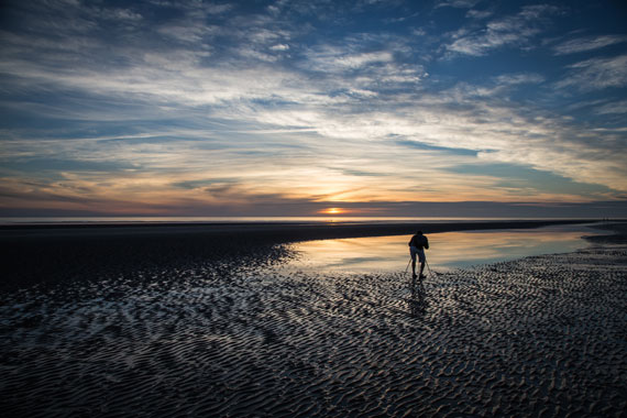
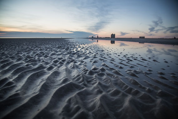
keskiviikko 19. heinäkuuta 2023

PictureCorrect.com: Types of Leading Lines in Photography Composition

When it comes to photography composition, one of the most powerful tools at your disposal is leading lines. Like the invisible hand that guides a viewer’s eye through an image, leading lines are a subtle, yet highly effective, compositional element that can dramatically improve the visual impact of your photos.

Also remember that a launch sale for the Cheat Sheets on all the Compositional Elements ends soon!

What Are Leading Lines?

Leading lines are, in essence, visual paths drawn in an image that lead the viewer’s eye towards a particular point, often to the main subject of the photograph. They serve to guide the viewer’s attention, create depth, and add a dynamic element to a composition. Leading lines are everywhere, from the natural lines created by rivers or coastlines, to architectural lines in cityscapes, to implied lines in portraits.

Understanding and leveraging leading lines in photography can significantly enhance your images, and here are some types of leading lines you should know.

1. Straight Lines

Straight lines are probably the most common leading lines that photographers utilize. They are powerful and direct. Whether vertical, horizontal, or diagonal, they create a sense of order and stability.

  • Vertical Lines: These lines can imply strength and grandeur. Think of towering skyscrapers or a towering tree in a forest.
  • Horizontal Lines: These suggest tranquility and breadth. The horizon line in a landscape photo is a classic example.
  • Diagonal Lines: Diagonal lines add a sense of dynamism and movement to a composition. They are often used to lead the viewer’s eye from one corner of the image to another or directly to the subject.
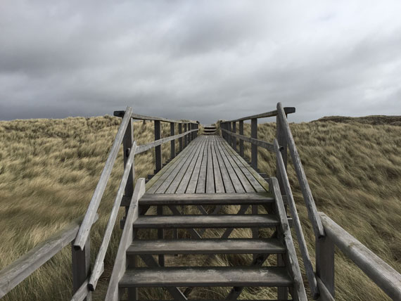
leading lines straight

Photo captured by Susn Matthiessen

2. Curved Lines

Curved lines, such as those found in winding roads, rivers, or architectural arches, create a sense of fluidity and grace in a composition. They can add a rhythmic, harmonious feel to your photographs and guide the viewer’s eye more subtly than straight lines. An “S” curve is a particularly pleasing type of curved line, often used in landscape and nature photography.

3. Implied Lines

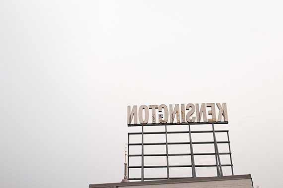
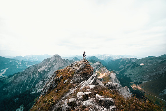
These are lines that don’t physically exist but are suggested by elements within an image. They can be formed by the direction a person is looking, the path of a dancer’s leap, or even the sequential positioning of objects in a scene. Although they’re less obvious, they can be incredibly effective in guiding a viewer’s gaze towards the subject.
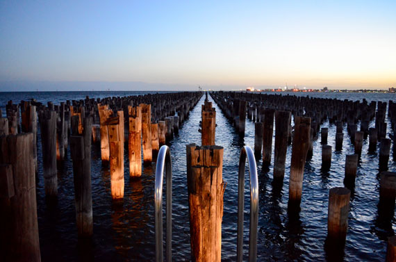
implied leading lines

Photo captured by Jonny Clow

4. Interrupted Lines

An interrupted line is a leading line broken by another element or object in the frame. For example, a fence line may be interrupted by a gate or a tree. This type of line can create tension in an image and adds interest to the composition by breaking up the monotony of a continuous line.

5. Converging Lines

Also known as perspective lines, converging lines are common in architectural and street photography. They occur when two or more lines start from different points but meet at a single point in the image, often on the horizon. Converging lines create depth and perspective, giving a three-dimensional feel to a two-dimensional image.
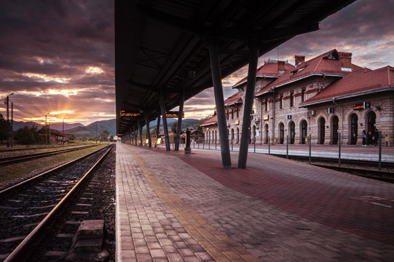
converging lines

Photo captured by Amariei Mihai

Conclusion

Mastering the use of leading lines can elevate your photography to new heights. They serve not only to draw attention to your main subject but also to instill a sense of order, add depth, and enhance the overall aesthetic of your images. As you become more familiar with these various types of leading lines, you’ll begin to see them everywhere and instinctively incorporate them into your compositions.

Remember, while these guidelines can be incredibly helpful, they’re not hard and fast rules. Experiment, be creative, and don’t be afraid to break the rules once you’ve learned them. After all, photography is an art form, and you are the artist. Harness the power of leading lines and let your unique vision shine through your work.

For Further Training on Composition:

These new Composition Cheat Sheets are designed to help. With clear, concise information on all the essential elements of composition, you’ll never be unprepared again. They are currently 81% off for the launch sale which ends soon if you want to check them out.

composition cheat sheets

Composition Cheat Sheets (see all the elements covered)

The perfect companion for any photographer. Print one out whenever you need it. These cheat sheets consolidate crucial composition-related information, allowing you to concentrate on what truly matters – composing striking photographs.

Launch sale ending soon: The Composition Cheat Sheets at 81% Off

- - - - - - - - - - - - - - - - - - - - - - - - - - - - - - - - - - - - - - - - - - - - - - - - - - - - - - - - - - - - - - - - - - - - - - - - - -

Did you appreciate this newsletter? Please help us keep it going by Joining Our Patreon Supporters

What are your thoughts on this article? Join the discussion on our Facebook Page

PictureCorrect subscribers can also learn more today with our #1 bestseller: The Photography Tutorial eBook

- - - - - - - - - - - - - - - - - - - - - - - - - - - - - - - - - - - - - - - - - - - - - - - - - - - - - - - - - - - - - - - - - - - - - - - - - -

The post Types of Leading Lines in Photography Composition appeared first on PictureCorrect.


from PictureCorrect https://ift.tt/r3xYONK
via IFTTT
tiistai 18. heinäkuuta 2023

PictureCorrect.com: Landscape vs Portrait Orientation for Panoramic Photography

When capturing panoramic images, the choice between landscape and portrait orientation can significantly impact the final result. Despite the simple distinction of turning the camera 90 degrees, each orientation offers unique benefits that may enhance or hinder your final composition depending on your subject matter and the image’s intended use. Let’s dive deeper into how these two orientations compare in terms of panoramic stitching.

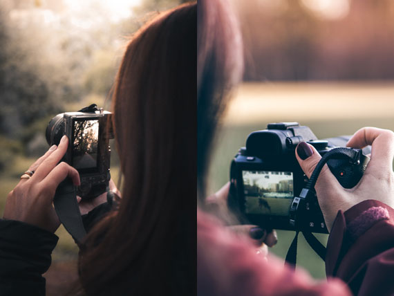
panorama orientation

Photos captured by Cezar Sampaio and Warren

Image Resolution and Detail

One of the main advantages of using portrait orientation for panoramic stitching is the enhanced vertical resolution. Since panoramic photography usually involves taking a series of images and stitching them together, using a portrait orientation means you’re capturing more data vertically, giving you a taller final image.

On the other hand, landscape orientation, by nature, captures more horizontal data in a single frame. This can be advantageous when dealing with broader subjects that may be difficult to cover using portrait orientation. However, it might result in lower vertical resolution when stitched together compared to portrait orientation.

Field of View

The orientation you choose also affects the field of view (FoV) of your final stitched panorama. In the landscape orientation, you get a wider horizontal FoV within each image, which might help you cover a wide scene with fewer shots.

However, in portrait orientation, you get a higher vertical FoV in each shot. This can be beneficial when you want to include more of the sky or foreground in the scene, such as capturing tall buildings or towering trees. Thus, for panoramic stitching, you might want to choose portrait orientation when the scene requires more vertical coverage.

Overlapping and Stitching Errors

The potential for stitching errors also varies between landscape and portrait orientations. When capturing in landscape mode, the shorter vertical edges may result in less overlap between images, increasing the likelihood of stitching errors or distortions.

Conversely, portrait orientation typically allows for more overlap between images, especially vertically. This increased overlap can provide more data for the stitching software to work with, potentially reducing the chances of errors and misalignments.

Ergonomics and Stability

The physical handling of the camera might also be a deciding factor. Some photographers find landscape orientation more comfortable and stable, especially when shooting handheld, which could lead to sharper images. Additionally, many tripods and panoramic heads are designed with the landscape orientation in mind, although portrait orientation is certainly possible with the right equipment.

On the contrary, using a portrait orientation might be somewhat awkward for handheld shooting. However, with a good tripod and a L-bracket, you can securely position your camera vertically with ease.

Concluding Thoughts

The choice between landscape and portrait orientation for panoramic stitching largely depends on your scene, the desired resolution, and your comfort level. If your scene is more horizontally expansive, or if you’re shooting handheld and need more stability, you might lean towards landscape. On the other hand, if you want to capture more vertical detail or reduce the chances of stitching errors, portrait could be your go-to.

Remember that photography is an art, and rules are merely guidelines. Don’t be afraid to experiment with both orientations in different scenarios. With practice, you will develop a sense for which orientation works best for your personal style and the particular scene you’re capturing.

Preorder Sale Ending Soon for New Panorama Stitcher:

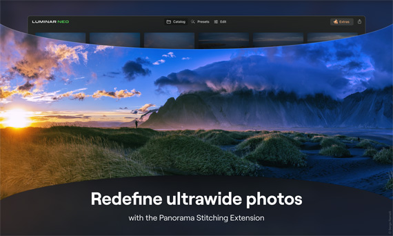
In photo editing news another extension has come to the Luminar Neo editing platform, the new Panorama Stitching Extension allows photographers to create sweeping panoramic photos with unparalleled versatility by introducing four distinct creation methods:

panorama stitching

New Panoramic Photo Stitcher (see how it works)

Effortlessly stitch RAW or JPEG files to create seamless panoramic photos that convey the grandeur of vast landscape and cityscape scenes.

Final Day: Panoramic Photography Stitching Early Bird Offer

- - - - - - - - - - - - - - - - - - - - - - - - - - - - - - - - - - - - - - - - - - - - - - - - - - - - - - - - - - - - - - - - - - - - - - - - - -

Did you appreciate this newsletter? Please help us keep it going by Joining Our Patreon Supporters

What are your thoughts on this article? Join the discussion on our Facebook Page

PictureCorrect subscribers can also learn more today with our #1 bestseller: The Photography Tutorial eBook

- - - - - - - - - - - - - - - - - - - - - - - - - - - - - - - - - - - - - - - - - - - - - - - - - - - - - - - - - - - - - - - - - - - - - - - - - -

The post Landscape vs Portrait Orientation for Panoramic Photography appeared first on PictureCorrect.


from PictureCorrect https://ift.tt/HQtmgWO
via IFTTT

maanantai 17. heinäkuuta 2023

PictureCorrect.com: Differences Between Lightroom Mobile, CC, and Classic

Adobe Lightroom has established itself as a commonly used tool in the digital photography landscape, offering solutions for image organization, raw photo processing, and non-destructive photo editing. The software suite is available in three versions, each tailored to meet different user needs: Lightroom Mobile, Lightroom CC, and Lightroom Classic. While these three share core functionalities, they are differentiated by their unique features and intended use cases.

This post aims to provide a clear understanding of these differences to help you make an informed decision about which version best suits your needs.

lightroom mobile

Lightroom Mobile

Lightroom Mobile is a free, standalone app available for Android and iOS devices. It has been designed with mobility in mind, bringing powerful Lightroom features to photographers on the go. Lightroom Mobile offers an intuitive, touch-friendly interface ideal for quick edits, and it supports RAW file import and editing.

While the basic version of Lightroom Mobile is free, to unlock its full capabilities you need a subscription to Adobe’s Creative Cloud Photography plan. The full version allows for seamless syncing with Lightroom CC and Lightroom Classic, so any edits made on your phone or tablet will automatically appear on your desktop, and vice versa. This is a great feature for photographers who want to edit photos while out in the field, then refine their edits on a desktop later.

Lightroom CC

Lightroom CC (Cloud Centric), as the name suggests, is a cloud-based service that allows for access to your photos from any device, anywhere. It’s available for Windows, Mac, iOS, Android, and even as a web application.

This version provides a more streamlined, user-friendly interface compared to Lightroom Classic. It’s designed to work well with touch interfaces and is less intimidating to new users. However, this simplicity comes with fewer advanced editing tools compared to Lightroom Classic.

One of the main features of Lightroom CC is its full-resolution cloud storage. With an Adobe Creative Cloud subscription, you get 1TB of cloud storage, making it easy to access and work on your photos from anywhere. However, if you have a large photo library, you may need to purchase additional storage.

Lightroom Classic

Lightroom Classic is the original, desktop-oriented version of Lightroom and is often favored by professional photographers due to its extensive feature set. It’s available for Windows and Mac systems.

Unlike Lightroom CC, which stores images in the cloud, Lightroom Classic is primarily designed to store and work with photos on your local storage. This might be preferable for photographers who don’t have consistent, high-speed internet access, or who want to maintain full control over where their files are stored.

Lightroom Classic provides more advanced, fine-grained photo editing tools, and it supports more complex workflows, such as split toning, color grading, and precise luminance control. It also has advanced features like smart collections, blending options, masking, and plugin support, which are not available in the other two versions.

The Right Tool for You

In essence, Lightroom Mobile is a versatile, mobile-friendly tool ideal for photographers on the go, Lightroom CC offers a simplified, cloud-centric experience suitable for beginners and users who value accessibility, and Lightroom Classic provides a comprehensive, desktop-centric toolset that appeals to professional photographers and power users.

Choosing the right version depends on your needs as a photographer. You might prefer Lightroom Mobile for its convenience and simplicity, Lightroom CC for its cross-device accessibility, or Lightroom Classic for its robust editing tools and desktop-oriented workflow. Alternatively, you might find that using a combination of the three serves you best. Whichever you choose, Adobe Lightroom offers powerful tools to help you get the most out of your photography.

For Further Training on Lightroom Mobile:

This is where the new iPhone Editing Academy, a course designed by professional photographer and photo editor, Clifford Pickett, steps in to bridge the gap. Pickett, who has edited over 10,000 photos using nothing but his iPhone and sold many to major corporate clients, has crafted this platform as an accessible way to master photo editing.

iphone editing academy

New: iPhone Photo Editing Academy (see preview videos)

During its launch, the course is on sale at a deeply discounted price. It also includes a full happiness guarantee, if you are not satisfied with the course for any reason simply let them know for a full refund – so there is no risk in trying it.

Launch sale ending soon: iPhone Photo Editing Academy at 80% Off

- - - - - - - - - - - - - - - - - - - - - - - - - - - - - - - - - - - - - - - - - - - - - - - - - - - - - - - - - - - - - - - - - - - - - - - - - -

Did you appreciate this newsletter? Please help us keep it going by Joining Our Patreon Supporters

What are your thoughts on this article? Join the discussion on our Facebook Page

PictureCorrect subscribers can also learn more today with our #1 bestseller: The Photography Tutorial eBook

- - - - - - - - - - - - - - - - - - - - - - - - - - - - - - - - - - - - - - - - - - - - - - - - - - - - - - - - - - - - - - - - - - - - - - - - - -

The post Differences Between Lightroom Mobile, CC, and Classic appeared first on PictureCorrect.


from PictureCorrect https://ift.tt/dK7aVeW
via IFTTT

sunnuntai 16. heinäkuuta 2023

PictureCorrect.com: Negative Space in Photography Composition

If you find yourself reading this article, chances are that you are looking for some ideas for photo projects. Naturally, it would be good to pick a photography project that helps you grow your photography skills. In this article, one such skill, negative space, will be discussed.

negative space photo ideas

Photo by Marisa Harris

This is a compositional technique that can be used to produce eye-catching photos. When properly used, it can help improve your images.

Composition

There are three principle compositional components to a photography image.

  1. Frame. The frame is the border that is all around the rest of the image.
  2. Positive Space. The subject of the image. This is generally the item on which the camera is focused.
  3. Negative Space. The rest of the image. It is located between the positive space and the frame.

When many people go about composing an image, they concentrate their attention on the positive space. The negative space, gets very little thought. If it receives any consideration at all, it is more of an afterthought. This kind of approach can result in second-rate images. When correctly utilized, negative space can serve two very important functions:

  1. It can help in defining what the positive space is all about. Basically, it helps to tell the story of the positive space.
  2. It can improve the positive space. Essentially, the negative space helps to make the positive space more noticeable.
negative space photo tutorial

Photo by Lucas Favre

Negative space can serve to help define the positive space by furnishing additional detail. As one example, a photograph may show part of a bridge. However, there may be few details that offer any suggestions of where the bridge is based. Is it in a crowded, urban park or in a forest? We can not tell from the close-up. If the photographer were to show some of the landscape, this would create some negative space that would certainly help to much better define the positive space. As a result, the image would be improved.

While utilizing a negative space can really strengthen an image, there is one thing that must be avoided. The negative space should never be allowed to overwhelm the positive space as this would serve to deteriorate the image.

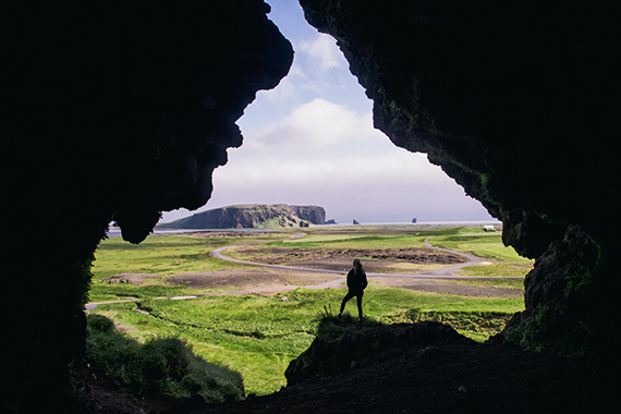
Making the positive space stick out is the other way that the negative space helps to enhance images. This is accomplished due to the fact the negative space helps to control the attention of a viewer. It does this by helping to lead the viewer’s attention to the positive space. When utilized in this fashion, the negative space is often relatively devoid of detail (this gets rid of any unproductive detail).

In short, both spaces need to be taken into consideration when figuring out how to best compose an image. Basically, both spaces are of equal importance and should be treated as such. This will help improve the quality of the images that you capture.

Your Photography Project

So, are you geared up to start a photography project? For this project, you should concentrate on capturing images where both spaces have been very carefully thought out. The goal is to carefully think about both spaces before the image is captured. This will require that you visualize the image. That is, you must imagine what the image will look like before you capture the shot.

negative space in phoography

Photo by Jonatan Pie

For this project, try capturing images of various types of subject matter. For instance, you could take shots in your garden, the city, a local park, and a national park.

Synopsis

This writing discussed one skill that can be used to launch a photography project. However, there are many more ideas that can help you improve your photography. Are you ready to check out some more photography ideas?

About the Author
Ron Bigelow (www.ronbigelow.com) has created an extensive resource of articles to help develop photography skills.

- - - - - - - - - - - - - - - - - - - - - - - - - - - - - - - - - - - - - - - - - - - - - - - - - - - - - - - - - - - - - - - - - - - - - - - - - -

Did you appreciate this newsletter? Please help us keep it going by Joining Our Patreon Supporters

What are your thoughts on this article? Join the discussion on our Facebook Page

PictureCorrect subscribers can also learn more today with our #1 bestseller: The Photography Tutorial eBook

- - - - - - - - - - - - - - - - - - - - - - - - - - - - - - - - - - - - - - - - - - - - - - - - - - - - - - - - - - - - - - - - - - - - - - - - - -

The post Negative Space in Photography Composition appeared first on PictureCorrect.


from PictureCorrect https://ift.tt/84Qck0s
via IFTTT

lauantai 15. heinäkuuta 2023

PictureCorrect.com: Perspective and Forced Perspective in Composition

In the dynamic and expressive realm of photography, perspective holds the power to transform the mundane into the extraordinary. It enables photographers to manipulate spatial dimensions, bring new meanings to subjects, and create uniquely compelling narratives. But what exactly is perspective, and how does it interact with the intriguing concept of forced perspective? Let’s delve into these fascinating areas of photography composition.

forced perspective

Photo captured by Alex Schwab

Understanding Perspective in Photography

The term “perspective” in photography refers to the representation of three-dimensional space on a two-dimensional plane (i.e., the photo) in a way that replicates human vision. Perspective is determined by the relationship between the camera and the subject.

In a nutshell, perspective can change how objects relate to each other within the frame, both in terms of size and spatial relationship. You can capture different perspectives by changing your camera’s position, angle, or focal length. There are a few common types of perspectives to consider:

  • Linear Perspective: This is observed when parallel lines appear to converge as they recede into the distance, creating a sense of depth.
  • Aerial Perspective: Also known as atmospheric perspective, this technique involves capturing the natural haze and color shifting in the atmosphere to suggest distance.
  • Vertical Perspective: This is the perception of depth and size based on an object’s height in the frame. Objects lower in the frame appear closer than objects higher in the frame.

The Art of Forced Perspective

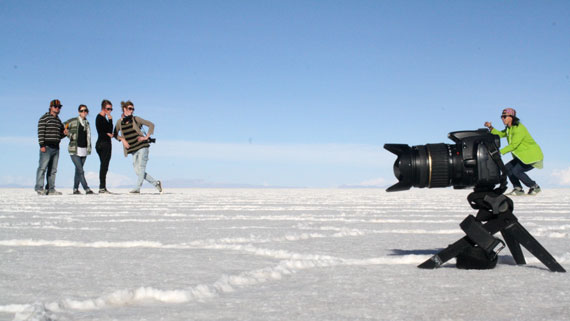
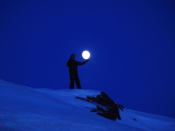
Forced perspective is a clever technique where photographers use optical illusions to make an object appear larger, smaller, closer, or further away than it actually is. This is achieved by manipulating the spatial relationships of the objects within the frame, often using depth of field and positioning to play tricks on the viewer’s perception.

A common example of forced perspective is the classic “holding up the Leaning Tower of Pisa” tourist photo. Even though we logically know the person isn’t actually holding up the tower, the photographer’s careful alignment creates the illusion that they are.

holding the moon

Techniques for Creating Forced Perspective

Creating effective forced perspective images requires a deep understanding of spatial relationships and some creativity. Here are a few techniques:

  1. Object Placement: Place your subjects at varying distances from the camera to manipulate their size relationship.
  2. Camera Angle: Low or high angles can exaggerate the size and importance of a subject.
  3. Depth of Field: Use a wide depth of field to keep both foreground and background objects in focus, emphasizing the illusion.
  4. Lens Choice: A wide-angle lens can enhance the sense of distance or size disparity between objects.
  5. Lighting: Use light and shadow to emphasize depth and spatial relationships.

The Impact on Composition

Both perspective and forced perspective significantly affect the composition of your images. They can help guide the viewer’s eye, create a sense of depth and scale, emphasize certain subjects, and create intriguing visual narratives.

For example, a low perspective can make a subject appear dominant and powerful, while a high perspective can make it appear small or insignificant. Forced perspective can tell playful stories or make the viewer question their perception of reality.

In conclusion, mastering perspective and forced perspective allows photographers to fully exploit spatial relationships and depth, adding layers of meaning and interest to their compositions. So next time you’re out with your camera, experiment with these techniques and see how they transform your images and the stories they tell.

For Further Training on Composition:

Are you ever tired of your photos looking dull or boring? These new Composition Cheat Sheets have you covered. With clear, concise information on all the essential elements of composition, you’ll never be unprepared again. They are currently 81% off for the launch sale which ends soon if you want to check them out.

composition cheat sheets

Composition Cheat Sheets (see all the elements covered)

The perfect companion for any photographer. Print one out whenever you need it. These cheat sheets consolidate crucial composition-related information, allowing you to concentrate on what truly matters – composing striking photographs.

Launch sale ending soon: The Composition Cheat Sheets at 81% Off

- - - - - - - - - - - - - - - - - - - - - - - - - - - - - - - - - - - - - - - - - - - - - - - - - - - - - - - - - - - - - - - - - - - - - - - - - -

Did you appreciate this newsletter? Please help us keep it going by Joining Our Patreon Supporters

What are your thoughts on this article? Join the discussion on our Facebook Page

PictureCorrect subscribers can also learn more today with our #1 bestseller: The Photography Tutorial eBook

- - - - - - - - - - - - - - - - - - - - - - - - - - - - - - - - - - - - - - - - - - - - - - - - - - - - - - - - - - - - - - - - - - - - - - - - - -

The post Perspective and Forced Perspective in Composition appeared first on PictureCorrect.


from PictureCorrect https://ift.tt/1UJz5pX
via IFTTT

perjantai 14. heinäkuuta 2023

PictureCorrect.com: Embracing the Horizon: Knowing When to Use a Panorama Stitcher

In the vast, ever-evolving world of photography, mastering a variety of techniques can transform an ordinary snapshot into a truly extraordinary capture. One such technique involves the use of a panorama stitcher, a powerful tool that blends separate images into a single breathtaking, wide-angle view. But when is the right time to use this technique? And how can it enhance your photographic artistry? Let’s dive in and explore the best times for photographers to utilize a panorama stitcher.

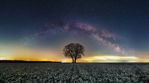
astro panorama

Photo captured by Evgeni Tcherkasski

The Magic of Panoramic Photography

Before understanding when to use a panorama stitcher, it’s essential to comprehend the magic that panoramic photography brings to the table. Panoramas offer a vast and immersive perspective, often covering a field of view that extends beyond the human eye’s natural range. This format helps convey the grandeur of expansive landscapes, bustling cityscapes, and other wide-angle scenes with an impact that standard photographs often can’t match.

When to Use a Panorama Stitcher

1. Capturing Broad Landscapes

This is perhaps the most common scenario where a panorama stitcher comes in handy. When faced with majestic mountains, sprawling valleys, or endless horizons, a single frame often falls short in capturing the entirety of the scene. A panorama stitcher allows photographers to create a wide-angle view that encapsulates the grandeur of such landscapes, offering the viewer a sense of the scene’s vastness.

landscape panoramic

Photo captured by Serge Ramelli

2. Immortalizing Architectural Wonders

Architectural photography can also significantly benefit from panorama stitching. Often, due to space constraints or the sheer size of buildings, it’s impossible to capture an entire structure within one frame. A panorama stitcher enables photographers to create a comprehensive image that accurately represents the architectural marvel in all its glory.

3. Conveying the Vibrancy of Cityscapes

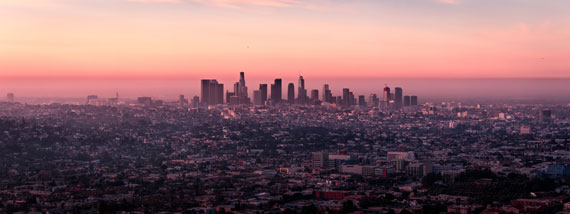
The complexity and energy of a bustling city can be hard to encapsulate in a single shot. By using a panorama stitcher, photographers can capture a broader perspective, capturing the dynamism and vibrancy of city life in a unique, immersive way.

cityscape panorama

Photo captured by Martin Adams

4. Indoor Spaces and Real Estate Photography

Photographers in real estate and interior design can greatly benefit from panorama stitching. Stitching together multiple images allows the capture of an entire room or property, providing a comprehensive view that can be more informative and engaging for potential buyers or clients.

5. Astrophotography

For those looking skywards, a panorama stitcher can be used to capture expansive views of the night sky, including the beautiful arc of the Milky Way. This technique can add depth and drama to astrological photography, creating stunning, high-resolution images that truly capture the awe-inspiring beauty of the cosmos.

Conclusion

In photography, having a panoramic perspective can give your work a unique edge, making your images more immersive and visually striking. The power of a panorama stitcher should not be underestimated; it’s a tool that can significantly enhance your ability to capture and convey the world’s beauty. So, the next time you’re faced with a scene that’s simply too big for a single frame, why not stitch it together and let your viewers enjoy the complete picture?

Preorder Sale Ending Soon for New Panorama Stitcher:

In photo editing news another extension has come to the Luminar Neo editing platform, the new Panorama Stitching Extension allows photographers to create sweeping panoramic photos with unparalleled versatility by introducing four distinct creation methods:

panorama stitching

New Panoramic Photo Stitcher (see how it works)

Effortlessly stitch RAW or JPEG files to create seamless panoramic photos that convey the grandeur of vast landscape and cityscape scenes.

Found here: Panoramic Photography Stitching in Luminar Neo

- - - - - - - - - - - - - - - - - - - - - - - - - - - - - - - - - - - - - - - - - - - - - - - - - - - - - - - - - - - - - - - - - - - - - - - - - -

Did you appreciate this newsletter? Please help us keep it going by Joining Our Patreon Supporters

What are your thoughts on this article? Join the discussion on our Facebook Page

PictureCorrect subscribers can also learn more today with our #1 bestseller: The Photography Tutorial eBook

- - - - - - - - - - - - - - - - - - - - - - - - - - - - - - - - - - - - - - - - - - - - - - - - - - - - - - - - - - - - - - - - - - - - - - - - - -

The post Embracing the Horizon: Knowing When to Use a Panorama Stitcher appeared first on PictureCorrect.


from PictureCorrect https://ift.tt/fhkEK6o
via IFTTT

torstai 13. heinäkuuta 2023

PictureCorrect.com: How to Highlight Texture in Photos: Best Lighting and Times

As a photographer, one of your most compelling tools is the ability to harness light to reveal the intricate textures within your subjects. Whether you’re capturing the delicate veins of a leaf, the worn grains of a wooden table, or the rugged roughness of a rocky landscape, the right lighting can make these textures pop, adding depth and dimension to your photos.

This blog post will delve into the best times and lighting conditions to accentuate textures in photography.

texture photographer

1. The Golden Hour

The golden hour, known as the first hour after sunrise or the last hour before sunset, is arguably one of the best times to photograph textures. The sun’s angle during this period produces a soft, warm light that glazes the subject, highlighting the textures with a blend of light and shadow. The longer shadows cast during the golden hour can bring out the depth and details of the textures you’re trying to capture.

2. Overcast Days

Although seemingly counterintuitive, overcast and cloudy days can provide excellent lighting conditions for texture photography. The cloud cover acts like a giant softbox, evenly dispersing the light and reducing harsh shadows. This diffused light can bring out subtle textures that might otherwise be lost under the stark contrasts of a bright sun.

3. The Blue Hour

The blue hour, which occurs just before sunrise and just after sunset, offers another window for capturing remarkable textures. During this time, the light is cool and soft, creating a serene atmosphere that can emphasize the textures of your subjects, especially if they have a cold color palette. Although the light during the blue hour can be quite dim, you can use this to your advantage to capture softer, more nuanced textures.

texture lighting

4. Side Lighting

Regardless of the time of day, the direction of your light source plays a crucial role in accentuating textures. Side lighting, in particular, is ideal for texture photography. When light strikes your subject from the side, it creates shadows that define and enhance the texture, making it appear more pronounced. You can create side lighting artificially with a single light source, or naturally with the sun during early morning or late afternoon.

5. Artificial Light

When natural light isn’t an option, artificial light can help to accentuate texture. Directional artificial light, such as that from a flashlight or a single studio light, can be used to create side lighting and shadow effects. Try adjusting the angle and intensity of the light source to see how it affects the appearance of the texture.

6. Utilizing Backlighting

Backlighting involves having the light source behind the subject, which can create a rim of light that outlines the subject and emphasizes texture. This technique works best with translucent or semi-translucent subjects, like leaves or slices of fruit, where the backlight can shine through to reveal intricate internal textures.

The Role of Texture in Photographic Composition

Texture plays a pivotal role in the overall composition of a photograph, and understanding how to incorporate it effectively can take your images to the next level. Just like line, shape, and color, texture is one of the essential elements of composition. It can be used to create contrast, providing a counterpoint to smooth areas within a shot or highlighting the similarities or differences between subjects.

Texture can also be used to guide the viewer’s eye, with coarse textures attracting more attention than smooth ones. In addition, texture can impart a sense of depth, making a two-dimensional image appear three-dimensional. This sense of depth can make your photos more immersive, inviting the viewer to ‘touch’ the surfaces with their eyes. Ultimately, texture adds richness and detail to photographs, creating a tangible quality that engages the viewer on a deeper level.

Remember, photography is a creative pursuit, and these guidelines are not set in stone. Experiment with different lighting conditions, times, and techniques to discover what works best for your unique style and the particular textures you’re capturing.

For Further Training on Composition:

Are you ever tired of your photos looking dull or boring? Our new Composition Cheat Sheets have you covered. With clear, concise information on all the essential elements of composition, you’ll never be unprepared again. They are currently 81% off for the launch sale which ends soon if you want to check them out.

composition cheat sheets

Composition Cheat Sheets (see all the elements covered)

The perfect companion for any photographer. Print one out whenever you need it. These cheat sheets consolidate crucial composition-related information, allowing you to concentrate on what truly matters – composing striking photographs.

Launch sale ending soon: The Composition Cheat Sheets at 81% Off

- - - - - - - - - - - - - - - - - - - - - - - - - - - - - - - - - - - - - - - - - - - - - - - - - - - - - - - - - - - - - - - - - - - - - - - - - -

Did you appreciate this newsletter? Please help us keep it going by Joining Our Patreon Supporters

What are your thoughts on this article? Join the discussion on our Facebook Page

PictureCorrect subscribers can also learn more today with our #1 bestseller: The Photography Tutorial eBook

- - - - - - - - - - - - - - - - - - - - - - - - - - - - - - - - - - - - - - - - - - - - - - - - - - - - - - - - - - - - - - - - - - - - - - - - - -

The post How to Highlight Texture in Photos: Best Lighting and Times appeared first on PictureCorrect.


from PictureCorrect https://ift.tt/asOXfeH
via IFTTT