sunnuntai 22. maaliskuuta 2026

PictureCorrect.com: Most Photographers Miss This Spring Moment Completely

Spring photography feels easy—until you realize how quickly everything disappears.

One day, trees are bare.
A few days later, they explode with color.
And just as quickly, it’s gone.

Most photographers don’t miss spring because they lack skill.

They miss it because they mistime it.

Related note: offer going on now for the Lighting Cheat Sheets 🍃 Golden Spring Sale

spring photo

Photo captured by David Becker

The Problem Isn’t Your Camera — It’s Timing

Spring isn’t a stable season.

It’s a transition.

And that transition moves fast.

Blossoms don’t last weeks—they often peak for just a few days.
Fresh green leaves shift color rapidly.
Petals fall almost as quickly as they arrive.

If you show up too early, everything feels empty.
Too late, and the magic is already fading.

The result?

Photos that feel like they almost captured something special—but didn’t quite get there.

The Three Spring Moments That Actually Matter

Most photographers only think about “flowers blooming.”

But spring really has three distinct phases, and each one creates completely different images.

1. The Pre-Bloom Stage (Often Overlooked)

This is the quiet moment before everything explodes.

Small buds. Subtle color. Clean compositions.

flower buds

Photo captured by Lukas Tennie

There’s less visual chaos here—fewer distractions, fewer competing elements.

This is where you can create:

  • Minimalist images
  • Macro detail shots
  • Soft, simple compositions

Most photographers skip this stage completely, but it often produces the most refined images.

2. Peak Bloom (The Shot Everyone Wants)

This is the moment everyone waits for.

Full color. Full density. Maximum impact.

But it’s also the hardest phase to shoot well.

Why?

Because everything is competing for attention.

spring bloom

Photo captured by niko n

Scenes can quickly become:

  • Overcrowded
  • Visually noisy
  • Lacking a clear subject

The key isn’t just showing up at peak bloom—it’s simplifying what you see.

Look for:

  • Isolated branches
  • Clean backgrounds
  • Strong light direction, especially backlight or side light

Peak bloom isn’t just about abundance. It’s about control.

3. The Falling Petals Moment (The One Everyone Misses)

This is the most fleeting—and often the most powerful—moment.

A light breeze.
Petals drifting through the air.
Color in motion.

It only lasts a short window, but it creates something unique:

Movement.

Emotion.

Atmosphere.

This is where spring stops being static and starts feeling alive.

You can capture:

  • Floating petals with fast shutter speeds
  • Dreamy motion with slower shutter speeds
  • Ground patterns as petals collect
flower petals

Photo captured by Jerry Wang

Most photographers pack up once the blooms start falling.

That’s exactly when things get interesting.

Why Spring Feels So Hard to Capture

Spring isn’t difficult because of your camera settings.

It’s difficult because it doesn’t wait.

Unlike landscapes that stay consistent for weeks or months, spring scenes are constantly changing—sometimes hour by hour.

Light changes.
Weather shifts.
Blooms open and fall.

The best spring photos don’t come from luck.

They come from showing up at the right moment.

A Simple Way to Capture It More Consistently

Instead of thinking:

“I’ll go shoot spring photos this weekend…”

Start thinking:

“What stage of spring am I trying to capture?”

Then plan around that.

  • Visit early for buds and simplicity
  • Return during peak bloom for color and impact
  • Go back again when petals begin to fall

The same location can give you three completely different photo sets—if you time it right.

The Real Difference

Most photographers treat spring like a single event.

But it’s not.

It’s a sequence.

And once you start recognizing those phases, your photos stop feeling random—and start feeling intentional.

Because the difference between a decent spring photo and a memorable one often comes down to just one thing:

Being there at the exact moment most people miss.

For Further Training:

Lighting is arguably the most important aspect of photography; but do you know how to use it? These new Photography Lighting Cheat Sheets are designed to help. With critical information on ALL the types of natural light and artificial light you can use. They are currently 80% off today for the Golden Spring Sale 🍃

lighting cheat sheets

New! Cheat Sheets for Photography Lighting (see how they work)

Whether you’re a seasoned professional or just starting out, photography cheat sheets can be a valuable resource for improving your skills and taking your photography to the next level. By having all the key information you need in one place, you can focus on what’s important – capturing amazing photos.

Spring sale: The Lighting Cheat Sheets at 80% Off


from PictureCorrect https://ift.tt/khuGIdt
via IFTTT

lauantai 21. maaliskuuta 2026

PictureCorrect.com: Why Your Sunset Photos Never Match What You Saw

You’re standing there watching an incredible sunset. The sky is glowing with deep oranges, reds, and purples. The foreground looks balanced, the light feels rich—and everything just works.

Then you take the photo… and it looks flat, dull, or completely blown out.

What happened?

Want to master advanced lighting techniques faster? PictureCorrect Premium is designed to be an accelerator with lessons, exercises, and more — and it’s only $1 to try this weekend

sunset diagram

The Problem: Your Camera Sees Less Than You Do

The main reason your sunset photos fall short is dynamic range.

Dynamic range is the difference between the brightest and darkest parts of a scene.

Your eyes? Incredibly powerful.
Your camera? Much more limited.

When you look at a sunset, your eyes automatically adjust:

  • You can see detail in the bright sky
  • You can still make out the darker foreground

But your camera has to choose:

  • Expose for the sky → foreground goes dark
  • Expose for the foreground → sky gets blown out

That’s why your photo never quite matches what you saw.

sunset image

Photo captured by Patrick Ryan

The First Fix: Exposure Compensation

If you’re shooting in Aperture Priority or Shutter Priority, your camera is trying to average everything into a “neutral” exposure.

That’s exactly what ruins sunsets.

To fix it, use exposure compensation.

Try this:

  • Dial in -1 to -2 stops of exposure compensation
  • Watch how the colors in the sky immediately deepen
  • Let the foreground go darker if needed

Why this works:

  • Sunset colors live in the highlights
  • Slight underexposure protects those highlights
  • Your image gains contrast, color, and drama instantly

A Simple Rule for Better Sunsets

If your sunset looks boring in-camera, it’s almost always because it’s too bright.

Dial it down.

Why This Still Isn’t Enough

Even with perfect exposure compensation, you’re still hitting a hard limit:

Your camera can’t capture the full dynamic range of the scene in a single shot.

That’s why:

  • The sky looks great, but the foreground is too dark
  • Or the foreground looks good, but the sky loses detail

Want the Shot You Actually Saw?

This is where most photographers get stuck—and where things start to get powerful.

Inside PictureCorrect Premium (only $1 to try this weekend), you’ll learn:

Bracketing + Blending Workflow

  • Capture multiple exposures (bright, medium, dark)
  • Combine them into one balanced image
  • Recover both sky detail and foreground texture

hdr example

Want to consistently capture sunsets the way they actually look (or better)? Only a few spots left.

Deal ending soon: Special Premium Enrollment This Weekend


from PictureCorrect https://ift.tt/pa0ugID
via IFTTT

torstai 19. maaliskuuta 2026

PictureCorrect.com: This One Camera Setting Changes Everything in Low Light

Low-light photography frustrates a lot of photographers for the same reason: the photos don’t come out the way they looked in real life.

They’re either blurry, noisy, or too dark. Sometimes all three.

Related: Want to master advanced techniques faster? PictureCorrect Premium is designed to be an accelerator with lessons, exercises, and more — and it’s only $1 to try this weekend

shutter speed trick

And when that happens, most people assume the problem is their camera, their lens, or the lighting conditions.

But in many cases, it comes down to a single setting:

Shutter speed.

Why Shutter Speed Matters More Than You Think

In low light, your camera is struggling to gather enough light to properly expose the scene. That means one thing has to give.

If your shutter speed is too fast, your image will be underexposed (too dark).
If it’s too slow, you’ll introduce motion blur—even if your hands feel steady.

This is where things start to fall apart for a lot of photographers.

They lower the shutter speed just enough to brighten the image… but not enough to stay sharp.

The result? A photo that looks “off” in a way that’s hard to explain.

The Hidden Limit of Handheld Shooting

Every photographer has a limit to how slow they can handhold a camera without introducing blur.

A simple rule of thumb:

Your shutter speed should be at least 1 over your focal length.

So if you’re shooting at:

  • 50mm → aim for at least 1/50s
  • 100mm → aim for at least 1/100s
  • 200mm → aim for at least 1/200s

This isn’t a strict rule, but it’s a reliable baseline.

Go below it, and your chances of motion blur increase quickly—even if your subject isn’t moving.

And if your subject is moving? You’ll need an even faster shutter speed.

Why Most Low-Light Photos Go Wrong

Here’s what typically happens:

You’re in a low-light scene—maybe indoors, at sunset, or in a city at night.

You lower your shutter speed to brighten the image…
But you don’t realize you’ve crossed your personal stability limit.

So even though the exposure looks better, the image loses sharpness.

To compensate, many photographers then raise ISO too much, introducing noise.

Or they open the aperture fully, losing depth of field.

Now you’re juggling trade-offs without a clear system—and the results become inconsistent.

A Simple Way to Improve Immediately

Next time you’re shooting in low light, do this:

Start by setting your shutter speed to a safe handheld value based on your focal length.

Lock that in first.

Then adjust your exposure using aperture and ISO instead of letting shutter speed drift too low.

This one change alone can dramatically improve your results.

Your photos may still have some noise—but they’ll be sharp. And sharp photos are almost always easier to fix than blurry ones.

But This Is Only Part of the Picture

Shutter speed is just one piece of a much bigger system.

Because in real-world low-light situations, you’re constantly balancing three competing factors:

  • Motion (your movement and your subject’s movement)
  • Noise (from increasing ISO)
  • Exposure (how bright the image needs to be)

And knowing which to prioritize—and when—is what separates consistent results from guesswork.

Take Control of Low-Light Photography

Inside the PictureCorrect Premium newsletter (only $1 to try this weekend), this is expanded into a complete low-light workflow.

An exercise walks through exactly how to:

  • Choose the right shutter speed for any situation
  • Balance ISO, aperture, and motion without guessing
  • Handle moving subjects in low light
  • Get sharp, clean images even in challenging conditions

Instead of trial and error, you’ll have a clear system you can apply every time you pick up your camera.

Low light doesn’t have to be unpredictable.

Once you understand how to control shutter speed—and how it fits into the bigger picture—you’ll start getting results that actually match what you saw.

Deal ending soon: Special Premium Enrollment This Weekend


from PictureCorrect https://ift.tt/Gvn0wFy
via IFTTT

tiistai 17. maaliskuuta 2026

PictureCorrect.com: End-of-Winter Fog: The Most Underrated Landscape Condition

As winter begins to fade, a quiet shift happens in the landscape. The snow recedes, the air softens, and—on the right mornings—fog starts to appear with surprising consistency. It’s easy to overlook. There are no bold colors or dramatic skies, just muted tones and soft light. But for photographers, this period offers one of the most visually powerful conditions of the entire year.

Related reminder: the winter season is almost over in the northern hemisphere (only 1 day left) and so is the Photo Adventure Cheat Sheets ❄ Winter Sale

fog landscape

End-of-winter fog is driven by temperature contrast. The ground and water are still cold from winter, while the air begins to warm slightly during the day. Overnight cooling followed by early morning warming creates just enough separation for moisture to condense into mist. Lakes begin to steam, valleys fill with haze, and coastal areas develop layers that shift and reshape constantly. These scenes don’t stay the same for long, which makes them especially rewarding to work with.

What makes fog so effective is how it simplifies everything. Background clutter disappears, leaving only the strongest elements behind. A single tree, a distant figure, or a simple line cutting through the frame can suddenly carry the entire image. Instead of building complex compositions, you begin to subtract. The scene does the editing for you.

At the same time, fog naturally builds depth. Objects don’t just shrink with distance—they fade. Foreground elements remain darker and more defined, while anything farther away softens into lighter tones until it nearly disappears. This gradual transition creates a layered look that feels atmospheric and three-dimensional, even in very simple scenes.

Because of this, fog encourages a different approach to composition. Instead of searching for more elements, the goal becomes finding less. Look for isolated subjects, clean silhouettes, or repeating shapes that fade into the distance. Negative space becomes a key part of the frame, not just empty background. If the image feels almost too minimal, that’s often a sign it’s working.

Technically, fog can be deceptive. Cameras tend to underexpose these scenes because they interpret all that brightness as something that needs to be toned down. The result is often a dull, gray image that lacks the lightness you actually saw. In most cases, it helps to push your exposure brighter than normal. Let the fog appear luminous rather than flat.

A good starting point is to dial in positive exposure compensation—somewhere around +1 stop—and adjust from there based on what you see in your histogram. The histogram becomes much more reliable than the rear screen in these conditions. Instead of aiming for a centered graph, you’ll usually want the data shifted toward the brighter side without clipping important highlights. Fog should feel light and airy, not muddy.

foggy trees

Aperture choices are fairly flexible, but something in the mid-range—around f/5.6 to f/11—tends to work well depending on how much depth you want to keep. Since fog already reduces contrast, keeping your ISO low helps preserve as much tonal detail as possible. For focus, it’s often better to use a single focus point or manual focus, especially when your subject is partially obscured and autofocus might struggle.

Another advantage of fog is the quality of light. Everything is naturally diffused, which eliminates harsh shadows and creates very smooth tonal transitions. This makes it easier to capture subtle gradients, especially in scenes where layers fade gently into one another.

It’s also worth slowing down. Fog can change rapidly—thickening, thinning, or drifting in ways that completely transform a scene within minutes. A composition that feels empty at first can suddenly come alive as elements appear or disappear. Staying in one place and observing these shifts often leads to the strongest images.

End-of-winter fog doesn’t rely on dramatic landscapes or vibrant color. It rewards patience, simplicity, and attention to subtle detail. While many photographers wait for spring to fully arrive, this in-between season offers something just as compelling—images that feel quiet, minimal, and atmospheric in a way few other conditions can match.

For Further Training:

For help remembering the camera settings for difficult situations like this, this set of Photography Adventure Cheat Sheets are designed to help. They are currently 80% off for a Winter Sale which ends tomorrow along with the winter season. Spring is upon us!

photography cheat sheets

The perfect companion for any photographer. Print one out whenever you need it. Whether you’re going on vacation or seeking out a specific photography adventure, these cheat sheets can provide you with the knowledge and inspiration you need to create your best work yet.

Only 1 day left: The Photography Adventure Cheat Sheets ❄ Winter Sale


from PictureCorrect https://ift.tt/2ZgPqaI
via IFTTT

maanantai 16. maaliskuuta 2026

PictureCorrect.com: Silhouette Photography Tips

This article is based on concepts from The Understanding Light Photography Guide which is currently 68% off for further training.

A silhouetted photograph almost always garners immediate and positive attention.

silhouette photo person diving into lake

Photo by Andrew Sharples

There is much confusion out there in Internet-land about the differences between a silhouette, a shadow, and when something is shadowed.

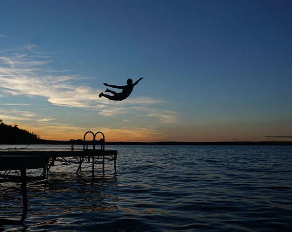
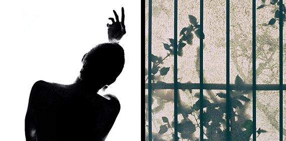
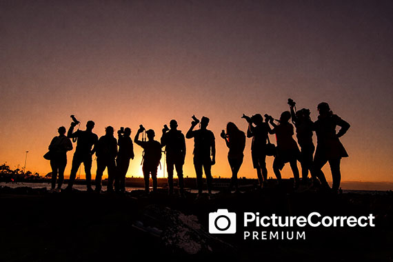
The picture above depicts a silhouette.

example of a shadow photo and a shadowed photo

Left photo by Martino Pietropoli, Right photo by maxime caron

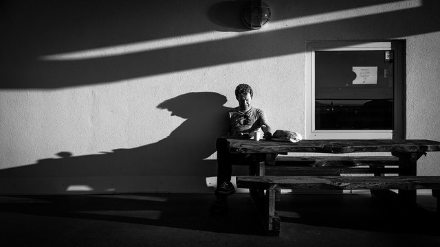
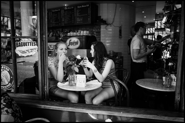
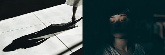
The photograph on the left is a shadow, and the photo on the right is a woman who is shadowed.

A shadow occurs when light is blocked by an object, and that results in a darkened area on another object. Shadowed is when an object is hit by a shadow so that part of the object is obscured due to a lack of light.

Here’s the definition of a silhouette as taken from a dictionary: a silhouette is a dark shape and outline of a person or object as viewed against a lighter background.

Each of these three results from light has its strengths. Today, I’m going to concentrate on the silhouette.

When you finish this blog post, you’ll realize that the silhouette is one of your most powerful tools as a photographer.

silhouettes are a powerful tool in photography

Photo by Sarah Arista

Key Thought: Silhouettes are powerful because they make use of shape. Recognizing shape is a primal instinct in the human brain. When a viewer perceives a shape within your photo, they can’t help but focus on it.

Secret to Success

The most potent silhouette photos include a storytelling element.

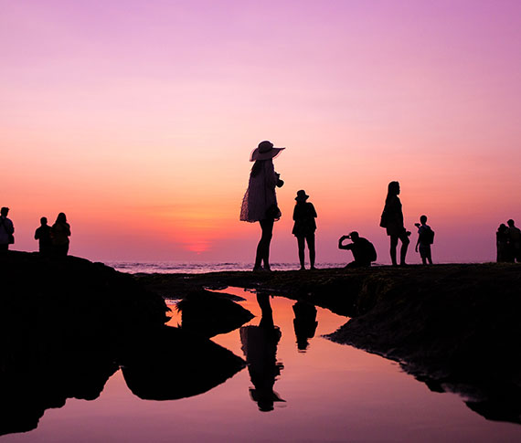
The above image hits every button. It has full silhouettes, a semi-silhouette (more on that in a minute), a strong story element, and fabulous color! What else could you ask for? Creating photos like this will definitely put you into the popular category.

simple silhouette

Photo by Aadesh Choudhari

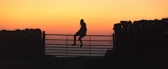
Here we have what is categorized as a ‘simple’ silhouette. It gives us a clearly defined shape, but it lacks a story element.

Simple silhouettes give little to a viewer other than a brief visual pleasure. This type of silhouette is a great way to begin as you master the basics if you are new to silhouette photography.

Let’s get started!

1. Get some help from a family member or a friend.
2. Take them out on a beautiful evening when the sun is setting.
3. Position them with no direct light source illuminating them on the camera side and a brightly lit sky behind them.
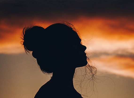
4. Start with a simple profile headshot (as illustrated above).
5. Use manual mode and take your meter reading from the sky behind your subject. Start with an ISO of 200, a shutter speed of 1/125th, and an aperture of f/8. Adjust the ISO as necessary to acquire correct exposure with that combination of shutter speed and aperture.
6. Set your file type to camera raw or .jpeg if not available.
7. Experiment with your exposure, using over and underexposure in ½ stop increments up to 2 stops from the nominal setting.
8. Study your results.

Key Thought: In full silhouette photography, underexposure will almost always work in your favor. It will darken the silhouette, while also adding density and color saturation to the background.

underexposure helps darken a silhouette

Photo by Adam Sherez

Let’s Recap What We’ve Learned so Far

  • A silhouette is the dark shape and outline of a person or object against a brighter background.
  • A silhouette is not a shadow or an object that is shadowed.
  • A simple silhouette displays a shape but has little storytelling value.
  • The best silhouette photography includes a storytelling element for added interest to viewers.

Time to Crank it up a Notch

1. Gather a model or two.
2. Pick out some props that could make exciting storytelling shapes, such as the fishing pole, hats, handbags, tennis racquets, a bicycle, or even a permanent structure like the dock in the opening photo for this post.
3. Plan out your story.
4. Pick a location that will put your models and props against the sky.
5. Set up your shoot time for sunset.
6. Follow the steps from the first challenge in this post.
7. Go for it!

silhouette against sky

The Silhouette as a Focal Point

Sometimes your silhouette will be the subject of the photograph as displayed in the first four example pictures.

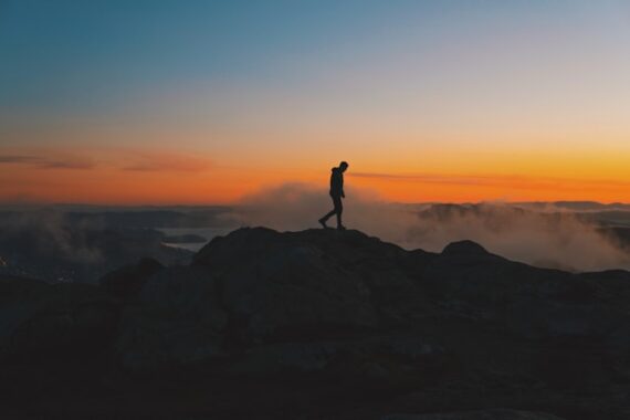
However, another superpower of the silhouette is as a focal point. The image of the lone figure walking along the landscape (above) is a perfect example of a silhouette as a focal point.

The setting sun and stormy clouds over the landscape are the subjects. However, it’s the silhouette that rivets the eyes right where the photographer wants them and adds a storytelling element.

Try This!

Repeat the previous exercises, but now use the model(s) and/or props as a focal point to a landscape photo instead of the silhouette being the subject.

example of a semi-silhouette

Photo by diego acosta

Are there different types of silhouettes?

We often study the topic of light. We’ve come to realize that there are various types of light and that light can be manipulated to create different effects in photography.

There are also three different types of silhouettes.

1. The Full Silhouette
2. The Semi-Silhouette
3. The Translucent Silhouette

The full silhouette is what we’ve discussed so far in this blog post. The full silhouette is a dense black shape with no visual detail facing the camera. This style of silhouette relies entirely on the shape formed to generate a viewer’s interest.

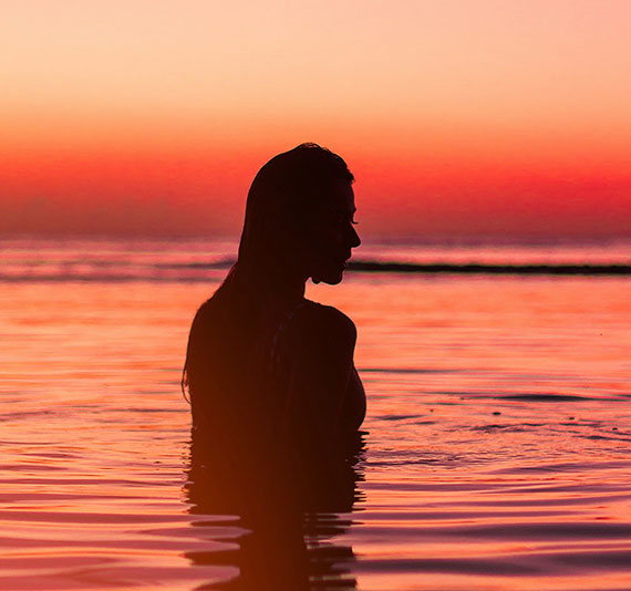
The photo of the woman standing in the water at sunset (above) is an example of a semi-silhouette.

It meets the definition of a silhouette. We have a dark shape and outline against a brighter background.

However, with a semi-silhouette, there’s some degree of detail left within the silhouetted shape. If you look deeply at the woman in the water, you’ll see her arm, her hair, and other defining features of her face.

Semi-silhouettes are much harder to produce. They take greater skill in lighting and exposure control. Many semi-silhouettes are often tweaked in post-production.

When you’re ready, give the semi-silhouette a try!

1. Follow the steps in the previous challenges with the following additions.
2. Bring a photo assistant or two. Your kids can do this!
3. Bring two pieces of cardboard that you have painted white, or get foamboard, which is a bit sturdier, at the local art supply store. The boards should be at least 3 feet wide by 4 feet long.
4. Start with a simple headshot, as displayed in the 4th photo within this article.

Note: With a semi-silhouette, underexposure is not your friend.

5. Set up your model against the sky.
6. Set your meter reading pattern to matrix or evaluative (depending upon your camera)
7. Use aperture priority and set the aperture to f/8.
8. Check the shutter speed. If it’s slower than 1/125th, then raise the ISO setting until you get a shutter speed of at least 1/125th. If the shutter speed is faster than 1/125th, then you can leave it as is.
9. Without your helpers or your reflector boards, start taking pictures and vary the exposure by ½ stop increments, go both over and under by at least 2 stops, using your exposure compensation setting on the camera.
10. Finally, move your helpers into position on either side of the model. They should hold the reflector boards, just outside of the view of the camera, with the white side reflecting the bright background light onto the dark side of your silhouetted model.
11. Again, start with a proper exposure setting and then vary it using the exposure compensation feature of your camera by 2 stops over and under in ½ stop increments.
12. Study your results.
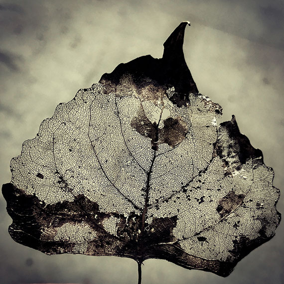
translucent silhouette

Photo by laze.life

This leaf depicts a translucent silhouette.

The leaf picture (above) meets the definition of a silhouette, but with an added dimension. When the object in silhouette isn’t wholly opaque, some of the brighter background light is going to pass through it.

This is known as translucent light.

Idea: Locate a subject you can photograph that’s part opaque and part translucent. Follow the steps in the previous challenges. This type of subject will create new levels of creativity, storytelling, and problem solving for you.

part opaque and part translucent silhouette

Photo by Rene Bohmer

By combining the three different types of silhouettes, you can create masterful pieces of artwork!

Are you up for this challenge?

Create a photograph where you mix all three types of silhouettes. Plus, don’t use the sky as the background. You have to find another background idea!

Post-Processing

post processing silhouettes

Left photo by Nathan DeFiesta, Right photo by Gabriele Diwald

Post-processing offers additional steps to your creative process.

Silhouettes lend themselves very well toward creating high contrast photos that have a poster-like lithographic film effect.

They also work exceptionally well for double exposure effects as well as texture over overlays.

The Final Challenge

Take some of the silhouettes that you created in the earlier challenges and perform some post-processing magic on them.

A silhouette often works perfectly with various actions and presets. Don’t forget to try some textured overlays.

You can use a mobile phone app for editing if you don’t have a layer editing program like Photoshop. You can import any picture into your phone, and then get creative on your silhouette images with apps like Mextures or Lens Distortions!

When you complete your mobile phone app editing, transfer your picture back to your desktop workstation.

silhouette in front of sunset

Photo by Josh Millgate

How did you do?

  • Do you now understand the difference between a silhouette, a shadow, and being shadowed?
  • Do you now recognize the three different types of silhouettes?
  • Were you able to gain some experience and perspective on how to set up your camera and expose a silhouette picture?
  • Did you accomplish a semi-silhouette photo that made you happy?
  • Do you recognize the importance of adding a story element to a silhouette photo for added impact?
  • Did you try some dazzling effects in post-processing?
  • Did you attempt to create a photograph that included all three silhouette types?
  • Did you discover how slight underexposure can really bump up the color saturation in a silhouette picture?
  • Were you able to complete the challenge where you had to use a different background other than the sky?
  • Are you excited about working with more silhouettes in the future?

About the Author:
Kent DuFault is an author and photographer with over 35 years of experience. He’s currently the director of content at the online photography school, Photzy.com.

For Further Training:

Light is the basic building block of ALL photography. Hearing about great light, talking about great light, and maybe even recognizing certain types of light is not the same as UNDERSTANDING light which is what this in-depth guide covers. Understanding it means you’ll know how to “accurately” manipulate light to your advantage. It is currently 68% off today if you want to check it out.

understanding light

New: The Understanding Light Guide

“If you want to be the type of photographer that creates photographs, not one who just snaps them, you must understand how light works. And, once you understand how it works, it will be to your advantage to thoroughly understand how to manipulate it. These skills will help you create photographs that you can pre-visualize in your mind.”

Deal ending soon: The Understanding Light Guide at 68% Off


from PictureCorrect https://ift.tt/h0O2rHC
via IFTTT

sunnuntai 15. maaliskuuta 2026

PictureCorrect.com: Depth Compression with Telephoto Lenses

One of the most visually striking effects in photography comes from using telephoto lenses to compress depth. Photographers often describe this as the “background getting pulled closer,” but what’s really happening is a change in perspective relationships between objects in the frame.

Related: offer ending soon for the Composition Cheat Sheets 🕙 March Markdown

lens compression landscape

500mm lens: mountains appear close to downtown

When you photograph a scene with a long focal length (such as 200mm, 300mm, or longer), distant objects appear larger relative to foreground subjects. This makes elements that are physically far apart—mountains, buildings, trees, or people—appear stacked tightly together in the image. The result is a scene with reduced apparent depth and stronger layering, often making landscapes look more dramatic or portraits more visually clean.

This effect isn’t technically caused by the lens itself, but by the distance you must stand from the subject when using a telephoto lens. Because you move farther away, the difference in distance between foreground and background becomes proportionally smaller. That reduced difference makes distant elements appear closer together.

Photographers use telephoto compression intentionally for several creative effects:

  • Landscape photography: Layers of mountains appear stacked dramatically, emphasizing atmospheric depth.
  • Portraits: Background elements look larger and softer, creating pleasing subject isolation.
  • Street photography: Crowds and architectural elements appear densely packed, adding visual intensity.
  • Wildlife photography: Distant scenery feels closer to the animal, creating a more immersive composition.

To experiment with the effect, try photographing the same subject with a wide lens (around 24mm) and then a telephoto lens (200mm+) while maintaining similar framing by changing your distance. You’ll quickly notice how the telephoto shot makes the background feel dramatically closer.

Mastering telephoto compression allows photographers to control the perceived depth of a scene, turning ordinary locations into layered, cinematic compositions simply by choosing the right focal length and shooting position.

For Further Training on Composition:

Are you ever tired of your photos looking dull or boring? These popular Composition Cheat Sheets have you covered. With clear, concise information on all the essential elements of composition, you’ll never be unprepared again. They are currently 81% off for a March Markdown 🕙 which ends soon if you want to check them out.

composition cheat sheets

Composition Cheat Sheets (see all the elements covered)

The perfect companion for any photographer. Print one out whenever you need it. These cheat sheets consolidate crucial composition-related information, allowing you to concentrate on what truly matters – composing striking photographs.

Deal ending soon: The Composition Cheat Sheets at 81% Off


from PictureCorrect https://ift.tt/bW5wEpI
via IFTTT

lauantai 14. maaliskuuta 2026

PictureCorrect.com: Diffraction: The Invisible Enemy of Landscape Photographers

Landscape photographers often assume that stopping down the lens to f/16 or f/22 will produce the sharpest images. After all, a smaller aperture increases depth of field, which should make more of the scene appear in focus.

But there’s a hidden optical effect that starts working against you when apertures get too small: diffraction.

Diffraction is one of the most common reasons landscape photos look slightly soft—even when focus and shutter speed are correct.

Related: Want to master advanced techniques faster? PictureCorrect Premium is designed to be an accelerator with lessons, exercises, and more — and it’s only $1 to try this weekend

understanding diffraction

What Diffraction Actually Is

Diffraction is a physical property of light.

When light passes through a very small opening, like the aperture of a lens at f/16 or f/22, the light waves begin to spread and interfere with each other instead of traveling in perfectly straight lines.

Instead of focusing to a precise point on the sensor, the light spreads into a small pattern called an Airy disk. As the aperture gets smaller, these Airy disks become larger and begin overlapping.

The result:
fine detail becomes blurred at the pixel level.

This isn’t caused by your lens being bad, and it isn’t a focusing mistake. It’s simply a limitation of optics.

Even the sharpest lenses in the world are affected by diffraction.

Why f/22 Often Reduces Sharpness

At first glance, smaller apertures seem beneficial because they increase depth of field.

However, there is a tradeoff between depth of field and diffraction softness.

Here’s what typically happens as you stop down:

  • f/2.8 – f/4: shallow depth of field
  • f/5.6 – f/8: peak optical sharpness for many lenses
  • f/11: still very sharp with increased depth of field
  • f/16: diffraction begins softening fine detail
  • f/22: noticeable softness across the frame

At f/22, the diffraction blur often outweighs the benefit of additional depth of field. This means that even though more of the scene appears “in focus,” the entire image becomes slightly softer.

Modern high-resolution sensors make this even more noticeable because they capture extremely fine detail.

Many landscape photographers unknowingly lose sharpness simply by assuming that smaller apertures are always better.

diffraction

The Balance Landscape Photographers Need

The goal is to find the optimal aperture where you gain enough depth of field without introducing too much diffraction.

For most lenses and modern cameras, that sweet spot usually falls between:

f/8 and f/11

But landscapes are rarely simple. Scenes often include:

  • rocks close to the camera
  • distant mountains
  • trees across varying distances

This is where truly sharp landscape photography becomes more advanced.

Simply stopping down to f/22 isn’t the solution.

Mastering Sharpness in Real Landscape Scenes

Professional landscape photographers typically combine several techniques to maintain maximum sharpness:

• choosing the optimal aperture for the lens
• positioning focus carefully in the scene
• using hyperfocal distance when appropriate
• combining multiple focus points when necessary

This is where landscape photography becomes much more technical than many photographers realize.

Want to Learn the Complete Landscape Sharpness Method?

Understanding diffraction is just the first step.

Inside the PictureCorrect Premium newsletter (only $1 to try this weekend), subscribers learn the complete workflow for maximizing landscape sharpness, including:

• How to calculate the optimal aperture for your camera and lens
Focus stacking techniques that allow you to avoid diffraction entirely
• A field-tested landscape sharpness method used by experienced photographers

picturecorrect premium

Whether you’re working to master manual control, or advanced photo editing techniques, Premium gives you the structure to make steady progress. The special $1 intro offer is wrapping up this evening, and once it’s gone, so is your chance to lock in early access.

Deal ending soon: Premium Newsletter Weekend Enrollment Special


from PictureCorrect https://ift.tt/KMtlHOB
via IFTTT

torstai 12. maaliskuuta 2026

PictureCorrect.com: What “Sharpening” Really Does at the Pixel Level

When photographers talk about “sharpening,” it’s easy to assume editing software is restoring lost detail or magically fixing soft images. In reality, most sharpening techniques don’t create new detail at all. Instead, they manipulate contrast at the pixel level, particularly around edges. By exaggerating the difference between neighboring pixels, sharpening tools create the perception of greater clarity.

However, modern AI-based tools have begun to push sharpening beyond simple edge contrast. Software such as Topaz Photo AI uses machine learning models to analyze patterns in the image and attempt to reconstruct realistic detail. Understanding both approaches helps explain what sharpening really does behind the scenes.

Related: only 1 day left for the Photo Editing Cheat Sheets 🔖 March Markdown Sale

sharpening diagram

The Traditional Approach: Edge Contrast

A digital photo is made up of millions of pixels, each containing brightness and color information. When an edge appears in a photo—such as the border between a dark object and a bright background—the pixels gradually transition from darker values to lighter ones.

If that transition becomes too gradual, the edge appears soft. Traditional sharpening algorithms look for these transitions and increase the contrast between pixels on either side of the edge.

Imagine a row of pixels across an edge:

Dark side → 40, 45, 50, 60, 70 ← Light side

A sharpening tool might adjust the values to something like:

Dark side → 35, 42, 50, 65, 78 ← Light side

The transition becomes steeper, which makes the edge appear sharper—even though the image contains exactly the same underlying information.

This is the core principle behind classic tools such as Unsharp Mask, High Pass sharpening, and most sharpening sliders found in photo editing software.

Why Images Often Start Slightly Soft

Many digital photos benefit from sharpening because several factors naturally soften edges during capture:

  • Anti-aliasing filters in some cameras blur fine detail slightly to prevent moiré patterns
  • Lens limitations reduce sharpness, especially near the edges of the frame
  • Motion blur from camera shake or subject movement
  • Noise reduction applied during processing

Sharpening is often used as a finishing step to restore the crisp edge transitions that were softened earlier in the imaging pipeline.

photo sharpening

The Rise of AI Sharpening

Traditional sharpening simply boosts contrast around edges. Modern AI tools attempt something more sophisticated.

Software like Topaz Photo AI uses deep learning models trained on large datasets of sharp and degraded images. The neural network learns patterns that represent real photographic details—such as hair strands, feathers, foliage, or architectural lines.

When processing an image, the AI analyzes these patterns and predicts what the sharper version of the image might look like. In some cases, it can even reconstruct fine texture that was softened by motion blur, noise reduction, or missed focus.

Instead of simply increasing edge contrast, AI sharpening works more like a detail reconstruction system.

Why Oversharpening Causes Problems

Because traditional sharpening exaggerates contrast, too much of it can create visible artifacts. The most common is haloing, where bright or dark outlines appear along edges.

Sharpening can also enhance image noise, especially in shadows or high-ISO photos. Since noise consists of tiny pixel variations, sharpening algorithms may treat it like real detail and amplify it.

AI-based sharpening tools can reduce these issues by selectively enhancing recognized structures rather than boosting contrast everywhere—but they can still produce unnatural textures if pushed too far.

The Three Stages of Sharpening

In most professional editing workflows, sharpening is applied in stages:

Capture sharpening
Applied early to compensate for softness introduced by the camera sensor and lens.

Creative sharpening
Selective sharpening applied to key elements such as eyes in a portrait or textures in a landscape.

Output sharpening
Final sharpening optimized for the image’s destination, whether that’s print, web, or social media.

Each stage adjusts pixel contrast slightly differently to ensure the image appears crisp in its final form.

The Bottom Line

At its core, sharpening works by manipulating pixel relationships—increasing contrast where brightness values change rapidly so that edges appear more defined.

Traditional sharpening enhances the edges that already exist in the image. AI-powered tools, on the other hand, attempt to reconstruct believable detail based on learned patterns.

In both cases, sharpening doesn’t truly create original detail captured by the camera sensor. Instead, it refines the way pixels transition across edges—making the image appear clearer, more textured, and ultimately sharper to the human eye.

For Further Training:

The March Markdown Sale on the Photo Editing Cheat Sheets is wrapping up soon, making this a great time to bring clarity to your editing workflow. If editing often feels scattered or uncertain, these cheat sheets provide a clear, repeatable process for tackling exposure, color, masking, retouching, and finishing touches in the right order.

photo editing cheat sheets

Paired with time-saving keyboard shortcuts, they help you edit faster, stay consistent, and know when an image is truly finished.

Only 1 day left: The Photo Editing Cheat Sheets 🔖 March Markdown Sale


from PictureCorrect https://ift.tt/z9YujdD
via IFTTT

keskiviikko 11. maaliskuuta 2026

PictureCorrect.com: Single-Point vs. Wide AF for Busy Travel Scenes

Autofocus technology has become incredibly sophisticated, but busy environments can still confuse even the most advanced camera systems. Whether you’re photographing a crowded street market, a lively festival, or a bustling city square, your camera may struggle to decide what exactly to focus on. This is where understanding the difference between Single-Point AF and Wide AF becomes especially valuable for travel photographers.

Choosing the right autofocus mode can make the difference between a sharp subject and a missed moment.

Related note: only a little while left for the Travel Photography Cheat Sheets at 88% Off!

single point or wide

Understanding Single-Point Autofocus

Single-Point AF allows the photographer to manually select one specific focus point within the frame. The camera will only attempt to focus on whatever is directly under that point.

In busy environments, this level of control can be extremely useful. Instead of letting the camera guess which object should be sharp, you explicitly tell it where to focus.

For example, imagine photographing a street performer in a crowded plaza. With wide autofocus, the camera might lock onto a passerby in the foreground or a sign in the background. With single-point AF, you can place the focus point directly on the performer’s face and ensure that the subject you care about remains sharp.

Advantages of Single-Point AF

  • Precise control over what the camera focuses on
  • Ideal for isolating a subject in cluttered scenes
  • Reduces the risk of the camera focusing on the wrong object
  • Works well for portraits, architecture details, and street photography

Potential Drawbacks

Single-point focusing can be slower when subjects move quickly. If your subject shifts position, you may need to reposition the focus point or recompose the frame.

Understanding Wide Autofocus

Wide AF (sometimes called Auto-Area AF or Wide-Area AF depending on the camera brand) allows the camera to evaluate many focus points across the frame and decide where to focus automatically.

Modern cameras often combine this mode with subject detection or eye-tracking, which can make it surprisingly effective for photographing people.

In travel photography, this can be helpful when capturing spontaneous moments—such as children running through a fountain or cyclists passing through a market street—where there simply isn’t time to manually place a focus point.

Advantages of Wide AF

  • Faster for unpredictable or moving subjects
  • Useful when shooting quickly or reacting to fleeting moments
  • Works well with modern face and eye detection systems

Potential Drawbacks

In crowded scenes, the camera may focus on something you didn’t intend—such as a nearby object, background detail, or a person walking through the frame.

When Busy Scenes Cause Autofocus Problems

Busy travel environments often contain several elements competing for focus:

  • People walking through the frame
  • Signs, poles, or architectural details
  • Foreground objects like fences or plants
  • High-contrast patterns that attract autofocus

Because autofocus systems tend to lock onto the nearest object or the highest contrast area, the camera’s choice may not match the photographer’s intent.

This is why experienced travel photographers often switch between autofocus modes depending on the situation rather than relying on a single setting all day.

Practical Situations and Which Mode Works Best

Crowded Street Scenes
Single-Point AF usually performs best. It allows you to lock focus precisely on a specific person or subject among the crowd.

Fast Action or Movement
Wide AF is typically more effective, especially when combined with continuous autofocus tracking.

Architecture in Busy Locations
Single-Point AF helps prevent the camera from focusing on people walking in front of the building you’re photographing.

Festivals and Events
Wide AF can be helpful for capturing spontaneous moments quickly, particularly if your camera has reliable face detection.

A Useful Travel Photography Strategy

Many photographers adopt a simple approach when working in busy locations:

  • Start with Wide AF when moving quickly through a scene.
  • Switch to Single-Point AF when you have time to compose a shot carefully.

Learning how to toggle between autofocus modes quickly—often using a customizable camera button—can dramatically increase your hit rate in chaotic travel environments.

The Bottom Line

Busy environments challenge autofocus systems because there are simply too many potential subjects competing for attention. Single-Point AF provides precision and control, making it ideal when you want to isolate a specific subject. Wide AF offers speed and convenience, helping you capture spontaneous moments before they disappear.

Travel photographers who understand both modes—and know when to switch between them—will consistently capture sharper, more intentional images, even in the most crowded destinations.

For Further Training:

Some shots are just harder than others. Ever struggled with Milky Way photos, twilight exposures, or star trails and focus stacking while you’re on the move? The Travel Photography Cheat Sheets (currently 88% off today) are built exactly for moments like that:

Showing you step by step how to dial in settings, avoid common mistakes, and get the shot — even when you’re tired, rushed, or shooting in unfamiliar conditions. Travel-ready, no Wi-Fi required, and designed to be quick to reference so you can spend less time guessing and more time shooting.

Deal ending soon: Travel Photography Cheat Sheets at 88% Off


from PictureCorrect https://ift.tt/Lqv7alM
via IFTTT

tiistai 10. maaliskuuta 2026

PictureCorrect.com: Want Sharper Photos? Topaz Photo’s Wonder 2 Model Makes It Easier

Photographers are always searching for one thing: tack-sharp images. Whether you’re shooting wildlife, landscapes, travel scenes, or fast-moving subjects, sharpness is often the difference between a good photo and a portfolio-worthy one. That’s why many photographers have turned to Topaz Photo AI, a tool designed specifically to improve image quality using artificial intelligence.

Now, Topaz has introduced a major update with a new model called Wonder 2—a powerful AI system that can denoise, sharpen, and upscale images in a single step, dramatically simplifying the editing workflow for photographers.

topaz photo wonder

The New Wonder 2 Model

At its core, Wonder 2 is designed to handle several image-enhancement tasks at once. Traditionally, photographers had to apply noise reduction, sharpening, and upscaling separately, adjusting sliders and fine-tuning settings along the way.

Wonder 2 changes that process.

Instead of multiple tools and manual adjustments, the model automatically analyzes your image and performs three enhancements simultaneously:

  • Noise reduction – Cleans up high-ISO noise and grain
  • Sharpening – Restores lost detail and edge clarity
  • Upscaling – Increases resolution while preserving detail

Perhaps the most interesting part is that there are no sliders or tuning controls required. The AI model determines the optimal enhancement automatically based on the image content.

For photographers who want quick results without spending time experimenting with settings, this approach can dramatically speed up editing.

Running a Massive AI Model—Locally

One of the most impressive aspects of Wonder 2 is its size and complexity. It’s a very large AI model, capable of analyzing fine image structures and reconstructing detail that would normally be lost to noise, motion blur, or lens softness.

Normally, models of this scale require heavy GPU memory or cloud processing. But Topaz solved this with a new technology called NeuroStream.

NeuroStream dramatically reduces VRAM usage, allowing the Wonder 2 model to run locally on standard creator hardware—meaning photographers can get powerful AI processing without needing a high-end workstation or sending their photos to the cloud.

This local processing has several advantages:

  • Faster performance
  • No upload times
  • Greater privacy for your images
  • Works even without internet access

For many photographers working with large RAW files, these improvements make AI enhancement far more practical in everyday workflows.

Why This Matters for Photographers

Sharpness problems come from many sources:

  • High ISO noise
  • Motion blur
  • Lens softness
  • Cropping or upscaling
  • Small sensors (common in smartphones)

Traditionally, fixing these issues required careful adjustments and sometimes multiple editing tools.

With Wonder 2, the goal is to simplify that entire process into one step. The model evaluates the photo and applies the necessary improvements automatically.

night photo processing

For example, a wildlife image shot at high ISO might receive aggressive noise reduction while still preserving feather detail. A slightly soft landscape might get edge enhancement and subtle upscaling to restore clarity.

The result can be images that look significantly sharper and cleaner, even when the original capture wasn’t perfect.

A Faster Editing Workflow

Another benefit of this approach is workflow speed.

Many photographers spend a large portion of their editing time toggling between sharpening tools, denoise settings, and resolution adjustments. Wonder 2 compresses all of that into a single automated step.

That means:

  • Less time tweaking sliders
  • Fewer export tests
  • Faster turnaround on large batches of photos

For photographers processing hundreds of images from a shoot, that efficiency can add up quickly.

Should Photographers Try It?

AI tools are becoming a regular part of modern editing workflows, and updates like Wonder 2 show how quickly the technology is improving.

Because it combines denoise, sharpening, and upscaling automatically, the new model is particularly appealing for photographers dealing with:

  • High-ISO images
  • Slightly soft shots
  • Heavy crops
  • Smartphone photos
  • Older camera files

If your goal is getting clean, tack-sharp photos with minimal editing effort, tools like the Photo AI Editor are becoming increasingly worth exploring.

With Wonder 2 now running locally inside Topaz Photo, photographers can experiment with powerful AI enhancement while keeping their workflow fast, simple, and completely under their control.


from PictureCorrect https://ift.tt/pT47I0c
via IFTTT

maanantai 9. maaliskuuta 2026

PictureCorrect.com: Shadows and Highlights: The Mark of Excellence

Related reminder: only a little while left for the Black and White Drills at 87% Off

Back in the days of black and white photography, I worked in a darkroom as a lab assistant, and sometimes students would make the mistake of asking me what I thought. If they wanted to learn this was not a mistake, but if they just wanted me say how great their work was, that was when it became a mistake. Sometimes I would advise them to crop tighter or change their center of balance, but by far the most common problem they had was with shadows and highlights.

black and white shadows

“The other me” captured by Giuseppe Milo.

I would ask a student to show me a pure white in their print and they would point to a cloud or something similar. I would say, “That’s not white,” and they would argue with me. Now admittedly this was done under safe lights, but once I asked them to fold over the edge of the print so they could see the back of the photo paper, that’s when I would say “Now that’s pure white.”

They didn’t argue, because they actually did have a pure white, they argued because that’s how they remembered the scene in their mind. I had to remind students again and again that unless you do something different, the camera only exposes at 18% gray. Likewise, in a darkroom, unless you do something different the prints that come out are also 18% gray. When you expose something at only 18% gray, you are using a middle of the road type exposure. That should be your starting point, not your final destination.

In the Zone System developed by Ansel Adams there are 10 zones—or shades—from pure white to pure black. If you take a close look at most exposure compensation settings, regardless if your camera is digital or 35mm, most of them only give you a plus or minus range of two f-stops. If the original setting that your camera uses (18% gray) is zone 5 and you can only expose at plus or minus two stops, that only gives you a visual range of five f-stops. What happened to the other five zones?

Camera manufactures keep coming out with bigger and better units every day, but to date, none of them have developed a sensor as sensitive as the human eye. You may remember those awesome white puffy clouds, but that is because your eye sees and comprehends a wider range of colors than just the standard 18% gray. Remember, if you want a subject to actually be white (a wedding dress, for example) you will have to give the shot more light than the camera suggests. If you want it to actually be black, a black cat for example, you have to give the shot less light than what the camera is indicating.

When it comes to light, it seems that many photographers become totally obsessed by the idea of controlling it. I mean, we buy studio lights so we can get more of it. We get reflectors and bounce things off the wall. Why? All for the mistaken idea that we need to get rid of the shadows. Let’s just take a moment, breath deep, and remember the classics.

photo guide

Photo by Giuseppe Milo; ISO 200, f/8, 1/2500 exposure.

When someone says they are going to use Rembrandt lighting or butterfly lighting what are they referring to? They are talking about studio lighting setups that allow you to control the shadows, not eliminate them. Shadows help to set the mood of a shot. When you think about it, all lighting patterns are defined by the shadows, not the light. If there were no shadows, there would be no patterns. All lighting would be the same.

Highlights are usually defined as the brightest area in a photo. As my students learned, what you shoot as white doesn’t always come out as white. This is often more obvious in black and white photography than with color, but when you lack highlights you also lack dynamics. When you shoot a snowy mountain top and nothing is truly white, you have what most of us to refer to as a “flat image.” We call it flat, because like a tire on your car, if it’s flat it just doesn’t take you anywhere.

black white snow mountain

“Heading home” captured by Vern.

Fashion photographers often go to great lengths to play with the highlights in the eyes, or in the hair, or in a smile. A photo tip worth remembering is that sometimes in an effort to get better highlights, we overexpose the image and actually lose detail. That’s referred to as burn out, and it’s not the same as a well thought out highlight.

With that in mind, I would like to redefine highlights as the brightest area in a photo in which one can still see detail. The same is true of a great shadow. A shadow is defined as the darkest area of a photo in which you can still see detail. If you see a picture of a cave opening and all is black, you don’t really have any shadows (you have darkness). If you can see eyes and a hairy outline of some type of creature breathing the cool night air, you can honestly say you caught something lurking in the shadows.

The reason the masters went to such great efforts to include shadows and highlights in their photos is that it took their work to the next level. If all cameras shoot at 18% gray, which is a middle of the road type exposure, it is fair to assume that 90% of the people in the world today are getting middle of the road type photos (as far as exposure is concerned).

black and white street photography

“A Quick Snack” captured by David Guyler.

Many advanced amateurs do use exposure compensation, but they’re still on the high or low end of middle gray. To ensure your images have the same richness as the masters, like Ansel Adams or Edward Weston, you too have to include shadows and highlights. Look again at the images that impress you, regardless of the subject matter. What do they have that you do not? I’m willing to bet that it’s in the details, and those kinds of details are often found in the shadows and highlights.

About the Author:
Award winning writer / photographer Tedric Garrison has 30 years experience in photography (better-photo-tips.blogspot.com). As a Graphic Art Major, he has a unique perspective. His photo eBook “Your Creative Edge” proves creativity can be taught. Today, he shares his wealth of knowledge with the world through his website.

For Further Training:

These new Black and White Drills (currently 87% off today) will give you 7 unique and powerful black and white photography projects so that you can learn as you’re shooting.

black white drills

These projects take you through one fundamental black with everything you need to quickly learn that specific outcome – from concept through to shooting and onto post-production.

Deal ending soon: The Black and White Drills at 87% Off


from PictureCorrect https://ift.tt/coxkjL8
via IFTTT