It’s easy to get carried away when editing your landscape photos. A little tweak here, some adjustment there, and before you know it, you’ll have over-edited your photos. The signs that you’re over-editing landscape photos aren’t always easy to see. But it’s helpful to know what to look out for. In this Lightroom tutorial, landscape photographer Mark Denney points out what to watch for when editing your landscape images:
1. Unrealistic Highlights and Shadows
It’s very common for landscape photos to have the highlights in the sun clipped. And if you try to bring the highlights down too much, you’ll end up getting a muddy orange patch around the sun.
Stop when you start seeing the ring around the sun, and pull the highlights back up a little bit. If something is bright, it will appear bright. No need to worry about clipping.
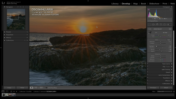
Going overboard with recovering highlights
Shadow is another important aspect of a landscape image. It adds drama, depth, and structure to an image. Trying to pull the shadows up will create an image that looks pretty flat.
“If you get to a point where you’re removing all the shadows from your photo and it starts to look flat, you’ve gone way too far on your shadow adjustment. You need to bring it back a little bit.”
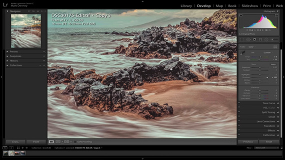
Image appears flat as there are no shadows
2. Too Much Contrast
Contrast is the key ingredient that adds punch to an image. It can make or break a photograph. But you can sometimes go overboard when adding contrast and not even notice it.
“Having too little contrast is not quite as detrimental to an image as having too much contrast. But being able to identify when you have applied too much is very critical.”
Denney suggests that you pay attention to the shadows when adjusting contrast to make sure you don’t overdo it. If you notice that you’re losing all the shadow details when increasing contrast, you’re overdoing it.
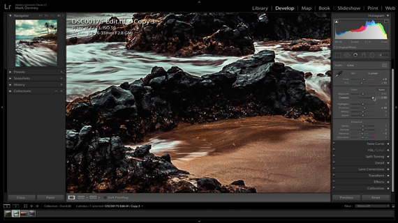
Too much contrast causing loss of shadow details
3. Over-Sharpening and Clarity
Every photographer loves sharp images. So much that they’d even try to make a blurry image appear sharp in post. But increasing the sharpness and clarity slider introduces some artifacts.
If you notice a halo on the areas of the image with tonal contrast, that is the number one sign that you’re over-sharpening. Adding too much clarity makes it glow even more.
“Really pay attention to the edges of your photo and look for that glowing halo because if you see that, you need to bring it back a little bit.”
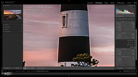
Halo around the edges due to over-sharpening
4. Extreme Vignetting
Beginner photographers are often guilty of adding too much of a vignette to their images. Vignettes are actually supposed to be subtle. Add too much vignetting and it becomes a distraction.
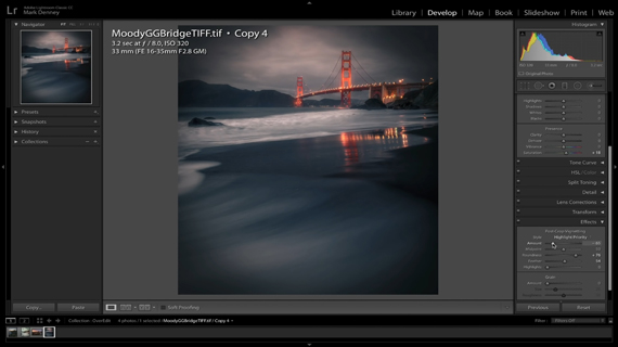
Unnatural looking vignette
“The purpose of a vignette is to direct the viewer’s eye towards the center of your photograph. But we’re conditioned to never put our subject smack-dab in the center of our image.”
Instead of using the built-in vignette function, use the radial filter. You can have greater flexibility with the radial filter regarding the placement and shape of the vignette. It also makes the vignette a lot more purposeful. But again, pay attention so that it doesn’t become too obvious.
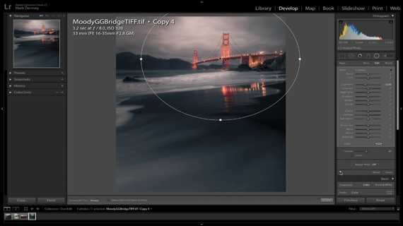
Purposeful vignette using radial filter tool
5. Oversaturated Colors
Saturated colors make an image appear vibrant and eye-catchy. This is the reason why some photographers are guilty of abusing the saturation slider.
“There really is not a good way to identify when you’ve gone overboard with saturation. I usually use negative saturation and positive vibrancy.”
To identify whether you’ve gone overboard with saturation in your image, Denney suggests putting your image in full screen by pressing F, and walking away from it for some time. Then come back and look at your saturation and see if it still looks normal. If it looks completely unnatural, rework on it.
Are you guilty of over-doing any of these adjustments when editing your landscape images?
Go to full article: Are You Over-Editing Your Landscape Images? 5 Items to Check
What are your thoughts on this article? Join the discussion on Facebook
PictureCorrect subscribers can also learn more today with our #1 bestseller: The Photography Tutorial eBook
The post Are You Over-Editing Your Landscape Images? 5 Items to Check appeared first on PictureCorrect.
from PictureCorrect http://bit.ly/2Hn7Cta
via IFTTT


0 kommenttia:
Lähetä kommentti