Food photography is still life photography. You have full control over where you place the elements and how you take the photos. And this is what determines the success or failure of an image. Photographer Joanie Simon from The Bite Shot discusses how you can apply effective composition techniques in food photography:
Visual Weight
Visual weight refers to whether or not the image looks balanced. For general photography, it’s not essential that your images be balanced. Images that put the viewer at unease with an unbalanced composition are equally effective. But that’s not the objective in food photography.
“In food photography, we’re trying to create images that are aesthetically pleasing, that are inviting people into that image, that you can feel at home, and you can feel comfortable in a sense of peace. We do that by creating visual balance by making sure we’ve evenly distributed the visual weight.”
Distribute Elements Evenly
You can ensure visual equilibrium by imagining a vertical or horizontal line and making sure that the elements are distributed evenly on both sides.
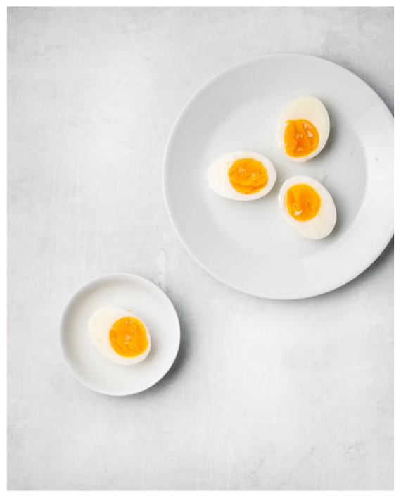
Consider the image below. It feels heavier on the right side because of the larger plate with more eggs.
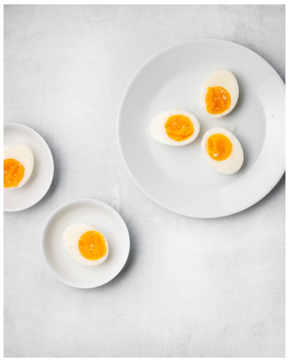
To make the image feel more balanced, Simon adds another small plate to the left side.
Attractive Elements Have Greater Visual Weight
Visual weight is not only determined by factors like size and quantity. If any element draws more attention to itself, you need to assign more visual weight to it.
Something with more texture, more pattern, more color, or something that just has more visual interest will appear heavier than something that’s simpler.
Consider the same image with the plain plate replaced by another one with patterns. It definitely feels busier and heavier on the right side again.
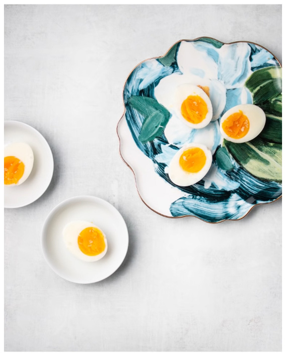
So the key takeaway here is that if you use something eye-catching make sure that you counterbalance the visual weight.
Culture Affects Perception of Visual Weight
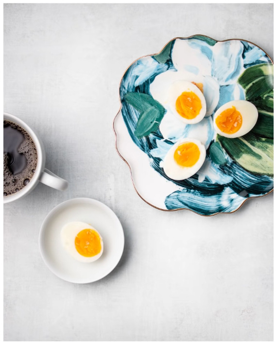
Culture can have an impact on how you interpret visual balance. Someone who reads from left to right can have the opposite interpretation of visual balance from someone who reads from right to left.
For someone who reads from left to right, the following image may seemed balanced. But that may not be so for someone who reads from right to left.
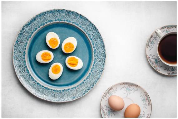
And in the following case, the image may seem balanced for someone who reads from right to left, but not for others who read from left to right.
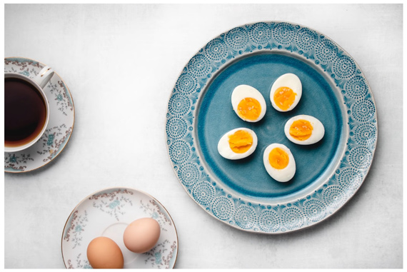
Elements at the Top Feel Heavier
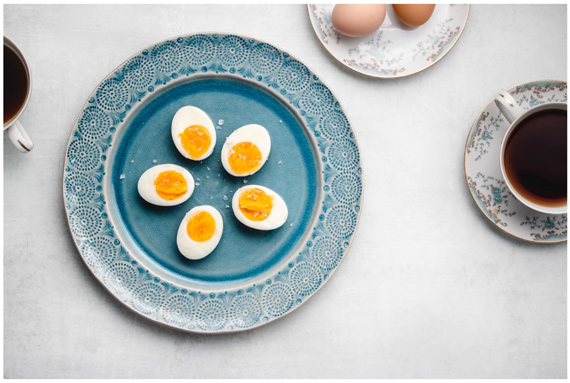
Whether you place your elements at the top or bottom of the frame also impacts visual balance.
“Elements at the top of the frame feel heavier than elements at the bottom of the frame.”
You can make use of this notion by placing smaller elements at the top to counterbalance the greater weight at the bottom of the frame.
Negative Space is an Element, Too
Finally, Simon suggests that you treat negative space as an element in itself and use it for balance.
“You may have a lot going on just in terms of smaller things on the left side, so you counterbalance that with a lot of open space on the right side as an equal distribution to create that sense of balance and harmony.”
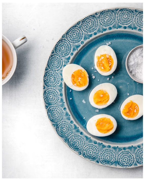
Give some of these tips a try to establish greater visual balance in your food photography.
Go to full article: Visual Balance in Food Photography
What are your thoughts on this article? Join the discussion on Facebook
PictureCorrect subscribers can also learn more today with our #1 bestseller: The Photography Tutorial eBook
The post Visual Balance in Food Photography appeared first on PictureCorrect.
from PictureCorrect http://bit.ly/307FtOn
via IFTTT


0 kommenttia:
Lähetä kommentti