When starting out in photography, you can end up making the same mistakes repeatedly. Landscape photographer Mark Denney goes through some of the mistakes he made over and over and shares some composition tips to take your landscape photography forward:
Going back through the archives and reviewing your own images is a good practice. It helps you evaluate your progress and opens up your eyes to the mistakes you were making.
“There’s no better way to make yourself feel better about your progression than looking at what you were creating a few years ago compared with what you’re creating right now.”
1. Shooting High and Wide
“Sometimes, a composition is best shot at eye level. But a lot of times, there’s a much better way to shoot that composition.”
We are all used to seeing the world from our eye-level. This is why sometimes even the best images taken from eye-level seem a little boring. Always explore the possibilities of photographing a scene from a lower or a higher perspective.

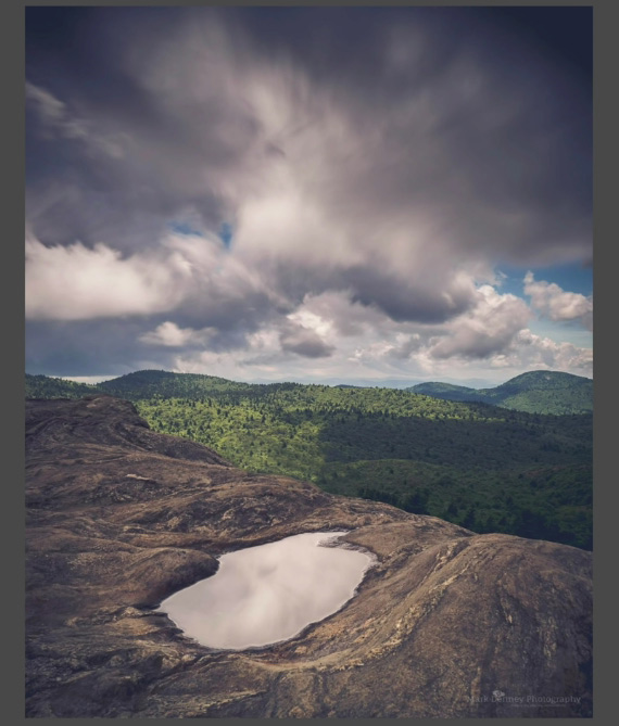
Similarly, photographing landscapes in landscape orientation is most common. There’s nothing wrong with that. However, it is a good idea to flip your camera over to portrait orientation. Doing so allows you to include more of the foreground in your image and adds depth in the process.

“Just shooting in a portrait orientation and getting a little bit lower to the ground really enhanced my composition. And I think that was probably a big step forward in my photography back then.”
2. Busy Edges
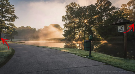
Another common mistake that beginners make is placing elements in the scene too close to the edge. When there are elements too close to the edges of the frame, they don’t get much breathing space. The image looks congested.

“I try and keep the edges of my photos as clean as possible because I want the viewer’s eye to be directed toward the center part of my photograph.”
Having busy edges is distracting, and it drives attention away from the main subject. If viewers start looking at the edge of the photo, there’s a greater likelihood that they’ll stop looking at your photo.

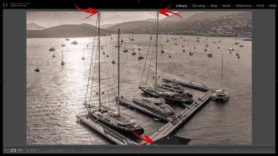
Also, be aware of cropping out elements at the edges of your frame. You might have been cropping out halves of trees, plants, and rocks. If such elements help balance your photo, include all of them. If they add no value, leave them out entirely. There’s no point in sticking half of them in your composition.
“If you can’t include an entire tree, maybe include half of the tree, but don’t just have like a couple branches sticking in because it kind of looks a little bit sloppy.”
3. Bad Horizons
Be aware of where you want to place your horizon. It’s rare that both the sky and the foreground are equally interesting. So, when placing your horizon, give importance to the sky or the foreground. If the foreground is interesting, include more of it. But if the sky is interesting, leave more of the foreground out and emphasize the sky. Placing the horizon dead center doesn’t make much sense.

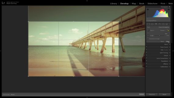
Also, when composing your image, make sure that your horizon isn’t crooked. Sometimes it’s difficult to get a straight horizon on location. In such cases, you can check and fix it in post.

“Nothing can ruin a photograph quicker than a crooked horizon.”
Have you been making these composition mistakes? If you’re not sure, go back and review your old photos.
Go to full article: Landscape Photography: 3 Composition Mistakes to Avoid
What are your thoughts on this article? Join the discussion on Facebook
PictureCorrect subscribers can also learn more today with our #1 bestseller: The Photography Tutorial eBook
The post Landscape Photography: 3 Composition Mistakes to Avoid appeared first on PictureCorrect.
from PictureCorrect https://ift.tt/2PpJMjB
via IFTTT


0 kommenttia:
Lähetä kommentti