Effective composition is a big part of producing eye-catching photos. It isn’t possible to carry out a comprehensive review of the field of composition in a few short paragraphs. Rather, three aspects of composition that tend to be especially important in texture photography will be covered: contrast, curves, and patterns.
Paying attention to these three aspects of composition can definitely make your texture photos shine. So, let’s take a look.

Photo by Angela Redmon; ISO 160, f/5.0, 1/160-second exposure.
Contrast’s Role in Composition
There are two primary types of contrast. The first is tonal contrast. The second is color contrast. Both of these forms of contrast can be used effectively with texture images.
There are two basic methods for using contrast with texture photos. One way to use contrast is within the texture itself. The key point is that contrast enhances the detail in texture and makes it stand out. Consequently, one of the tricks to creating interesting photography is to start off with objects that have good contrast. This shouldn’t be too challenging as there are many such objects everywhere. One example is a rock formation with multi-colored layers.
The second approach to utilizing contrast is to select a background that contrasts with the area of texture that’s serving as the center of interest. When this is done, the textured area will stand out and will attract the interest of viewers of the image. As a result, the goal with this method is to locate objects that contrast in tone or color with their backgrounds. An individual, green vine climbing up a white wall is a good example of an object that would work well with this method.
So, if you want to create eye-catching texture images, a good way to start is to find an object with good contrast; then, illuminate it with side light.
Curves and Texture
Texture can often take the form of curves. These curves can be very effectively utilized for composition purposes. When this is the case, the curves tend to fall into one of two categories: leading curves and non-leading curves.
The purpose of leading curves is to direct the eye of a viewer. Generally, leading curves direct the attention of the viewer to the center of interest of the image. The center of interest is strengthened as a result. The curves in the pedals of flowers that point toward the center of the flower are one example of this use of curves.
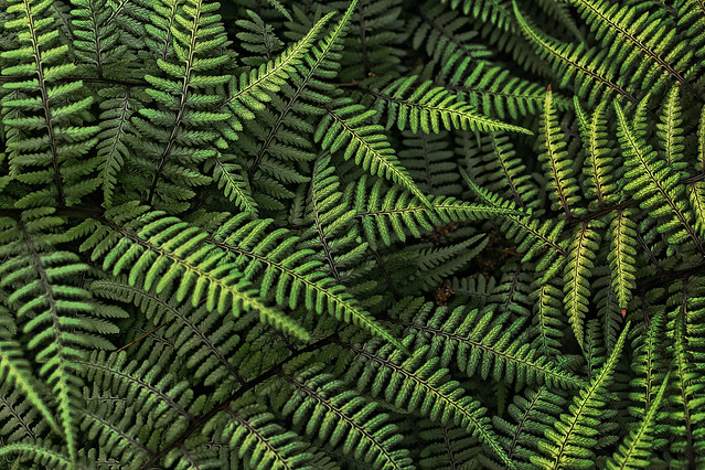
Non-leading curves do not lead a viewer’s eye to the center of interest. The role that this type of curve serves is different in that the curves function to add either emotional or informational content to a texture photo. One need only look at the patterns formed by ferns to see a good example of non-leading curves.

Photo by liz west; ISO 640, f/6.3, 1/500-second exposure.
When utilizing curves, it is very important to use curves that work in harmony with the rest of an image to communicate the primary point of the image.
Patterns
Patterns are often very effective at getting people’s interest. On the other hand, the viewer’s attention can quickly fade if the pattern is rather simple. Therefore, it is necessary to be a little more ingenious when using patterns if we wish to maintain a viewer’s interest for a longer time. There are two approaches to using texture patterns that can create more fascinating patterns. The approaches are multiple patterns and breaking the pattern.
The first approach is to use two or more patterns in the same image. However, the patterns must be used in a way that strengthens both patterns. An example is a flower close-up shot where the texture pattern of the center of the flower is matched with the texture pattern of the pedals.
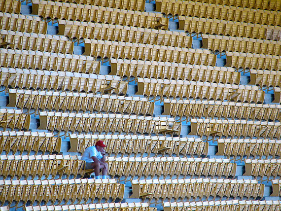
The other option is to break the texture pattern. This is usually done by placing an object into the pattern. A single rock in a field of clover is a good example of breaking a pattern.
The image should be composed so that the inserted object improves the composition. One way that this can be done is to apply a composition rule (such as the rule of thirds or the golden triangle) in placing the object.

Photo by Harold Neal
The information in this article provides a good groundwork for creating texture photos, but it’s just the beginning. There’s much more information available about the field of texture photography. Always remember, the more you master, the better your images become.
About the Author
Ron Bigelow (www.ronbigelow.com) has created an extensive resource of articles to help you develop your photography skills.
Go to full article: Texture in Photography
What are your thoughts on this article? Join the discussion on Facebook
PictureCorrect subscribers can also learn more today with our #1 bestseller: The Photography Tutorial eBook
The post Texture in Photography appeared first on PictureCorrect.
from PictureCorrect https://ift.tt/2NRTBDW
via IFTTT


0 kommenttia:
Lähetä kommentti