That’s deliberate—‘for’ black and white—-not ‘in’, because digital has reversed the decisions and choice that used to accompany this, the most traditional form of photography. Even acknowledging a newish specialist trend toward monochrome sensors, digital black and white starts with the color information collected by the Bayer filter in front of the sensor, and this influences shooting in two major ways. One is that you can turn any color into any tone, which liberates your interpretation (as Ansel Adams used to say) hugely. The other is that you can decide whether the shot is going to be black and white at any time during your shooting, even years later.
So, it’s hardly surprising that with all this choice, there’s a more pressing need than ever to have your own good creative reasons for doing this conversion. Here are ten suggestions.
1. Drama

Because black and white isn’t in the first place bound by any expectations that it’s realistic, it can take more extreme processing—conversion, if you like—than can color. Exaggerate contrast in color and it will simply look exaggerated and incompetent. Do the same with black and white and it becomes dramatic. As in the example here, that could mean making blue skies black. Extreme blacks and extreme whites are within the aesthetics of black and white imagery.
2. Subtle grays
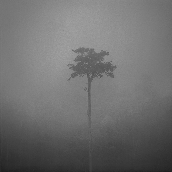
But historically, black and white has an opposite tradition, that of the long grey range, avoiding the harsh extremes. It comes from older, legacy darkroom printing methods, notably platinum and palladium. Removing color simplifies the tonal scale, and allows a clearer, purer concentration on the subtleties of transition between shades of grey.
3. High key

High key is a term from early cinema, where it meant something rather different from the way we use it today. It meant balancing the lighting ratio so that there were no deep shadows. Now it basically means a treatment that is overall bright, though not over-exposed. For it to work well, you need smaller darker elements in the frame. So, while the contrast over most of the image is very low, when you include the small darker parts there’s actually a full range of contrast, and as in the example here, the main subject can be very small and dark. High brightness and contrast throw emphasis on whatever smaller darker areas remain.
4. Low key
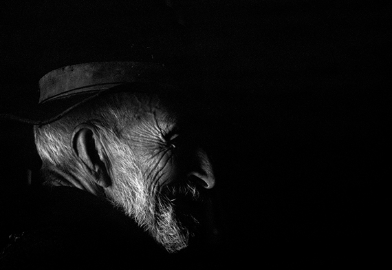
Low key is another cinema term that’s migrated to our world of still photography. It was the basic lighting technique of film noir, as in Creole Reed’s The Third Man with Orson Welles, and is overall dark. Nevertheless, it relies on both a very high contrast ratio and incomplete lighting on the main subject. Rim or edge lighting is very typical of a low key shot, as in the example here.
5. Line and shape
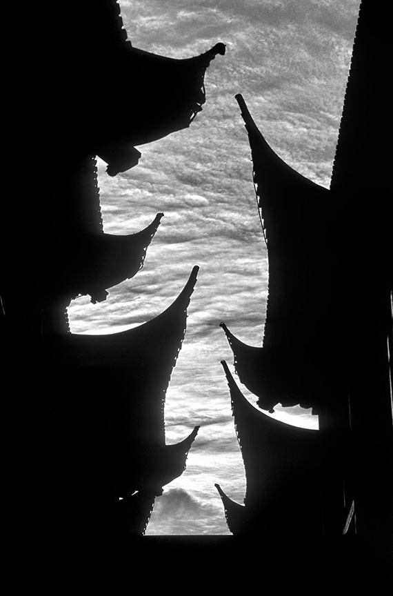
One of the most basic qualities of any image is the shape of the subjects inside it, and this usually depends on outline. Remove color and these qualities naturally spring forward to catch attention. Strong edge contrast is a key technique for emphasis, so that dramatic conversion, which we began this article with, typically reveals line and shape clearly.
6. Modeling and depth

Another classic image quality is form, which means basically the roundedness and volume of a subject. Lighting is key, and a steady gradient from dark to light around an object always works, which makes broad directional light, as from a window, a favorite technique. The Dutch masters of the Golden Age perfected this technique, and when you shoot in black and white, the modelling on the subject takes even more attention.
7. Weak colors
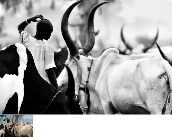
Of course, it’s a matter of taste (but then, isn’t all photography?), but you may simply find the colors you’re presented with insipid. This, and the next two reasons, are essentially ‘corrective’, meaning that black and white is doing a problem-solving task, when the conditions you’re shooting in aren’t satisfying you. Black and white allows you to escape the problem, especially if you go for the drama of extremes.
8. Distracting colors
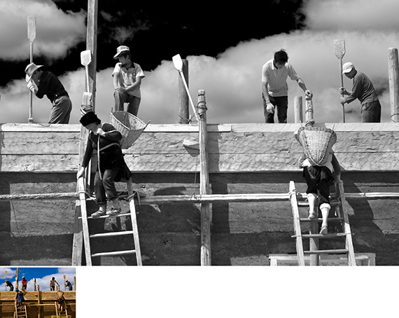
Or, rather than being weak and not to your taste, sometimes there’s a color element or two that simply takes the attention away from where you want it to go. Yes, of course a striking spot color—color accent—can be the whole point of a photograph, but when it gets in the way of something else you want to show, black and white can be the solution. Better still, you can blend that color with its surroundings to essentially eliminate it
9. Harsh light
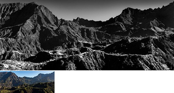
Color and light go hand in hand, and just as you may find some colors unappealing, some kinds of light may not be to your taste. Hard midday sunlight is one kind that many photographers prefer not to work in (although it’s important not to make a rule out of this and slavishly follow the common recommendation to work in the Golden Hour). If this happens to you, then on the same principles that worked for the first reason in this article—dramatic extremes—monochrome works surprisingly well in strong, harsh lighting. Make a virtue of had light and high contrast, and you can even exaggerate it with impunity in black and white.
10. Continuity

Finally, black and white has a valuable and often-overlooked quality. It brings uniformity to a series of images. Series, you may query? So what? Well, nowadays we’re all in charge of the presentation of our images, mainly on our website galleries. Few of us show only one image. We show a number, often in a click-through sequence. One factor is of course to have an entertaining variety, but sometimes, say with a single theme or story, you might want to have the set of images simply hang together as a unit. Monochrome does this naturally. Worth a thought.
About the Author:
Michael Freeman, professional photographer and best-selling author, has worked for clients that include all the world’s major magazines, most notably the Smithsonian Magazine. Of his many books, which have sold over 4 million copies worldwide, more than 60 titles are on the practice of photography. His latest book is Black & White Photography: The Timeless Art of Monochrome.
Go to full article: 10 Reasons to Shoot for Black and White
What are your thoughts on this article? Join the discussion on Facebook
PictureCorrect subscribers can also learn more today with our #1 bestseller: The Photography Tutorial eBook
The post 10 Reasons to Shoot for Black and White appeared first on PictureCorrect.
from PictureCorrect https://ift.tt/2gsi0le
via IFTTT


0 kommenttia:
Lähetä kommentti