When it comes to selling products, how those products appear to your customers matters a lot. It’s even more important for online stores as the customers can’t touch and feel the products. But, taking photographs of products with shiny surfaces can be a challenge. In the following video, photographer Andrew Boey shows the easiest and the fastest way to shoot commercial quality photos that have the “product floating in mid-air” look:
Use a Clear Stand
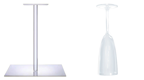
Visit your local acrylic store to see if they can make a small acrylic stand for you to place your products on. An alternative is an inverted champagne glass. Just place the product on the inverted base at the top. Using something that is almost transparent as a base to place products will make them look like they’re floating.
Product Placement and Background Lighting
Place your stand on any piece of furniture and place the product on the transparent base. Make sure that the wall is at least 3 to 5 feet away from the product. Walls with neutral color work great to prevent color cast. White or grey is a good choice.
For background lighting, place one speed light on either side of the product. Make sure to point the speed light towards the wall. Adjust the power settings on the speed lights in such a way that if you just take an image of the blank wall, the histogram at the back of your camera should be pushed all the way to the far right. Usually, the speed lights produce pure white background at either 1/2 or 1/1 power setting. A perfectly white background also ensures that the acrylic stand or the champagne glass becomes invisible.
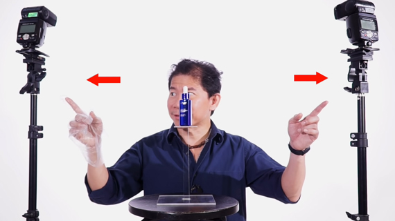
Note: To avoid fingerprints and smudges on the product, wear gloves while handling the product.
Product Lighting
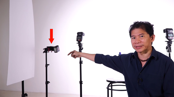
To complete your setup, clip a white mounting board or a flag on a light stand to be used as a white surface and place it to the side of the product. Point a speed light toward the white surface so the light from the speed light can bounce on the flag and light up the product.
Taking the Photo
One you have these three things covered, the next step is to go ahead and take the photo.
- Decide how much depth you need for your product photo and set the aperture accordingly. For his photo, Boey uses f/11 for a greater depth of field.
- Use the lighters’ cheat-sheet to determine the power you need for your setup. For Boey’s setup, according to the cheat sheet, at f/11 the flag cuts away 2 stops. To gain back that two stop, he increases the power of the light that is lighting the product by 2 stops (1/8 to 1/2) as his flag is 3 feet from the product.
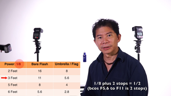
Lighters’ Cheat-sheet
However, keep in mind that the lighters’ cheat sheet is just an estimation and you might need to fine tune the settings depending on what results you get. Keep an eye on the histogram.
After you’re done with the photograph, you might want to zoom in to have a closer look at the image. The image will reveal some scratches and other imperfections on the product. And since we’re using a light source only on the one side, the logo will turn out brighter on one side and darker on the other. Photoshop is your friend to touch up and make the product look flawless.
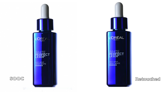
Using this basic guide for product photography, see how you can build on it to get better images.
Go to full article: Product Photography Tutorial for Online Stores
What are your thoughts on this article? Join the discussion on Facebook
PictureCorrect subscribers can also learn more today with our #1 bestseller: The Photography Tutorial eBook
The post Product Photography Tutorial for Online Stores appeared first on PictureCorrect.
from PictureCorrect http://bit.ly/2FJwUm3
via IFTTT


0 kommenttia:
Lähetä kommentti