It’s one thing to admire a photographer’s work, but it’s entirely something else to replicate it. Oftentimes, you will hear people remark that a photographer has “the eye” for it. Yet, that makes it sound like a predetermined ability instead of acknowledging that amateur photographers can study and experiment composition to improve their landscape work. Photographer Nigel Danson shows his tips to improve your landscape compositions:
1. Look First, Photograph Later
Leave yourself time to explore an area that you intend to photograph. Although the light might be changing or receding, the best photos come from knowing your angles and how the light will affect the scene. Danson suggests composing through a smartphone before you even get your camera and tripod out.
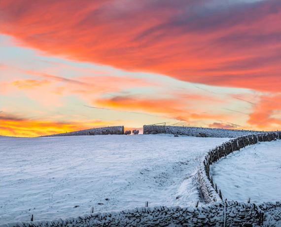
Search for a point of interest in your composition. A sunrise or sunset can always be beautiful, but will likely look generic if there isn’t a creative element included. Danson’s first example shows a colorful orange sunset over a herd of sheep enclosed between the walls.
After that, find a way to direct the viewer’s eye to your point of interest. You don’t want to have distracting elements on the sides or corners of your image that will drive the attention away from that point.
Danson’s keys to look for in the initial composition before you actually start taking photos are focus, light, interest, corners, and simplicity.

2. Find Patterns
Scour the landscape for repetition and simplicity. These two push the viewer’s eyes to the striking point of interest.
3. Use Lines and Shapes
Most images have “visual weight,” which indicates where your eye lands when first looking at a picture. By using lines and shapes in your composition, you can direct the viewer’s attention through the details on to your point of interest. The goal is to move their gaze around your image to absorb more than just the focal point.
4. Move from 3D to 2D
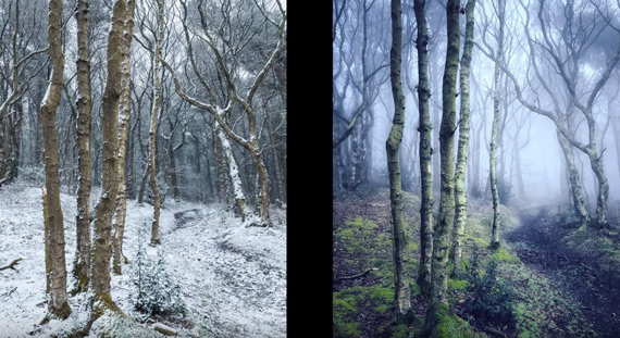
When you’re scouting the landscape, your eyes obviously view your surroundings as three dimensional. However, images on your camera and computer screen are two dimensional and need depth and detail to convey what you originally saw. For example, Danson suggests finding texture or using fog to create this effect in your work.

5. Tell a Story
Try using color to convey a feeling throughout your landscape. Danson’s example shows cool colors in the snowy foreground, but then warm, orange sunlight creeping in on the mountain peaks in the background.
6. Use Negative Space
Negative space can be used to your advantage to push more attention to interesting details in your composition. For example, negative space around a mountain peak shows the grandeur of the size and height.
7. Remove Distractions
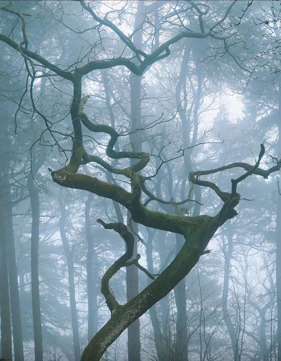
Unnecessary details or elements in your composition can create distractions from the point of interest or overall movement. In Danson’s example, there is a striking tree in the foreground overwhelmed by the vertical lines of the trees directly behind it. When fog is added, the background trees change exposure and lose detail, essentially pushing the foreground tree further into view. You can also try cropping your image to see if there are distractions to remove from the sides or corners.

There you have it—seven tips for improving your landscape compositions. Like always, practice makes perfect, so the best thing for you to do is get out there and put these tricks to use!
Go to full article: 7 Ways to Improve Your Landscape Compositions
What are your thoughts on this article? Join the discussion on Facebook
PictureCorrect subscribers can also learn more today with our #1 bestseller: The Photography Tutorial eBook
The post 7 Ways to Improve Your Landscape Compositions appeared first on PictureCorrect.
from PictureCorrect https://ift.tt/2HsZGIE
via IFTTT


0 kommenttia:
Lähetä kommentti