It’s disappointing when you come home from a day of shooting only to find that your photos aren’t what you had hoped. You might have put in a lot of time and effort, but things don’t work out every time. It’s important to understand why things aren’t working for you so that you can tackle the problem. Photographer Nigel Danson discusses 7 principles to help you understand what you can do to improve your photos:
1. Edges
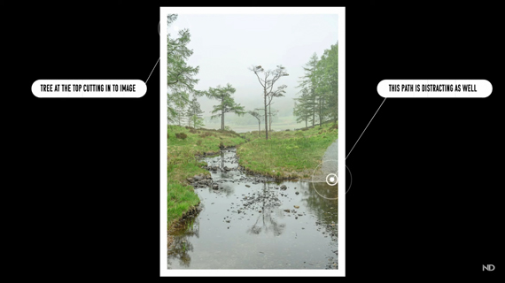
When composing the shot, you can get so engaged with the subject that you end up paying less attention to the edges of the frame. This can lead to distractions creeping into the frame. You can try cropping in post, but that doesn’t always work. Spend a little time patrolling the edges of your frame before taking an image.

2. Route Through
“Try to think when you compose your image how your eye is going to go through that image.”
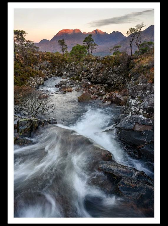
If you can guide a viewer through your image, it becomes more engaging. Use natural structures like rivers, streams, riverbanks, or rock formations as leading lines to engage your viewers.

3. Simplicity
Simple images usually make for the best images. But when it comes to landscape photography, simplicity can be difficult.

A busy landscape image
“Simplicity is something that nature is not great at.”
However, as a photographer, it’s your job to simplify the complexities and nature by composing in a way that makes the image as easy as possible to interpret. To do so, you may need to compose with fewer elements, and that’s okay. If the scene in front of you is overwhelming, try zooming in. This breaks the image down into something simpler.

The above image made simple by zooming in
4. Resting Point
“You need to have somewhere in your image where your eye can rest.”
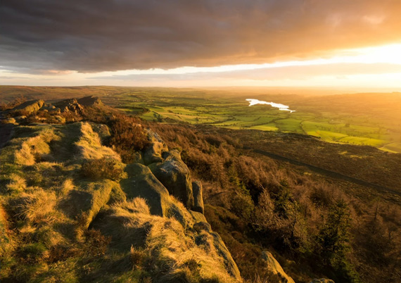
Once you draw the viewer’s attention toward your image, it must lead somewhere—a point in the image where viewers can pause and interpret the story that you’re trying to tell. Having a resting point makes the image more dynamic.

The lake acts as a resting point for this image.
5. Separation
Separation adds a sense of contrast and depth to an image. Maintain some level of distance between subjects and between the subject and its surroundings.

“By having that separation, it just makes it a more powerful composition and a better photo.”
6. Space
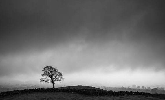
When composing your images, make sure that you leave space around your subject. Space is essential for the subjects to “breathe.” Otherwise, the image just feels too restrictive and confined.

“I tend to think about the bottom as having space that you can go into the image and the top of having space that holds you into the image. And if you think about those two things together, that can really help.”

Use of negative space
7. Balance
Balance is about composing with the right amount of emphasis on the various elements in an image. For your image to be effective, there should be a balance between the foreground and the background and the subject and its surroundings.

Overpowering foreground bringing about an imbalance in the image

Proper balance in the foreground, mid-ground, and background
These simple but powerful principles should help you improve your photography. Give them a try and let us know how it goes!
Go to full article: Improve Your Photos: 7 Simple Tips
What are your thoughts on this article? Join the discussion on Facebook
PictureCorrect subscribers can also learn more today with our #1 bestseller: The Photography Tutorial eBook
The post Improve Your Photos: 7 Simple Tips appeared first on PictureCorrect.
from PictureCorrect https://ift.tt/2D0tZBI
via IFTTT


0 kommenttia:
Lähetä kommentti