Do you know what it takes to create a vintage fashion photo? Fashion photographer Lindsay Adler chooses one of her beauty photos and deconstructs it so we can see not only the gear it takes but also the inspiration and thought process behind it:
High-end studio photography doesn’t have to involve a lot of gear. It’s more about how you use it. Adler wanted to create an image that was “clean and timeless but also creative.” She chose to go with a classic black and white vintage look with hard light, crisp shadows, and blown out highlights.
We’re so often taught to avoid hard light and especially blown out highlights, but there’s a time and a place for everything. Hard light can be an especially powerful tool, especially when creating vintage-style images.
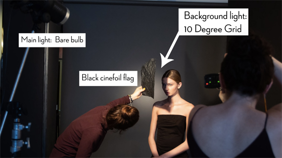
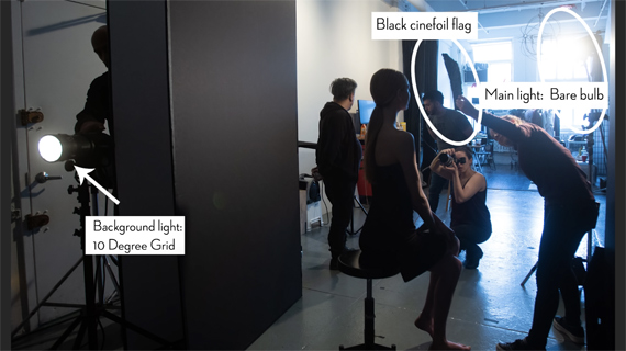
Back to the gear. To create this photo Adler uses only two lights: a bare bulb on a Profoto D1 as a key light and a Profoto D2 with a 10-degree grid as a background light. The background light serves to create some separation of the subject from the background, leaving the key light as the only illumination source.
The only other elements are a piece of black cinefoil to create the shadow and a black v-flat to prevent any spill from the background light or any light bouncing back onto the subject from the walls.

If you’re wondering, cinquefoil is black tin foil made for putting on lights (it can take high heat). The closer it’s held to the model, the more defined the shadow will be. Adler wants a very defined shadow, especially on the subject’s jawline, so the foil is being held quite close.
Here’s another view, looking out from next to the background. The v-flat is on the photographer’s right, and the background light is behind it.

Adler may not be using a lot of gear, but she sure does seem to have a lot of assistants!
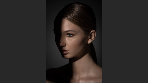
Here’s the straight-out-of-camera shot, taken on a Canon 5D IV with a Canon 70–200mm f/2.8 lens:

Canon 5D IV + Canon 70-200mm lens; 1/200 second | f/8 | ISO 100
To process the raw photo, Adler uses a combination of Lightroom and Photoshop. She begins with basic editing in Lightroom, increasing the contrast, changing it to black and white, and popping up the highlights on the skin.
For retouching, though, she’ll need Photoshop. There she edits out the earrings and ponytail. The earrings are a bit too modern for the look she’s going for and the ponytail muddies up the lines of the back of the neck. Next, she lengthens the neck (that takes some practice!) and removes the white highlight in the bottom left.
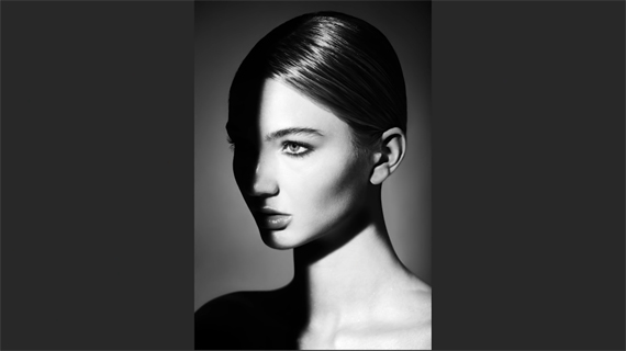
The end result is clean, bold, and quite defined:

Adler describes black-and-white vintage imagery as “so timeless and it never ages,” yet she didn’t want to merely recreate a look. That’s where the creativity came in—in the form of cinefoil and hard shadows.
There’s not really much to it once you have the idea in mind. Two light sources, a background, a v-flat, and a bit of creativity. You could even rig a lightstand to hold the cinefoil if you don’t have any assistants handy.
What do you think? Worth the effort?
Go to full article: Vintage Beauty Photography Tutorial
What are your thoughts on this article? Join the discussion on Facebook
PictureCorrect subscribers can also learn more today with our #1 bestseller: The Photography Tutorial eBook
The post Vintage Beauty Photography Tutorial appeared first on PictureCorrect.
from PictureCorrect https://ift.tt/2JB2d2Y
via IFTTT


0 kommenttia:
Lähetä kommentti