


This article is based on concepts from The Photography Action Cards which are currently 88% off for a summer sale.
If you conduct a search on websites like Flickr, 500px, or Instagram using the search phrase, monochromatic color, you’ll see a confusing array of pictures that have been tagged with this art terminology.
Let’s begin this Quick Tip with some definitions and examples.
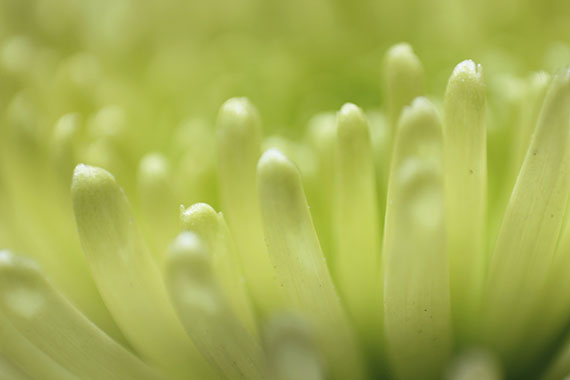
Photo by Jen Theodore
Monochromatic Color
Monochromatic colors are all the colors of a single hue. Monochromatic color schemes are derived from a single base hue and extended using its shades, tones, and tints.
The above photo is a perfect example of monochromatic color found in nature.
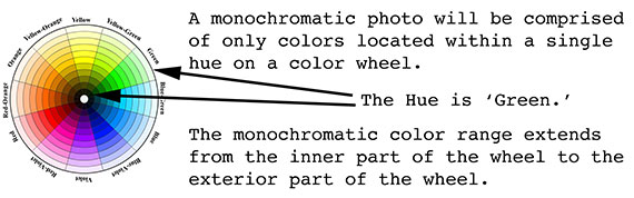
Photo by Kent DuFault
Quick Tip: When you create a monochromatic color photo, it’s said to have a Monochromatic Color Scheme. The term Monochrome is interchangeable with Monochromatic when referring to color photography. However, Monochrome is also used to describe a black and white photograph. This can be confusing because we don’t think of a black and white image as having color. However, when using the term Monochrome to describe a black and white photo, the color is gray. A black and white photo is comprised of varying tones of gray from black to white.
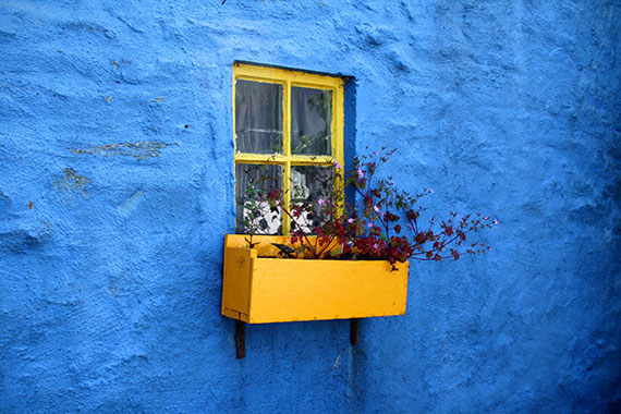
Photo by Vincent Giersch
The photograph of the window, with the window box and flowers, was tagged on a popular stock photography website as having monochromatic color.
Does it have a monochromatic color scheme?
One might be tempted to say, “yes,” because of the disproportionate amount of blue within the scene.
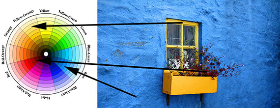
Photo by Vincent Giersch with edits by Kent DuFault
However, we can plainly see that there are three distinct color hues in this shot. This photo was mislabeled as a monochromatic color image. Instead, it relies on the composition tool known as Color Contrast. It’s actually displaying what’s known as a Three-Point, Tricolor, Color Scheme.
Why should you consider using monochromatic color in your photos?
Quick Tip: Monochromatic color creates a mood. It influences the mind to perceive certain values and situations. It also evokes a sense of unity.
Have you ever noticed that in the movies, when a scene is shot in a hot location, such as a desert, the film director will have a yellow-orange monochromatic color scheme over the entire frame? This creates the feeling of heat. How about a scene set in Alaska? Chances are it will have a monochromatic color scheme set in blue. Blue monochromatic color evokes a feeling of cold.
According to Gestalt Theory, (an advanced study on art composition and perception), our brain relies heavily upon pattern recognition to give context to the content of a photograph. The more patterns we find – for example, repeated monochromatic colors in a single scheme – the easier it is to process the image. That, in turn, makes us more likely to find the photograph pleasing.

Photo by Kent DuFault
Have you ever wondered why sunset photography is always liked and admired?
The answer is easy. These photos generally display a monochromatic color scheme!
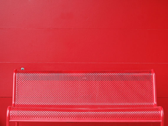
Photo by Matese Fields
Quick Tip: When creating a monochromatic photo, make sure that there are no opposing colors within the shot!
When you look at the example photo (above), where do the eyes immediately travel? They probably go straight to the metal bracket on the wall to the left. They do this because of the color contrast. The metal bracket is an opposing color (on the color wheel) to the rest of the scene, and it ruins the impact of an attempted monochromatic color scheme for this picture.

Photo by Matese Fields with edit by Kent DuFault
Look what happens when the metal bracket is brought back into the monochromatic color scheme? The image now has unity, as it was initially intended.
Is monochromatic color right for every scene and situation?
Certainly not. But, when the time is right, using this knowledge will help you create a dazzling photo that will knock your viewers’ socks off!
About the Author:
Kent DuFault is an author and photographer with over 35 years of experience. He’s currently the director of content at the online photography school, Photzy.
For Further Training, Deal Ending Soon:
With summer here and readers looking for more photography practice near home, we were able to get another huge markdown on the popular Photo Action Cards – which includes a card specifically on monochromatic color. Expand your photography skills with 65 printable project sheets that will give you over 200 photography assignments, covering everything you can imagine. They are currently 88% off until the end of the month, August 31, if you want to try them out.

New: The Photography Action Cards (Click to See How They Work)
These Action Cards discuss a photographic topic, provide you with suggested considerations, and give you specific photographic assignments. They’ll kick you out of the “nest” to go have a personal discovery experience all on your own. P.S. try the coupon code picturecorrect at checkout for even more of a discount which ends soon.
Only a few days left: The Photography Action Cards at 88% Off
Go to full article: Monochromatic Color Photography Tips
What are your thoughts on this article? Join the discussion on Facebook
PictureCorrect subscribers can also learn more today with our #1 bestseller: The Photography Tutorial eBook
The post Monochromatic Color Photography Tips appeared first on PictureCorrect.
from PictureCorrect https://ift.tt/3lqHdwF
via IFTTT

0 kommenttia:
Lähetä kommentti