sunnuntai 28. helmikuuta 2021

PictureCorrect.com: How to Keep Your Street Photo Editing Simple

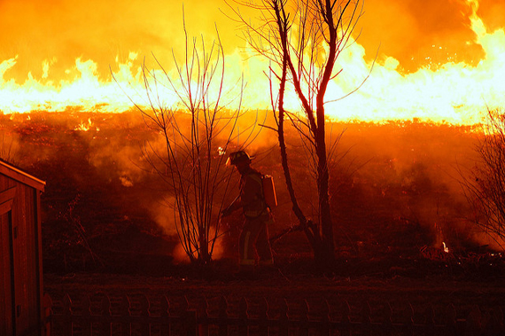
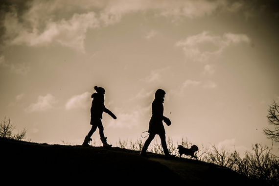
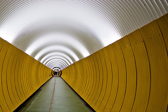
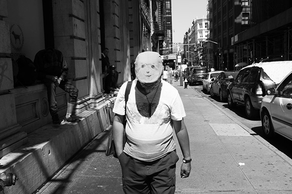
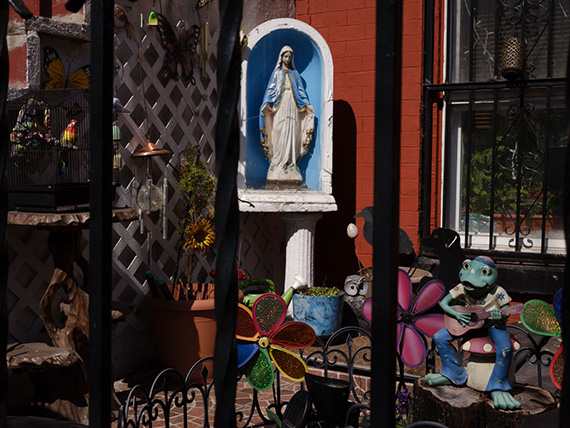
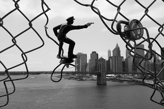
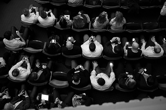
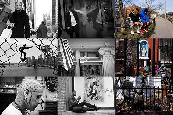
The essence of street photography is all about real, unplanned, special moments—going out into the world to see what you can find and relate to and bringing these moments back to share.

keep it simple street photography editing

But too often, photographers take these special moments and edit them to death, trying to over-perfect them—and this just diminishes the spontaneous, special feeling that great street photography can create.

So here are a few tips to keep it simple when editing your street work.

The 5-minute rule

While there will always be problem photographs, if you can’t get your photograph to a general place you like within five minutes (and often less), then perhaps it’s not good enough in the first place.

keep it simple street photography editing

I will often come back and re-tweak my street photos with a fresh eye, but still, I try to keep things simple enough that it really doesn’t—and shouldn’t—take too long.

When you spend too long on photographs like these, the effects tend to be over-done and the photographs start to look fake. The last thing we want is for our street work to look fake, since it is a genre that’s meant to feel real. (With exceptions of course.)

Embrace imperfection

I can’t tell you how often I’ll be working with another photographer and they’ll show me an incredible moment and say something like, “I just wish I hadn’t cut off the person’s foot.”

keep it simple street photography editing

It’s usually something I didn’t even notice. Especially if you come from a landscape or portrait photography background, where perfection means a lot, this can be a tough habit to break.

But imperfection is at the heart of street photography. Of course, these imperfections can easily ruin a photo, but if the moment is interesting and special enough, these imperfections can often just make the photo that much better and more real.

Embrace skewed photographs, blur (whether purposeful or by accident), things getting in the way that you didn’t plan, blown-out highlights, all of that type of stuff. Think about whether it harms the photograph—or if it’s just part of what happened in that unique moment.

I think you’ll find, over time, that you will grow to love these imperfections.

Consistency

Consistency can be important in your work. While different projects and prints can certainly look completely different, if you’re creating a cohesive body of work, it can (usually but not always) be beneficial to keep things consistent.

keep it simple street photography editing

This means it can often be a good idea to keep a body of work in all color or black and white, to keep the color quality consistent, to keep your aspect ratio consistent, and so on.

This will keep your viewer focused on the content of the work instead of being taken away by photos looking completely different. And the other benefit is that it will make your editing that much more simple!

Crop, color profile or black and white, color temperature, exposure, contrast, black levels, highlights, clarity (sparingly), saturation (sparingly), vignette

These are the sliders that I strictly use about 99% of the time, and very often it’s only a few of these and sparingly. I look through them in this order but often will skip many. Having an efficient way of looking through your sliders will speed you up and allow you to become very intuitive with your editing.

keep it simple street photography editing

For those who don’t know about color profiles, in Lightroom, you can select a color profile that comes from your camera (Fuji has excellent ones). After cropping, this is my first major step for color images that will dictate everything else. I don’t always choose a color profile from the camera, but I always go through to see if one will look better.

Let it go

keep it simple street photography editing

If you have to do too much, it just might not be a great photo. Letting go is just as important as anything else.

Sometimes we get too attached to the feeling in the moment we took the shot and the hope that it would be great, and try to do everything we can to turn it into a great photo. But when it doesn’t work, it just doesn’t work.

For Further Training:

This new in-depth course shows you James Maher’s entire street photography editing process from beginning to end. We were able to negotiate a 37% discount today – simply use the coupon picturecorrect at checkout.

street photo editing

Street Photography Editing Course (see what’s inside)

We all take a ton of bad street photographs. It’s the best photographers who can weed out the strongest work, organize it correctly, and figure out how to grow a vision while presenting it in an effective manner.

Deal ending soon: Street Photography Editing Course at 37% Off


Go to full article: How to Keep Your Street Photo Editing Simple

What are your thoughts on this article? Join the discussion on Facebook

PictureCorrect subscribers can also learn more today with our #1 bestseller: The Photography Tutorial eBook

The post How to Keep Your Street Photo Editing Simple appeared first on PictureCorrect.


from PictureCorrect https://ift.tt/3r3Khl1
via IFTTT

PictureCorrect.com: Interesting Photo of the Day: Beetle Sunset Silhouette

This amazing photograph of a bluemint beetle against the backdrop of the setting sun is an amazing capture. It was taken by Abhy Shék and described perfectly by Reddit user joelhagraphy as “Jurassic Park meets a Bugs Life meets Lion King”. Captured with a Canon 6D Mark II and 24-105mm kit lens, in many ways it is just that; an imaginative combination of these three movie favorites.

Bug against setting sun creates an amazing image

Bluemint Beetle at Sunset by Abhy Shek (Via Reddit. Click image to see full size.)

The fact that there’s another small bug, probably a fly, behind the bluemint beetle will resonate with Lion King fans. It makes you think of a king and his son looking out on to their kingdom. At least, that’s what I thought when I looked at this image for the first time.

My takeaway from this picture? You don’t need fancy locations or expensive models to make a compelling image. Sometimes, you need to change your perspective and appreciate the little things around you. Like this bluemint beetle, and the other little bug, that made this a wonderful image.


Go to full article: Interesting Photo of the Day: Beetle Sunset Silhouette

What are your thoughts on this article? Join the discussion on Facebook

PictureCorrect subscribers can also learn more today with our #1 bestseller: The Photography Tutorial eBook

The post Interesting Photo of the Day: Beetle Sunset Silhouette appeared first on PictureCorrect.


from PictureCorrect https://ift.tt/3kvRxn0
via IFTTT

PictureCorrect.com: Portrait Composition Tips with Background Considerations

When you think of portrait photos, you might think that all you need is an 85mm lens, a camera, and a pretty model. Simply capture the face in the frame and that’s it. You have a nice portrait image. However, the pros know there’s more to it than that. This video on compositional tips for portrait photography by Julia Trotti is to help beginner portrait photographers – those who might not know that there’s more to creating a good composition with portraits:

Some of the interesting compositional tips that Julia shares are:

  1. Never crop out the feet when shooting full-body portraits.
  2. When shooting mid-length portraits crop above the knees rather than below.
  3. Keep the subject’s face as the center of focus for sitting down portraits. It also helps keep distortions at bay (especially with a lens like the 35mm which is unconventional for portraits).

She loves shooting with a 35mm lens – an unconventional choice for portraiture, no doubt. With a wide-angle lens like that you must get in close to be able to make a good composition.

She justifies the use of the lens by stating that she loves leaving negative space around the subject. We happen to like this technique a lot too. What do you think about it? Let us know in the comments.


Go to full article: Portrait Composition Tips with Background Considerations

What are your thoughts on this article? Join the discussion on Facebook

PictureCorrect subscribers can also learn more today with our #1 bestseller: The Photography Tutorial eBook

The post Portrait Composition Tips with Background Considerations appeared first on PictureCorrect.


from PictureCorrect https://ift.tt/301Waf8
via IFTTT

lauantai 27. helmikuuta 2021

PictureCorrect.com: Photo Composition: How to Tell a More Compelling Story

They say that a picture is worth a thousand words. That means that your photographs should be a great way for you to communicate. The question is, do your photographs communicate the right thousand words to tell your story?

best composition story

Photo by E_Bass; ISO 400, f/4.5, 1/45-second exposure.

Have you ever had the experience of photographing in a wonderful location, feeling eager to rush home and look at your pictures, only to be disappointed in the results? It’s quite a challenge to convert a three-dimensional, full sensory experience into a two-dimensional photograph.

I would like to share a few tips on composition that I think can boost your success rate in capturing your experience while photographing. Instead of just raising your camera for a quick snapshot, take the time to make a careful composition that will guide your viewer to understand what you think is important in the scene, and even how you feel about it.

Tip #1: Choose colors and tones that reinforce your story

Light is the fundamental building block of any image. Light produces two kinds of contrast: color contrast and tonal contrast. Color is the hue that you see, like red, or green, or purple. Tone is another word for brightness, or how light or dark something is. Our brains are good at forming associations, and we associate colors and tones with particular feelings. These same associations appear in our spoken language. You’ve heard the expressions, “He was in a dark mood,” and “She was feeling blue.”

Blue connotes melancholy or tranquility. It’s also a color associated with stability and reliability. (What color are the logos of IBM, Microsoft, and Ford?) Red is the color of passion. Photographing an orange beach umbrella gives a stronger impression of a hot day than a purple one. Using dark tones creates a sense of gloom and foreboding. Light-toned images make us feel light-hearted and uplifted. Consider carefully whether the tones and colors in your image strengthen the story you want to tell or contradict it.

composition by professionals

Photo by Susanne Nilsson; ISO 200, f/11.0, 1/1000-second exposure.

Tip #2: Use lines to guide your viewer’s eye

Color and tone also reveal lines in your image. Lines are the boundaries created where two contrasting colors or tones meet. A thin shape, like a road, the stem of a plant, or a tree branch, may also be perceived as a line in your photograph. The brain’s visual cortex is programmed at a fundamental level to follow lines.

This is a powerful tool for you as a photographer. You can guide your viewer’s eye toward what you consider important in the image by using something in the environment to point to it. Conversely, be careful not to inadvertently place lines so that they lead your viewer out of the image.

Tip #3: Orient the lines in your image so that they convey the right emotion

Just as with colors, our brains also make emotional associations with line orientation. Vertical lines in an image give an impression of power, strength and pride. Horizontal lines are stable and calm. Diagonal lines, on the other hand, are dynamic, and signify motion or change. Curved lines may convey a sense of melancholy or of hope, depending on the direction in which they curve.

composition tips

Photo by Mike Steinhoff; ISO 200, f/5.0, 1/125-second exposure.

Think carefully when composing your image so that you include colors, tones, and lines that reinforce the story you’re trying to tell. You’ll be much more likely to create a photograph that captures and communicates how you felt when you were observing the original scene.

About the Author:
Julie Waterhouse writes for Ultimate Photo Tips, which provides friendly education and encouragement for photo enthusiasts around the world, presented in a way that’s clear, organized, and easy to understand (ultimate-photo-tips.com). Whether you’re looking for the answer to a specific question, or just want to explore and learn.


Go to full article: Photo Composition: How to Tell a More Compelling Story

What are your thoughts on this article? Join the discussion on Facebook

PictureCorrect subscribers can also learn more today with our #1 bestseller: The Photography Tutorial eBook

The post Photo Composition: How to Tell a More Compelling Story appeared first on PictureCorrect.


from PictureCorrect https://ift.tt/2KSG12E
via IFTTT

PictureCorrect.com: Interesting Photo of the Day: Snow Dog Portrait

Often times, even the simplest of images can be interpreted in various ways – perhaps literally or figuratively. Consider the following image that photographer Simon Huntley took of his pet. Depending on what you think you’re looking at, you might come to some interesting conclusions about it. Have a look:

snowy bear like dog

“A Dog Bear” by Simon Huntley (Via Reddit. Click image to see full size.)

The image is in fact of his dog which is a Chow and Australian Shepherd mix. Because of how close he was when taking the shot, and because of the dog’s build, you might easily confuse it with an image of a bear. You can see how close Huntley was just by looking at the crisp details on the dog’s piercing eyes.

Now, if you take into account the snow on the dog’s pitch-black coat, things may appear even more interesting. If you picture the snow as stars, you might interpret the image to be of the night sky. And if you look really hard, it also appears like what you see when looking up at tree branches against the sky.

This image is a simple example of how you can use your imagination to interpret an image. What did you first think of when you saw the image?


Go to full article: Interesting Photo of the Day: Snow Dog Portrait

What are your thoughts on this article? Join the discussion on Facebook

PictureCorrect subscribers can also learn more today with our #1 bestseller: The Photography Tutorial eBook

The post Interesting Photo of the Day: Snow Dog Portrait appeared first on PictureCorrect.


from PictureCorrect https://ift.tt/37WJdrA
via IFTTT

PictureCorrect.com: Camera Lens Focus Tutorial

Focus is critical in any kind of photo. You may be able to recover some details in post if you miscalculate your exposure. Or crop the image to adjust your composition. But if it’s out of focus, there’s no cure. So it’s crucial for every photographer to understand how focus works. Photographer Micael Widell explains how focus works and how you can use the distance scale on a lens:

Focus and Focal Plane

Widell uses a simple and effective tool to visualize how focus works: the gradient tool in Photoshop. If you’ve ever used the gradient tool, you may have noticed that it’s darkest at the center and gradually fades off on either side. Focus works in a similar way.

Focus is gradual. The plane in which you place your focus point, called the focal plane, is actually very thin. And as we move away from the plane, the subject gets immediately out of focus. But since focus is gradual, the out of focus areas do not become immediately noticeable to the human eye, and it becomes more prominent as we look at a significant distance from the focal plane.

how camera focus works

It is also very important to understand that if your plane of focus is very close, like in the case of macro photography, or when the subject is close to the minimum focus distance of the lens, the focal plane gets thinner. This is why we get more background blur when shooting something close to the camera.

So remember, focal plane is thinner close to the sensor and wider far from the sensor. If you feel that you’re not getting a blurry background when taking photos of subjects that are far away, try to move in closer and see if that helps.

thin focal plane

Relation Between Aperture and Focus

Aperture is the opening in the lens through which light enters the camera. Besides controlling the amount of light entering the camera, aperture also controls the depth of filed.

Depth of field is the range of area in acceptable focus. Wider apertures, like f/1.4 or f/1.8, have a very shallow depth of field (i.e., the focal plane is very narrow). This results in an image where only a small area is in focus, while the other areas in front and back of the focal plane turn out to be blurry.

On the other hand, narrower apertures, like f/8 or f/11, have a greater depth of field (i.e., the focal plane is relatively wider, resulting in a image where most of the areas are in focus).

Hyperfocal Distance

Have you ever noticed some images where the image seems to be in good focus from the foreground up to the distant background? Chances are that it was shot by setting focus at the hyperfocal distance. Hyperfocal distance is actually the focusing distance at which the depth of field becomes maximum, allowing you to have the frame in acceptable focus up to infinity. Hyperfocal distance is mostly used by landscape photographers to capture images that are sharp from the foreground to the background.

If you happen to have a lens with a distance scale, it is quite convenient to calculate the hyperfocal distance. Just follow these simple steps:

  1. Set the aperture using the aperture ring. For example, let’s say you set it at f/16.
  2. Now pay attention to the distance scale just above the aperture ring. Rotate the focus ring so that the infinity sign coincides with the value 16 on the right (because we have our aperture at f/16).
  3. Note the value that coincides with the value 16 on the left side. Let’s say it’s 5 meters.

Then in this case, it would mean that under these settings, the camera will have everything in focus from 3.5 meters up to infinity.

using distance scale for hyperfocal distance

You may be confused about whether to set your focus on infinity or use the hyperfocal distance when shooting landscapes. As Widell demonstrates, if you have a subject in the foreground and need a shot that is acceptably sharp from the foreground far up to the background, it’s a better idea to use the hyperfocal distance. However, if you’re not concerned about the foreground and need to have the distant subject in focus, set the focus to infinity.

We hope that you learned something from all of these discussions on focus, focal plane, aperture, and hyperfocal distance.


Go to full article: Camera Lens Focus Tutorial

What are your thoughts on this article? Join the discussion on Facebook

PictureCorrect subscribers can also learn more today with our #1 bestseller: The Photography Tutorial eBook

The post Camera Lens Focus Tutorial appeared first on PictureCorrect.


from PictureCorrect https://ift.tt/2NBM6VD
via IFTTT

PictureCorrect.com: How to Use Lines in Photography Compositions

A very powerful method of improving the composition of photos is the use of lines. Properly used, lines can significantly increase the impact of images. Lines serve to affect photographic composition in two ways. First, they serve to create a mood. Second, they lead the eye through the photograph. By affecting mood, lines add emotional content to images. By leading the viewer’s eye, they keep the viewer’s attention focused on the image.

line techniques in photography

Photo by Dun.can; ISO 100, f/8.0, 1/30-second exposure.

When dealing with lines, the subject can be broken into the following types:

  • Horizontal
  • Vertical
  • Diagonal
  • Jagged and irregular
Mood: Horizontal

Horizontal lines tend to indicate a sense of homeostasis (lack of change). This use in an image often projects a feeling that an image, or part of one, is somehow frozen at a point in time. Horizontal lines should be used when a photographer wants to impart a sentiment of timelessness or lack of change to an image. In addition, they can serve to provide a contrast with more dynamic parts of an image. Examples can be found in buildings, horizons, and fallen objects (e.g. trees).

Mood: Vertical

Vertical lines can project either a mood of stability or peace. When projecting a mood of stability, they often function similarly to horizontal lines. This can convey an implication of substance or permanence. Examples of vertical lines used to impart a mood of stability can be found in rock formations, power line poles, and vertical lines of buildings.

Proper use of vertical lines can also impart an impression of peace and tranquility. Examples of this use are trees in a fog shrouded forest, old fence posts on an isolated prairie, and a figure on a secluded beach in the early morning.

how to use lines in photos

Photo by Scott Meis; ISO 100, f/4.8, 1/60-second exposure.

Mood: Diagonal

Diagonal lines can convey a sense of action or make an image more dynamic. For this reason, diagonals are a very powerful tool. Their power resides in their ability to grab the attention of the viewer. The viewer’s eyes tend to travel back and forth along diagonals. Diagonal lines can be formed, not only of objects such as streets or sidewalks, but also of color. For instance, a diagonal section of color can add drama to a flower image. Examples of diagonals are plentiful: roads, streams, waves, and branches are but a few examples of objects that can be utilized in a diagonal manner.

Mood: Jagged and Irregular

Jagged and irregular lines take us one step further on the continuum of emotion and feeling. While diagonals move us into the area of the dynamic, jagged and irregular lines often impart a sense of unease, tension, or fear to the viewer of the image. Heavy use of jagged and irregular lines can cause a negative feeling in the viewer (which may be exactly what the photographer intended). Therefore, they are the tools of choice for the photographer who wants to create a feeling of disquiet or agitation in the viewer. Examples can be found in roots, a crocodile’s teeth, stark mountain peaks, and the twisted metal of an automobile wreck.

basics of lines in photography

Photo by fındık_fıstık; ISO 100, f/2.8, 1/25-second exposure.

Leading the Eye

As powerful as lines are in helping to create a mood in an image, they become even more powerful when they are also used to direct the viewer’s attention. When using lines to direct the viewer’s attention, two rules need to be followed. First, make sure that the lines always point toward the most important object in the image. This will direct the viewer’s attention directly to that object. Second, make sure that the lines never point outside of the image. Lines that point outside the image will make the viewer’s eye leave the image. This weakens the image and may result in the viewer losing interest in the image entirely.

About the Author:
Ron Bigelow (www.ronbigelow.com) has created an extensive resource of articles to help develop photography skills.


Go to full article: How to Use Lines in Photography Compositions

What are your thoughts on this article? Join the discussion on Facebook

PictureCorrect subscribers can also learn more today with our #1 bestseller: The Photography Tutorial eBook

The post How to Use Lines in Photography Compositions appeared first on PictureCorrect.


from PictureCorrect https://ift.tt/2CeWRmW
via IFTTT

perjantai 26. helmikuuta 2021

PictureCorrect.com: Interesting Photo of the Day: Morning View of San Francisco

If you’ve ever had the opportunity to visit San Francisco, you must have noticed the very steep streets. The reason behind this being that the city has quite a hilly terrain and the roads are largely aligned on a rectangular grid system. This has made the city synonymous with difficult road design – many drivers new to the area find it a real challenge to maneuver the steep hills. Photographer Joshua Singh‘s image gives us a perfect glimpse of the kind of extreme hills the city is known for:

steep street in San Francisco

“A Morning Sight of San Francisco” by Joshua Singh (Via Reddit. Click image to see full size.)

Singh shot the image on a Sony A7RIV with the 400mm lens right after sunrise. Since he shot the image at such a long focal length, the compression is very prominent. It’s quite interesting to see how even the distant structures appear to be pulled forwards making the image seem flat. It’s almost like everything’s on a two-dimensional plane. To get a better sense of this, you can simply look at the cars. The slope of the road and the lens’s compression makes it appear as if the cars are piled up one upon the other.

Even the visual elements that Singh has included are quite relevant to the city of San Francisco. While the person walking with his dog at the center of the frame seems to be the highlight, there are other meaningful inclusions as well. For instance, you’d expect a rich city like San Francisco to have its cables managed underground. But the messy cables here work as a part of the city’s character and add to the vibe. Also, notice how the cars are parked facing the curb. This shows how steep the road actually is – parallel parking can be a pain on steep roads.

Even the processing that he’s done is quite beautiful. The muted mid-tones and offset blacks make it fun to explore visually. You might even say that the image looks like a watercolor painting.


Go to full article: Interesting Photo of the Day: Morning View of San Francisco

What are your thoughts on this article? Join the discussion on Facebook

PictureCorrect subscribers can also learn more today with our #1 bestseller: The Photography Tutorial eBook

The post Interesting Photo of the Day: Morning View of San Francisco appeared first on PictureCorrect.


from PictureCorrect https://ift.tt/2O64fwy
via IFTTT

PictureCorrect.com: Using a Drone to Light a Long Exposure

Drones, in recent years, have been able to establish themselves as a popular addition to a photographer or videographer’s arsenal. The fact that they’re equally capable on the photography and videography front, makes them a rather handy tool. Then, there’s the unique perspective they allow us to shoot from, which is what differentiates it from other photography tools. However, today’s video covers a slightly different aspect. The team of photographers from TMS Productions demonstrates how you can use a drone as a lighting accessory and take a really cool looking long exposure:

The idea is quite simple. Mitchell simply sticks two Lume cubes, which are just your basic high-powered mini-LED lights, to a drone using some double-sided tape. With this, the drone now becomes an aerial light source that you can conveniently control and fly around. He then sets the drone to circle automatically around a subject in a dark environment and captures a long exposure. As you can see in the video, the team also adds another light panel behind the subject to create a separation from the background. This further emphasizes the subject.

You can easily try this technique in an open and safe place at night. However, before lifting off, make sure to check that the drone’s propellers are clear of any obstacles and that it can easily lift the load without losing balance. Also, you might need to experiment with your exposure settings to get a good-looking result. So, be sure to have some patience with the process.

Will you be giving this long exposure technique a shot?


Go to full article: Using a Drone to Light a Long Exposure

What are your thoughts on this article? Join the discussion on Facebook

PictureCorrect subscribers can also learn more today with our #1 bestseller: The Photography Tutorial eBook

The post Using a Drone to Light a Long Exposure appeared first on PictureCorrect.


from PictureCorrect https://ift.tt/3qZYBuG
via IFTTT

torstai 25. helmikuuta 2021

PictureCorrect.com: Interesting Photo of the Day: Shanghai Library Portrait

A frame within a frame is one of the most interesting composition techniques in photography. By enclosing your subject within a physical frame, you can direct the viewers’ interest to your subject. The following image by photographer Nathan Ackley is an amazing example of beautiful composition:

girl reading a book

“Girl Reading a Book” by Nathan Ackley (Via Reddit. Click image to see full size.)

Ackley took this image at a library in Shanghai, which he happened to stumble by chance. By placing the subject in the center of the image and framing her using the shelves, he is able to draw our eyes directly to the subject. The subject’s eyes looking directly at the camera provide a sense of contact, as well.

The photographer shares a handy tip. If you happen to stumble upon a great location for a shoot but don’t have a model with you, here is what you can do:

“In those situations when I find something cool like that but don’t have a person [with] me I’ll make a mental note to come back later with the right model. Take a pic with your phone to save the location and plan for another day.”


Go to full article: Interesting Photo of the Day: Shanghai Library Portrait

What are your thoughts on this article? Join the discussion on Facebook

PictureCorrect subscribers can also learn more today with our #1 bestseller: The Photography Tutorial eBook

The post Interesting Photo of the Day: Shanghai Library Portrait appeared first on PictureCorrect.


from PictureCorrect https://ift.tt/2NYNsXG
via IFTTT